New York Design Meets Houston
I own Celerie Kemble’s first book Celerie Kemble To Your Taste and was so excited to be called in on a project that this talented New York designer and team were doing in Houston . I thought I was going to be intimidated when working with such a famous lady, but Celerie and her design assistant Lindsey who is from Katy Texas were as nice, down to earth and fun as they come!! Meeting in the sweltering heat on this total redo with no air-conditioning, they mapped out their design plan to me.
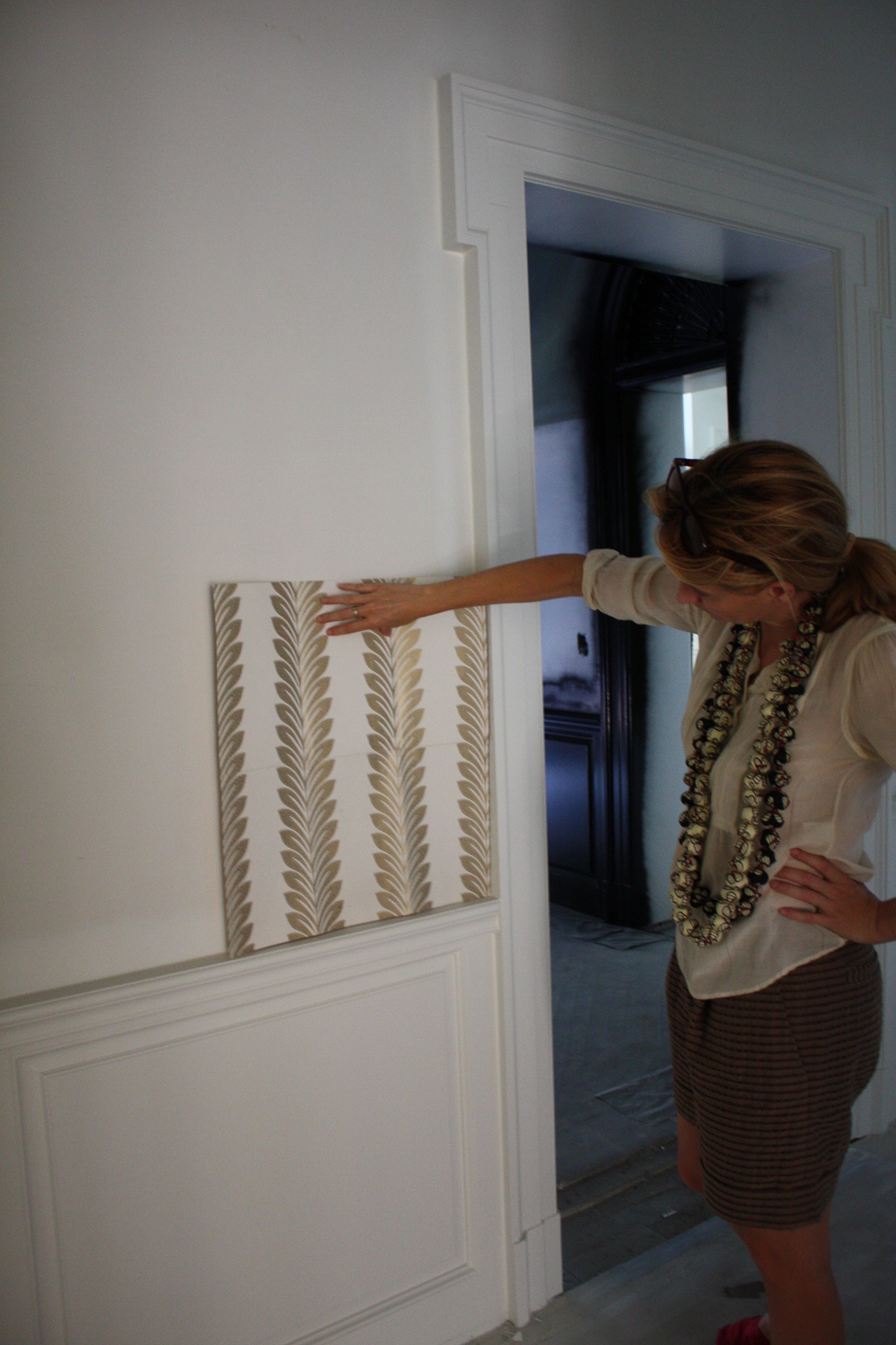
Celerie adores the scale and design of this wallpaper from Designers Guild and plans to cover the entrance and upstairs landing with it. Unfortunately, it is no longer being made. She’s trying to have them make one last run, but if not, the Segreto team will use the wallpaper design as inspiration to come up with a stencil.
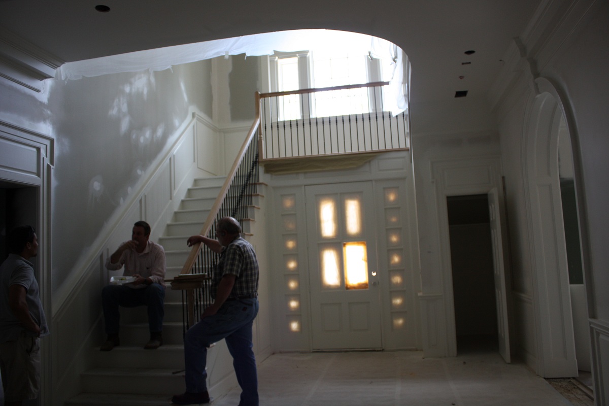
Remodeler extraordinaire, Christopher Garrett, is heading up the construction (and taking a quick lunch while talking to the subs). Although the homeowners loved the bones and details of their formal 20 year-old Georgian-style home, they wanted to bring down the formality with their design to suit the needs of a young family and add some interesting surprises. As Celerie explains, “Our clients have a good sense of humor and were willing to go with almost all of our crazy ideas. Monkey wallpaper in the powder bath? Why not! There is also a bit of an English garden theme that runs through the main rooms to suit the house and the clients’ love of flora.”
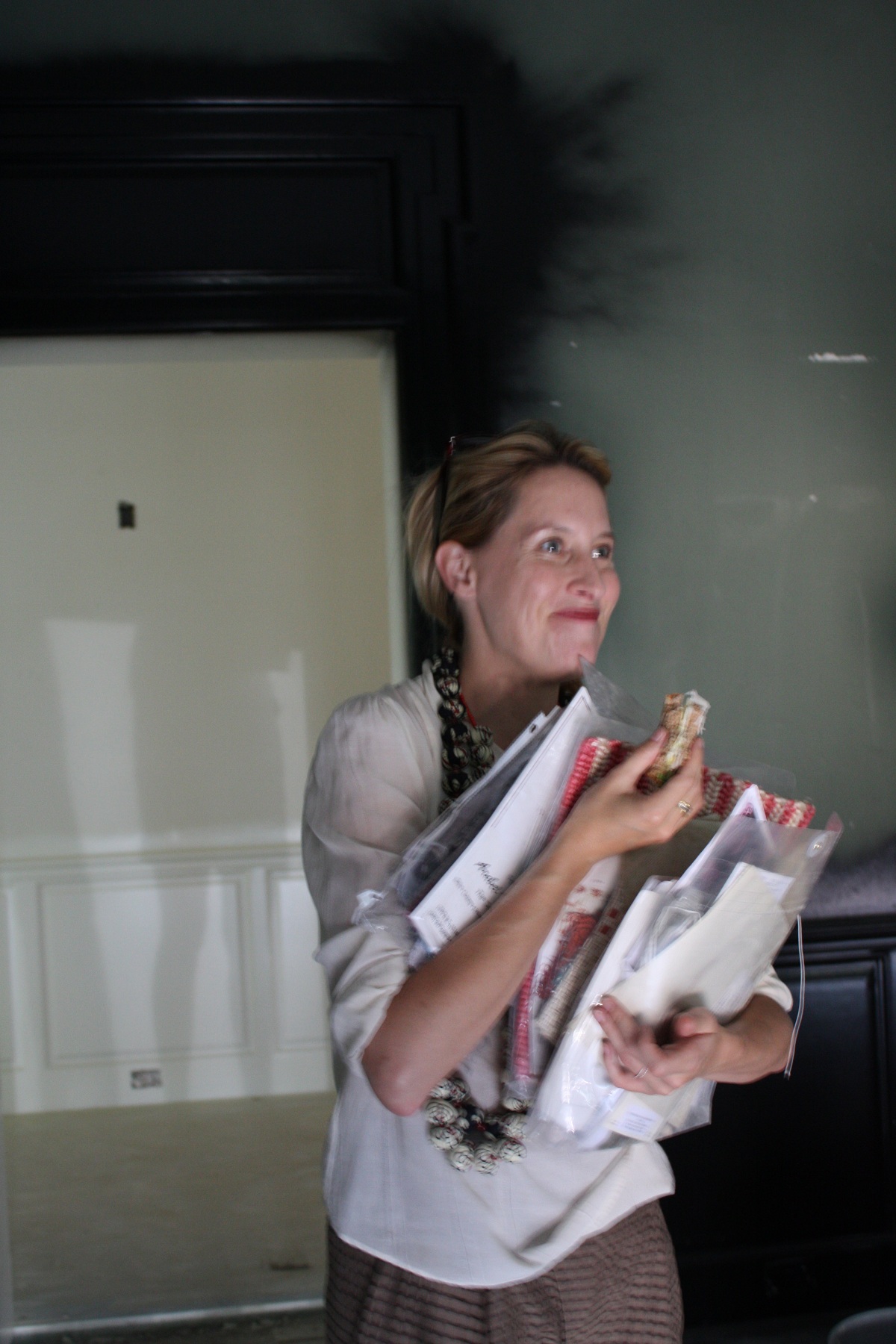
No time to waste here – Celerie is also eating on the run! There are so many decisions to be made during this trip to Houston. This couple came to Celerie and Lindsey to create their “forever” house with a big personality, ideas they had never seen before and personal touches that would work for their family.
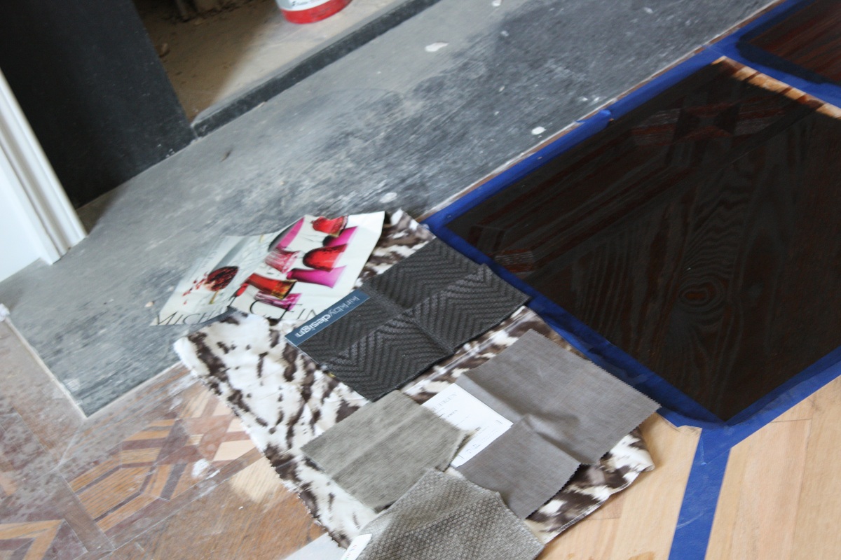
What was the inspiration in picking out flooring stains and fabrics for the dining room? The starting place was the beautiful raspberry crystal that the homeowner uses for entertaining. The drapery, chair upholstery, and fabric wall coverings combine to give the room romance and texture. Everything is considered when developing a unique room that will work for all occasions. The painted trim in the dining room is a Pantone color, 412C. When Celerie and Lindsey can’t find the perfect color on the charts, they turn to Pantone colors that are typically used for printing—wow that opens up a whole new world for me!!
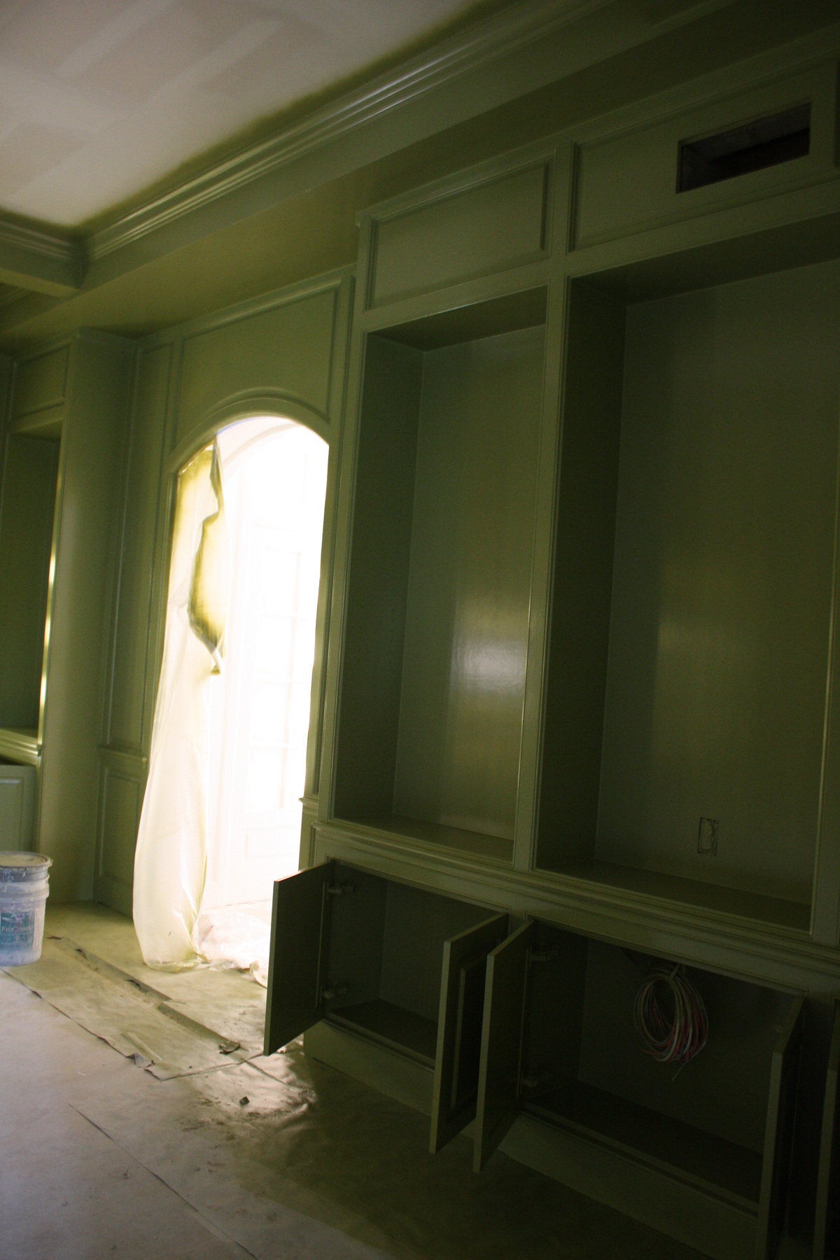
The entrance leads into the paneled den, painted a wonderful pantone green. Lindsey passionately states “there are few colors I’ve come across that I didn’t like – it all depends on the context and the way you pair them together. Color makes a house come alive!” To overcome the challenge of maintaining a sense of flow throughout, colors reveal themselves again in other rooms through fabrics. “Greens consistently run through the main floor, and the raspberry of the dining chairs appears as an accent in the floral in the family room, for instance. Orange is another repetitive color theme, transitioning from pale apricot in the master bedroom, to bright lacquered burnt orange in the study, to pomegranate in the living room, to rust in a bar slab.”
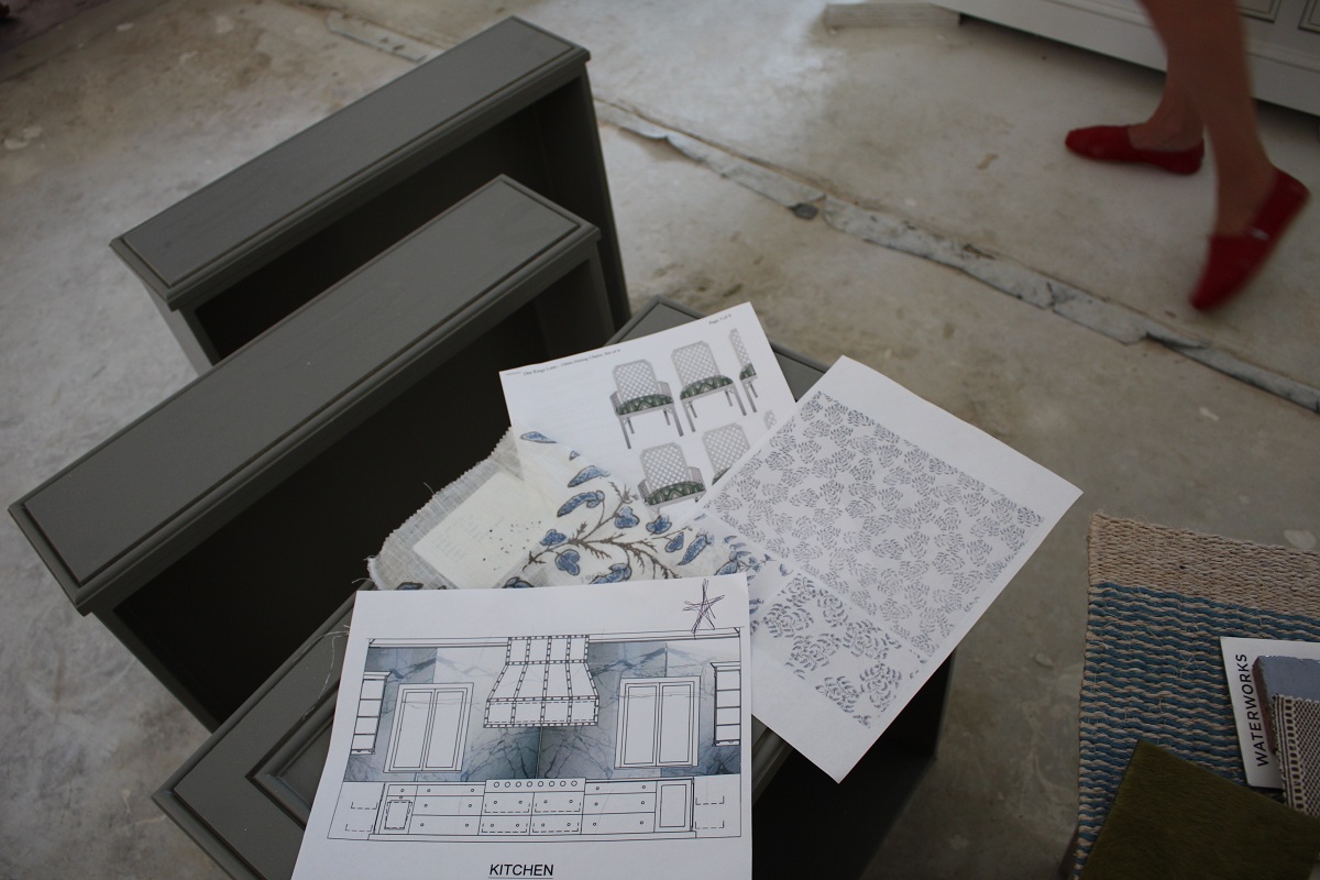
Moving into the kitchen, I was given another challenging project. The floors will be a cream stained wood with the grain undertone coming through. The blue floral drapes will serve as the inspiration for a floor design painted on a larger scale with a weathered, “been there” technique. Because this will lead to other rooms and hallways, it presents quite a challenge! I’m looking forward to seeing which of our four designs they will choose. We tried to incorporate some of the lattice pattern used on the chairs to highlight that chic garden feel.
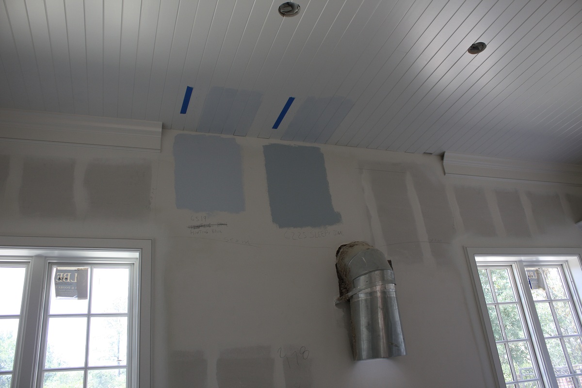
Here are some cheerful blue color choices for the kitchen. I love the bead board ceiling that they installed – it gives the room a wonderful texture.
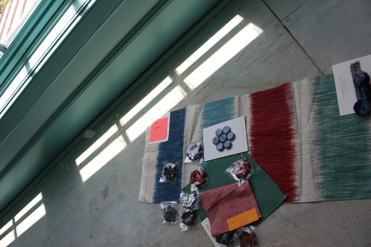
For one of the upstairs kids’ rooms, Celerie and the homeowners chose these fun, bold fabrics. The hardware looks like vintage wheels! They are actually old outdoor faucet handles found on Etsy (a wonderful internet shopping sight if you haven’t tried it!).
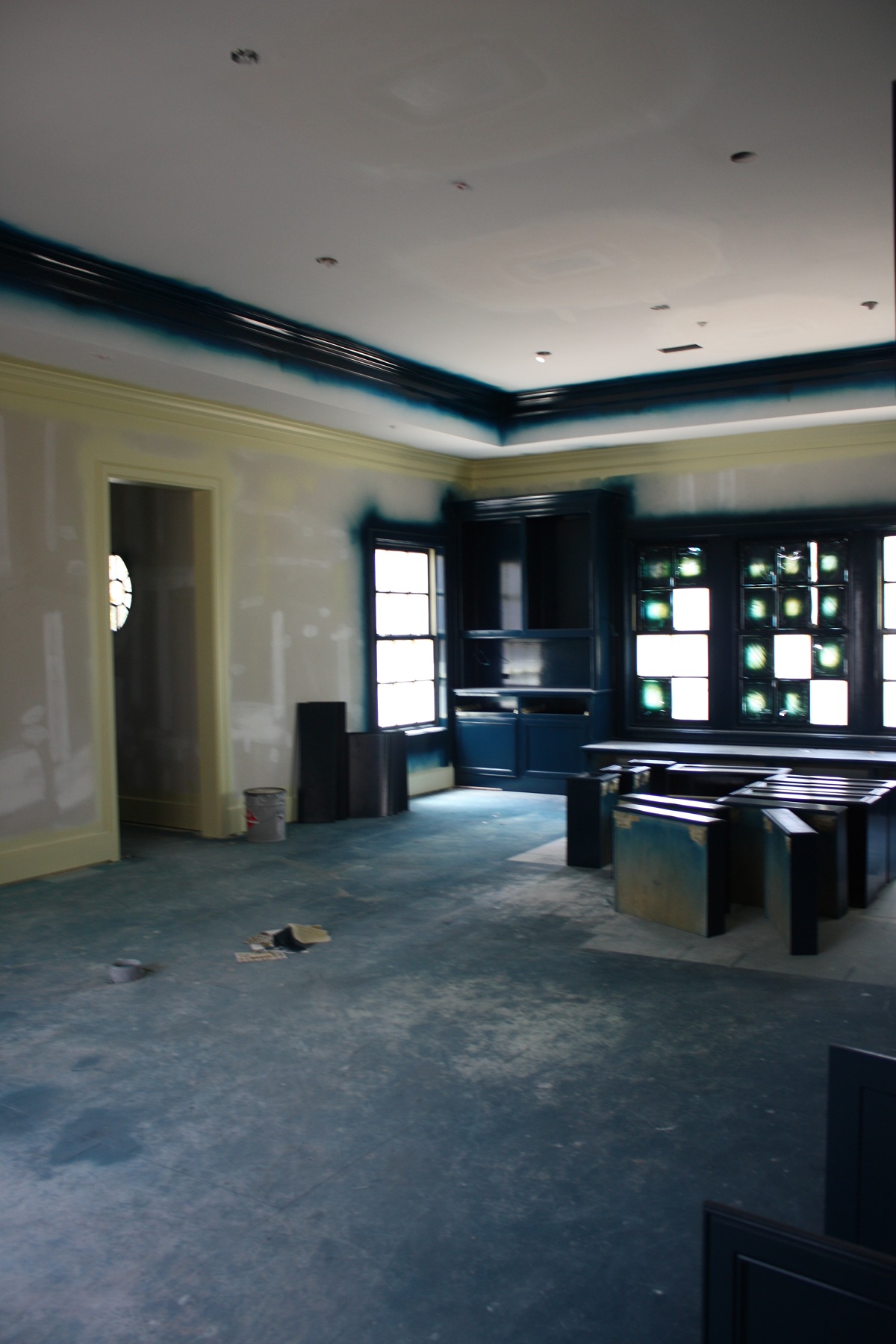
This upstairs game room has two trim colors. The lighter color SW Rice Paddy meshes with the hemp wall covering so it blends and then the teal on the crown and cabinets, Pantone 547C, becomes the accent. Eurolux paint is a great product for high sheen finishes; it is much easier to use than lacquer and gives the same effect! I love that tip!!! Their philosophy is that “every room needs a little sheen (or a lot!), a little woven, chippy, metallic, soft, textured, old and new. It creates curiosity and visual appeal. If everything has the same quality, the look becomes flat.”
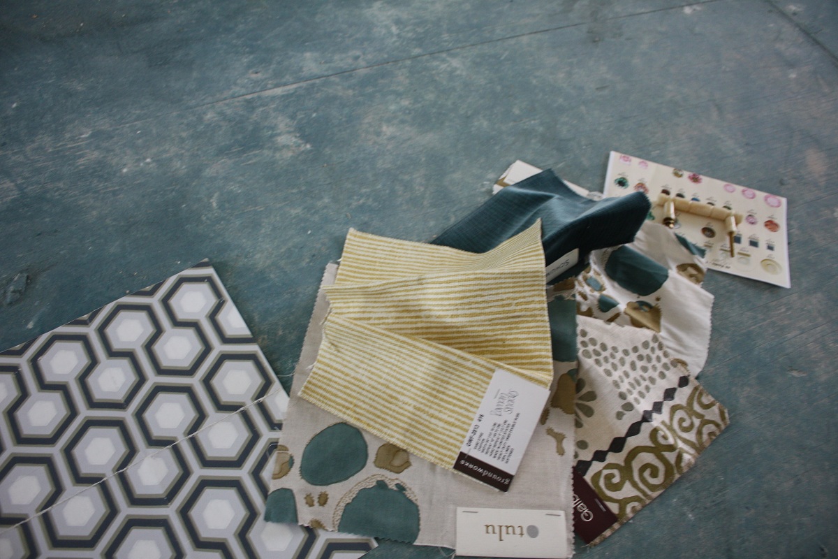
The fun fabrics and textures they are using in this room are fantastic. The walls will have a celery colored hemp, while the ceiling will be covered in the wallpaper, making a game room that will definitely inspire creativity and fun!! Don’t miss the bone hardware selected!
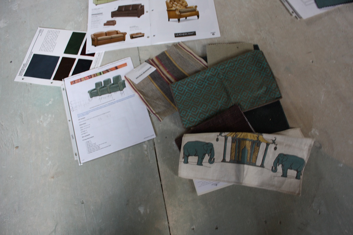
The media room is also full of whimsy. The furniture layout plan is still up in the air. The husband loves those big oversized leather chairs that recline and would like to do two rows of the bench seating. Celerie’s idea is a bit different—she wants to honor his wishes by placing these in the back row and two in the front, alongside a comfy, cozy, “curl up with hubby and watch a movie” couch. I love this idea, turning the media room into a multi-purpose great entertaining room that can work equally well for a family movie night or a date night destination!!!
Look at these fun fabrics and color combinations! Being so lucky to listen in on all the choices, I quickly learned that the team shopped everywhere! They were very upfront about costs of everything – both low and high. “I think there are always places to splurge and places to save,” smiles Celerie. “While nothing compares to a real silk velvet, sometimes something from West Elm or Ikea works perfectly too. We are honest with our clients and tell them when it’s okay to buy inexpensive chairs so we can get a killer chandelier. Our biggest job is knowing where to find exactly what you’re looking for at every different price point.”
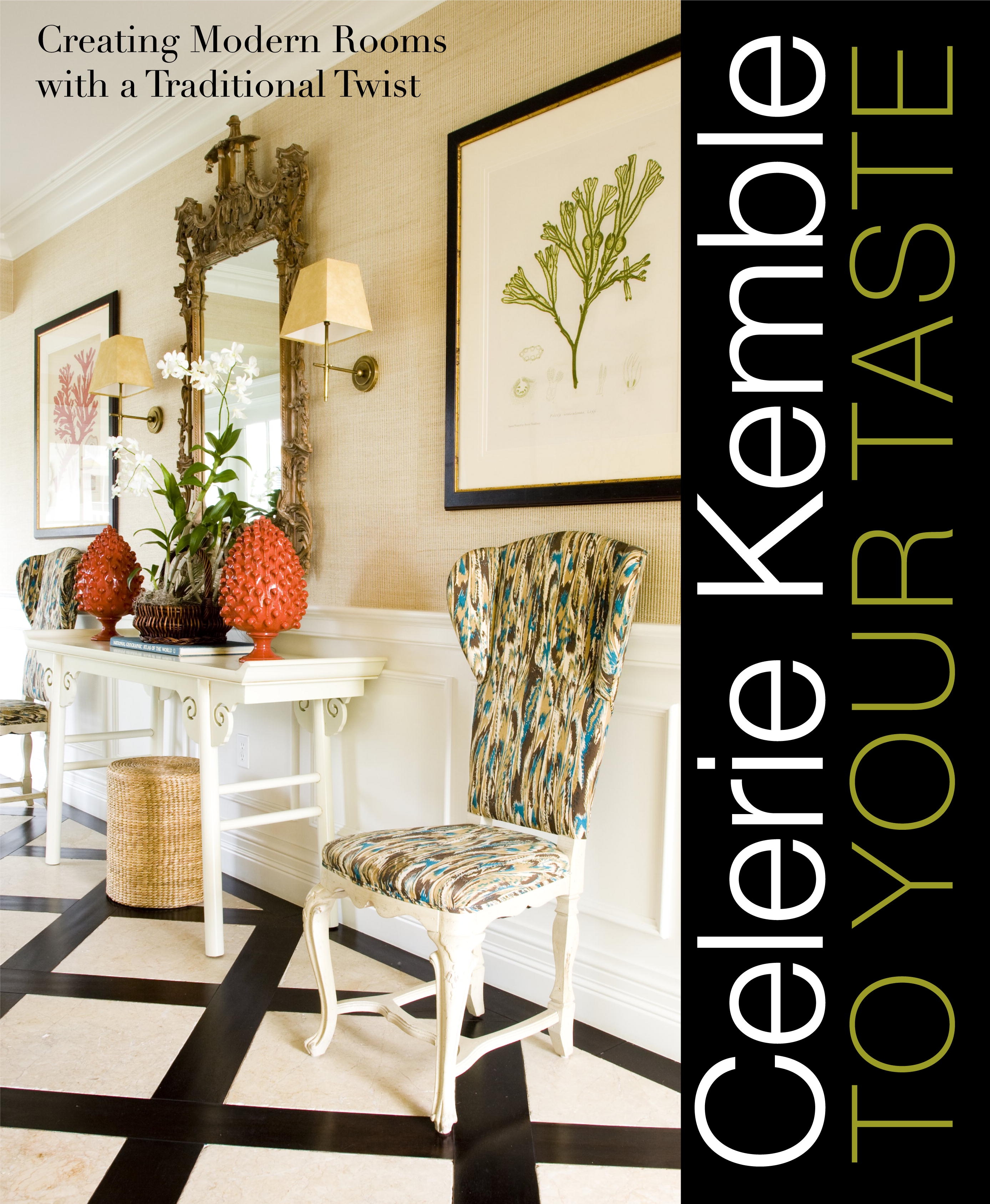
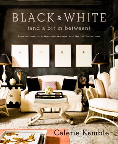
Celerie and Lindsey certainly are staying true to their philosophy that decorating your home doesn’t have to be so serious, it should be fun! We had a great time together – I just can’t wait for her next book, Black & White (and a bit in between), to come out in November. She’ll be signing books in Houston at the Kinkaid Book Fair on November 7th ! I feel honored to be there with her to with Segreto: Secrets to finishing Beautiful Interiors. So excited!!
Thanks Celerie and Lindsey—you both are wonderful!! You can find out more about Celerie at www.kembleinteriors.com or follow Lindsey on twitter, @LindseyHerod. The New York office now has six designers and an influx of interns who all work with clients around the world, as well as a Palm Beach office that’s run by Celerie’s mother.


No Comments