Industrial Ranch
When I’m asked to think of moments in which beautiful design magically comes together overnight, I will now always draw to mind how MAI Consigned owner Beverly Shaeffer, along with her design team and her go-to stylist George Brownley, transformed a 10,000 plus square foot home in an incredibly short time frame. They worked on everything from finding the perfect furnishings to putting food in the pantry – all in three days! This project was such an evolution from 4 months ago when there was no tile, lighting, finishes or furnishings selected. The results are gorgeous, and I love how these elements have worked together to create a unique ranch-style home with an industrial, sophisticated twist.
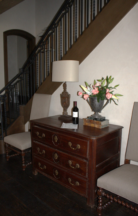
Welcomed by a lovely note, a bottle of wine and beautiful flowers scattered around, these homeowners who had been out of the country would have never known what a whirlwind the house was in just days before. Building on the same lot as their previous home, the homeowners became overwhelmed with the many decisions needed to meet their July move-in date. Thankfully, building designer Rudy Colby recommended Beverly Schaffer to come to their rescue. When Beverly started the project in March, builder Stefano Costantini from Costa Custom Homes was in a holding pattern awaiting some design decisions, so the pressure was on to make selections FAST.
Though the design choices were reached quickly, the result has an air of aged sophistication. As you walk in the entrance, the distressed beams, beautiful plastered walls, lime-washed staircase railings and dark wooden floors make you feel as if you are stepping into a quaint European hunting lodge.
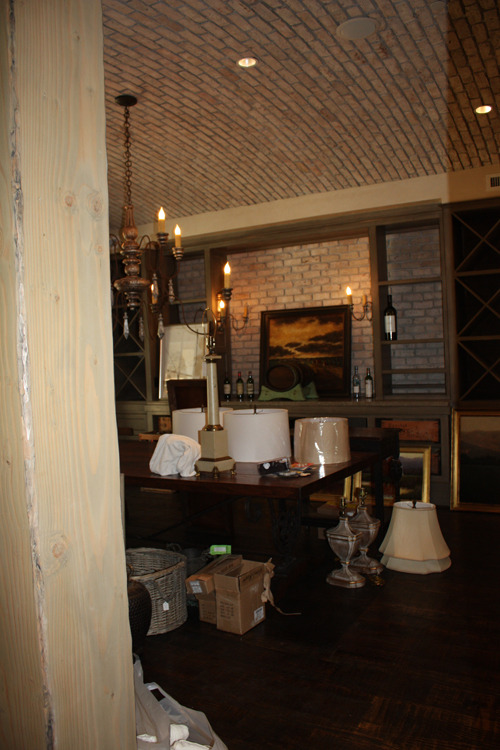
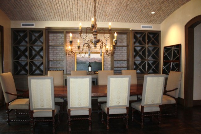
To the left of the entrance, this charming dining, wine cellar room with wine racks and a brick-covered wall and ceiling was utilized as the staging area for lighting until just two days before the unveiling.
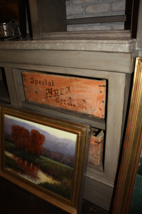
I love the mix of these antique built-in wine crates with the distressed wood finish of the new cabinets. This lovely landscape painting by Darlene Walls was out on approval from Segreto Studios – try to spot where it ends up!
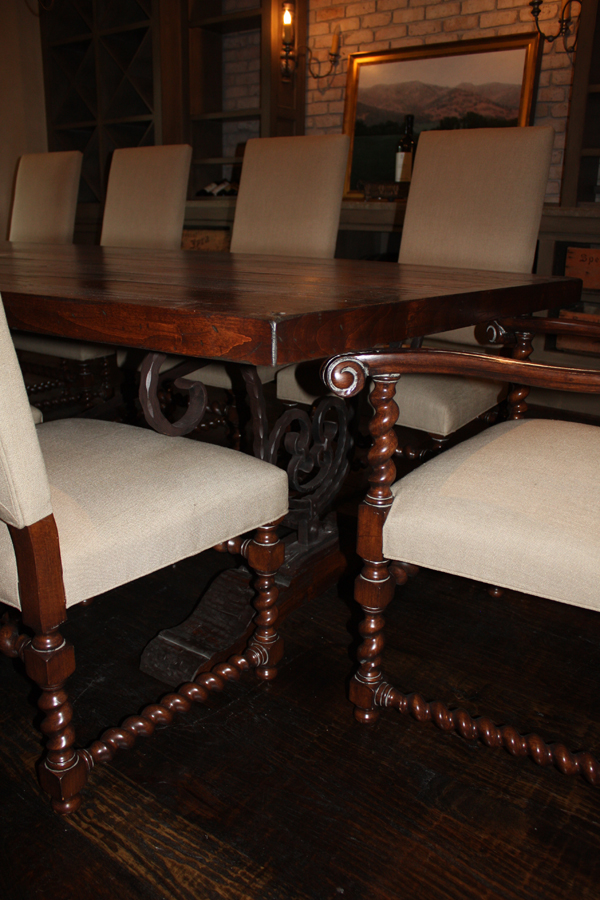
This wonderful one-of-a-kind, custom-built table by Randall Edwards is complemented by these Randall Edwards upholstered chairs that have a great two-toned effect.
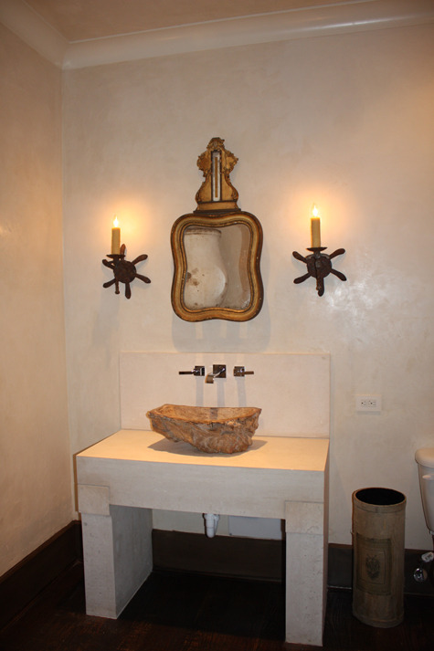
Inspired by the unusual, tree trunk-like sink bowl that the homeowner and her friend found at the Marburger Farm Antique Show, this powder room meshes beautiful antique and rustic pieces with more modern, clean lines. The simple industrial look of the plumbing fixtures and the stone basin that Beverly and Rudy designed gives the space that chic contemporary feel while the mirror and sconces incorporate an interesting, aged touch. Polishing up the same plaster finish that’s used throughout the main areas of the home dressed up this room and set it apart.
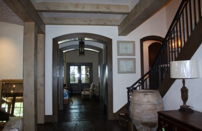
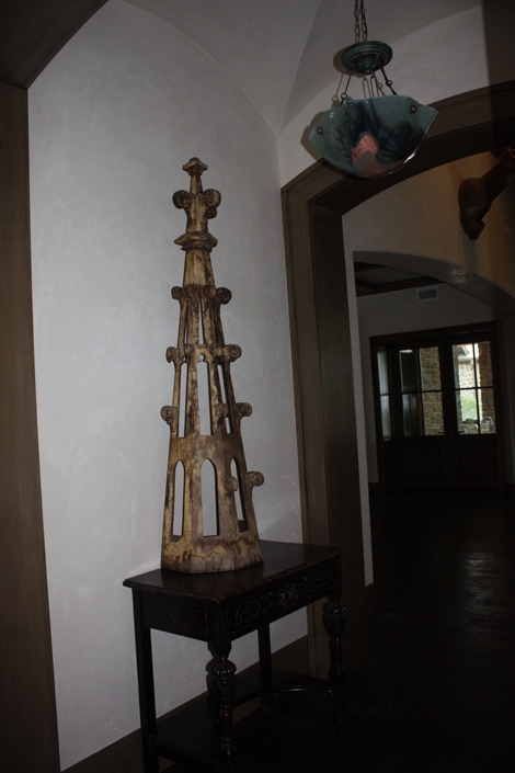
The vestibule leading to the great room features both a really cool, glass bowl light fixture that Beverly found at Carolyn Thompson’s Antique Center for just $127.00 and an antique Catholic altar fragment from Antiques and Interiors on Dunlavy, sitting atop a table from Beverly’s own shop MAI Consigned. With her gift for mixing unusual elements together, Beverly turned this beautiful, lodge style home into a welcoming retreat full of unexpected combinations.
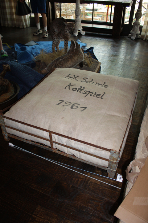
It was so fun to see the various items scattered everywhere…I felt like I was doing some shopping myself. I loved this dog bed from the Fabulous Flea, letting Beverly know that if it wasn’t used at this house, it would be perfect at mine!!!
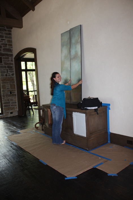
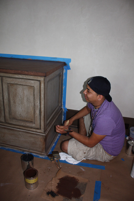
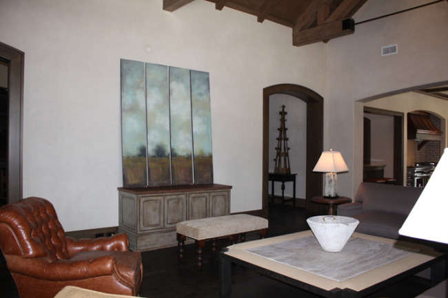
Because there is a full wall of windows, a stone wall with a fireplace, and an open kitchen-great room floor plan, this wallspace over the cabinet is the only place for both the TV and art. Beverly was originally planning to have Segreto paint a piece of art on large panels and mount them as sliding doors to would hide the TV, but then she saw these wonderful panels by Debbie Mosley at our gallery and will use these for the screen instead. Because the flat stain on the cabinet wasn’t producing the right effect, we started to transform this piece just three days before the unveiling! Here is the lovely Karen, my amazing right-hand gal, testing out the scale of the paintings in the space. The white primer on one of the cabinet fronts is our first step in the painting process of the distressed look we’re going for.
Rikki, part of the Segreto Finishes team, worked on a Saturday to finish up the piece before the homeowners’ arrival that evening!!!
He did a beautiful job! And I think Debbie’s panels will look amazing when installed on industrial glides!!! I love how her pieces rethink landscapes in a contemporary way.
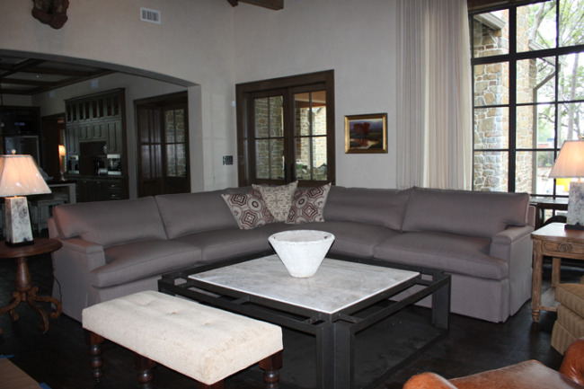
Did you find Darlene’s small landscape? I love its placement here – pulling in the same colors of Debbie’s panels on the other side! And here we find some of those wonderful Boxwood pillows again!!
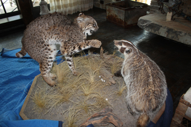
This large taxidermic piece is just one representative of the homeowners’ large collection of mounts, skins, etc. that they really wanted to use. So how did Beverly incorporate these two friends?
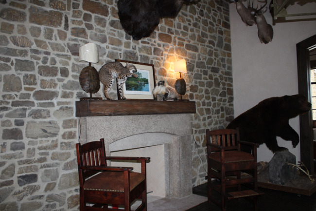
Since these two had been fighting all day, they had to be separated – hehe – ending up on the mantle of the billiard room’s fireplace. Creating a masculine, hunting lodge feel in this space, many of the mounts are displayed here in interesting groupings. I love the turtle lamps on the mantle— perfect!!
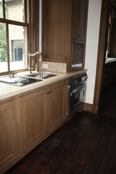
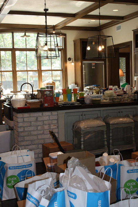
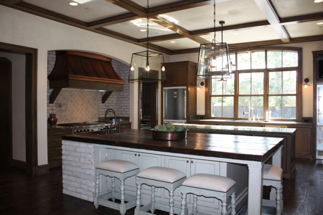
Seeing the kitchen in this state two days before the clients returned just made me tired for Beverly!! The homeowners who love to cook, bake and entertain unexpected guests wanted to have a space that was comfortable and could accommodate all!! This large kitchen that opens to the den is just that! Featuring two large center islands, a sink-stove area and a large cabinet that displays dishes and houses an elaborate coffee bar, these homeowners definitely have space to entertain and enjoy meals!!!
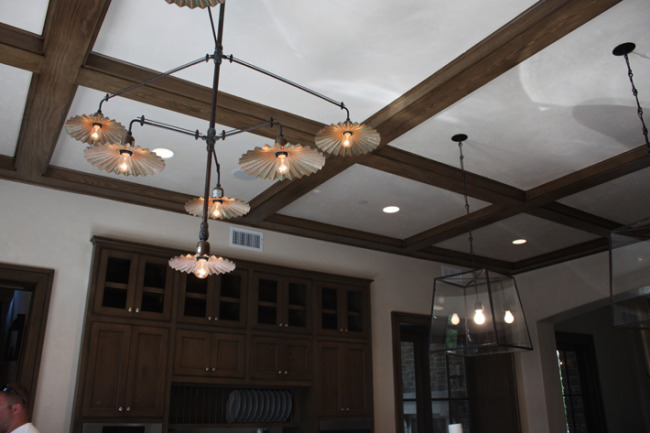
I love the combination of lanterns and custom industrial lighting from Italy. Very unexpected and very cool – both fixtures came from Brown. There are also two small sconces by the sink that coordinate with the industrial piece.
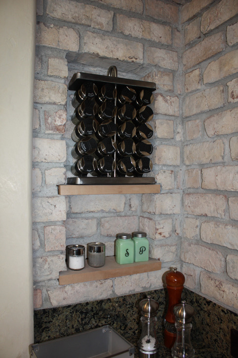
These recessed shelves built into the brick near the stove are a perfect place to store spices and seasonings.
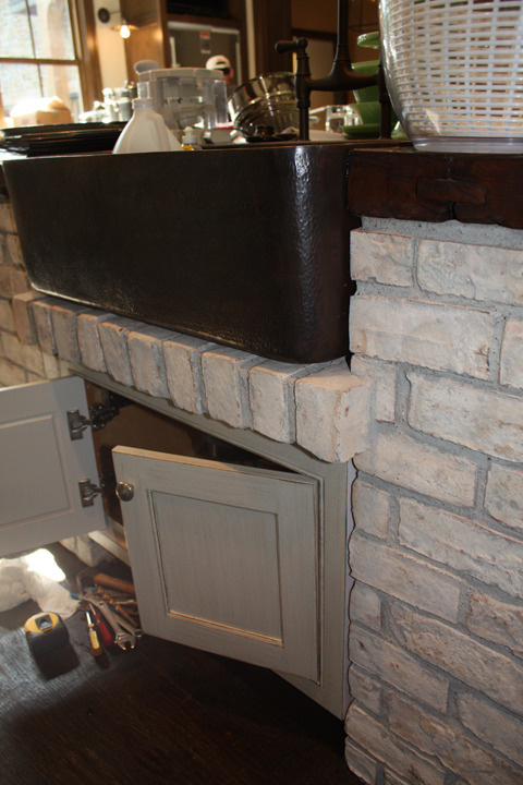
The far island with this wonderful copper sink also integrates some of the reclaimed brick, and the custom counters are reclaimed wood built by Custom Floors Unlimited. We did a painted finish on the island’s cabinetry to lighten up the space and take a break from all the stained wood.
Wow, what a beautiful kitchen that suits all the homeowners’ needs!!! Unbelievably these barstools from Boxwood matched our island finish exactly!
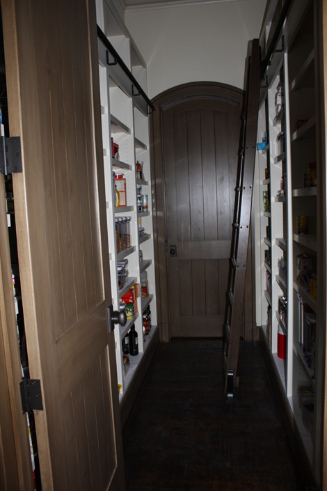
The butler’s pantry located between the prep area and the bar is any foodie’s dream—not only is all the food placed in the room, but all the shelves have been labeled!!
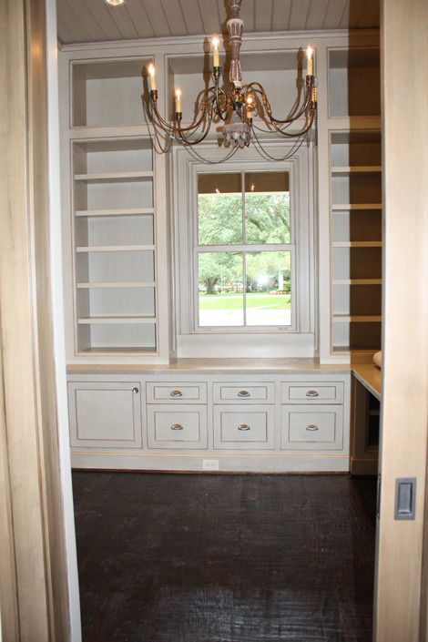
The series of glazes on the cabinets in her office provide warmth, charm and a bit of femininity.
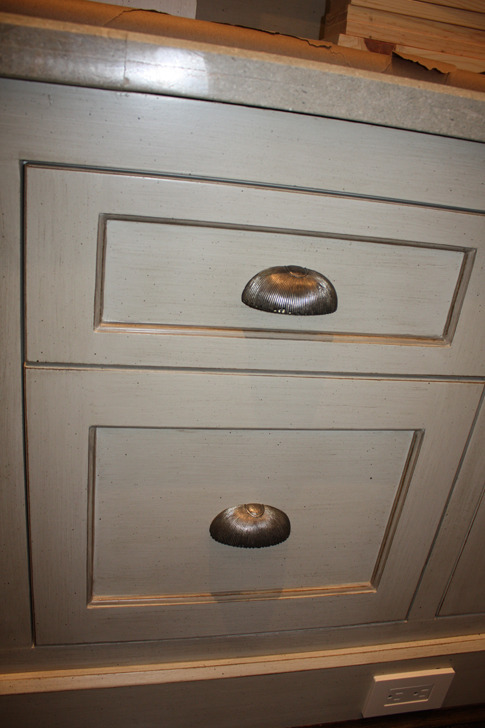
Cabinet finishes makw such a difference in can a space! They can soften, define, add interest, etc., but regardless of the effect, they always transform one-color sprayed pieces or built-ins into incredible furniture accents. I like this one so much I did the same finish on the previously stained built-in cabinet in my den.
This home has way too much to share in one visit! Next week, I’ll take you through the fabulous master suite, the bedrooms, study and outdoor patios. How they managed to unpack and furnish in three days and make all selections and complete the builing process in just 4 months is beyond me – I won’t complete my kitchen and den redo in 10!! Thanks Beverly, Stefano, and Rudy for bringing me in on working on such a wonderful project and sharing it with us all!! To get the blog sent to you every week, be sure to sign up under subscribe and it’ll come straight to you every Monday! Hope you have a great week!!


bucket elevators
Posted at 09:02h, 28 MayThis very good blog, and appreciate your work.
You have done the very good job to making this blog, it's very useful for me.
thanks
Bucket Elevators