A House Update!
Well my house is really moving along! With my dream team of Newberry Campa Architects, Goodchild Builders and architectural consultant Sarah West, my master suite area is really taking shape!!!
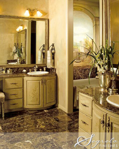
I found this picture of the master bath when we purchased the house in 1987!
Here is how we changed it way back then! What you can’t see is the shower across from the tub. We tore down a linen closet and made it into a shower so the shower was very very small.
At a later date we built on a Master closet addition behind the doors and made the old small master closet into this sitting area in the bathroom!
Our house was built in the late 60’s and our old pipes started bursting so we had to replace them all leading to a master bath redo!!! Tired of a very small tub and shower, we hired Ken Newberry and his team of Will and Gina from Newberry Campa Architects to help us out! The bathroom was gutted and the three small areas it previously held was made into one larger space.
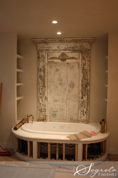
Here is the new Jason tub from Acero Bella, which is where the sitting area used to be. Ken wanted a window there looking out to gardens lending the illusion that the space was larger and allowing more natural light to flow in. This would have been beautiful, but my husband who is so concerned about break-ins didn’t want exterior access to this part of the house. Soooooo… I found this wonderful piece at Joyce Horn Antiques. I posted on Facebook should I put a mirror there, hand a painting, leave it as is or paint something decorative on it. What do ya’ll think? I hope I can keep those open shelves (not yet painted) neat!!
Here is my inspiration picture which is a piece from Tara Shaw for my sink cabinets. Remember the beautiful mirrors which I found from Mitra Kilburn at Marburger Farms Antique Show, I thought they would look amazing over pieces like this.
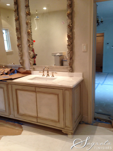
With the mirrors hung, faucets installed, walls plastered and counters on, I was getting excited!!! Now for the paint!
Here is Jerry, my head cabinet guy putting up the samples, and the finished sample.
With the paper pulled off the floors and the counters, I could really start envisioning the space. I did change my faucets which I had posted in the original blog on my house. These mirrors were so large that I had to drop my counters to 34 inches and there was no space for wall mount faucets! I love these French Gold, New Port Brass Victoria faucets I purchased from Acero Bella, the marble from Walker Zanger fabricated by Olympus Marble and Granite, and floors from Materials Marketing. The old faucets are for sale at a great price!!!!!!!!!!!
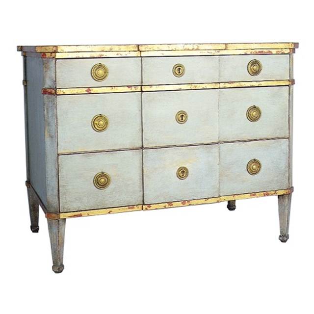
Opposite of the sink vanities is a dressing table for me! I loved this piece of furniture from Niermann Weeks and used it as my inspiration.
Goodchild Builders did an amazing job building the pieces-now for the paint!!
Here is Ricki, one of my furniture refinishing guys working on the piece. It’s not done yet, but I’m loving the gold accents. Any ideas on sconces?
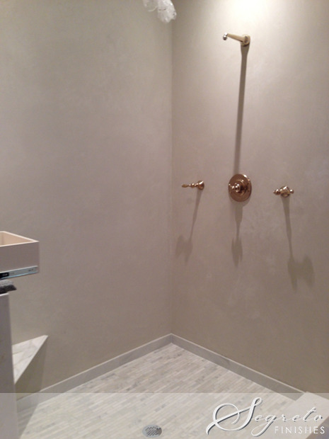
Because the space has a lot of elements in it I didn’t want to visually break it up with marble tiles in the shower. Instead we plastered it with a water proof plaster. All the walls and ceilings are coated with the same material!! All I need now is the glass! Note to all. The finish on the hardware that I purchased is not available on handles and brackets needed to install the shower doors. I am having to re-plate them which is an additional cost. Same with the drain.
Stay tuned for more updates, there is lots going on around my home!! Til next week!! xo Leslie









Gigi Harlan
Posted at 13:22h, 21 JulyIt's already so beautiful. You must be absolutely giddy with excitement! Looking forward to seeing it all finished, just gorgeous!
Gigi @ Old World Patina
designchic
Posted at 00:28h, 22 JulyWow, wow, wow, Leslie, you must be thrilled!! It is beyond gorgeous and every detail is stunning. I cannot get over the mirrors – unbelievable and the cabinets so elegant…dying to see more!!
Kristy Woodson Harvey
Posted at 00:34h, 22 JulyIt looks AMAZING!! The whole thing is fabulous but that bathtub… So great! Thanks for sharing!!
Jamel
Posted at 17:12h, 27 OctoberThe first photo you showed of the uurqaneled brass faucet was also one of my favorites. I purchased an antique brass gooseneck faucet with porcelain handles that is breathtaking. It used to belong to an old clawfoot bathtub, and is wall mounted. I’m just waiting until I renovate my kitchen as I too was planning on doing a concrete counter. I have antique brass and copper apothecary hardware that is incredible. Sounds like we’re going for a similar look. Personally I don’t love the newness and shine of the second faucet photo. I prefer the patina of the first.