The Dream Team-Architect Michael Landrum and Designer Garrett Hunter
Hi Friends!! Today is going to be a real treat as I am sharing a project just completed with architect Michael Landrum and designer Garrett Hunter!
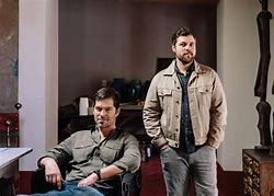
Looking like they are both right out of a Hollywood movie set in this photo taken by Paper City Magazine, Micheal is to the left and Garrett to the right. Often working together, these two have been an amazing inspiration to me when collaborating on projects.
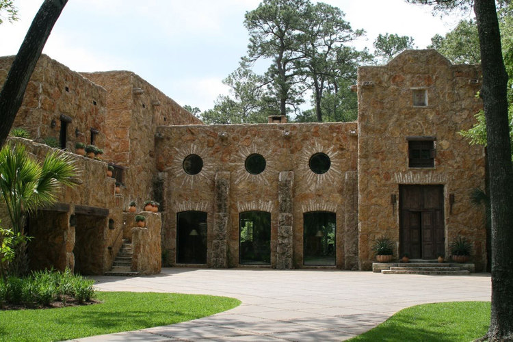
Micheal and I have completed many beautiful homes together……….. his style?? Any style-well done!! This home featured in Segreto Style (p144-149) is Hacienda at it best!
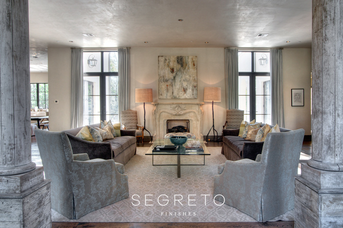
I labeled this home Gracefully Eclectic in my first book Segreto Secrets to Finishing Beautiful Interiors (p 32-37). Completed years ago with interiors by Don Connelly, I think it was my first glimpse into a more modern European style.
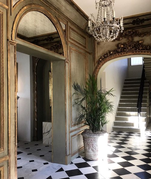
This home and stunning entry, feels as if it was built centuries ago, however it is actually a new construction modeled after historical New Orleans. LOVED the project!! Not only was it the first opportunity I had the pleasure of working with this brilliant duo together, we did something quite unique! Because there was not enough paneling to complete the space. Segreto restored the antique pieces and finished the new panel insets and surrounds to read like the old. Can you tell which is which?
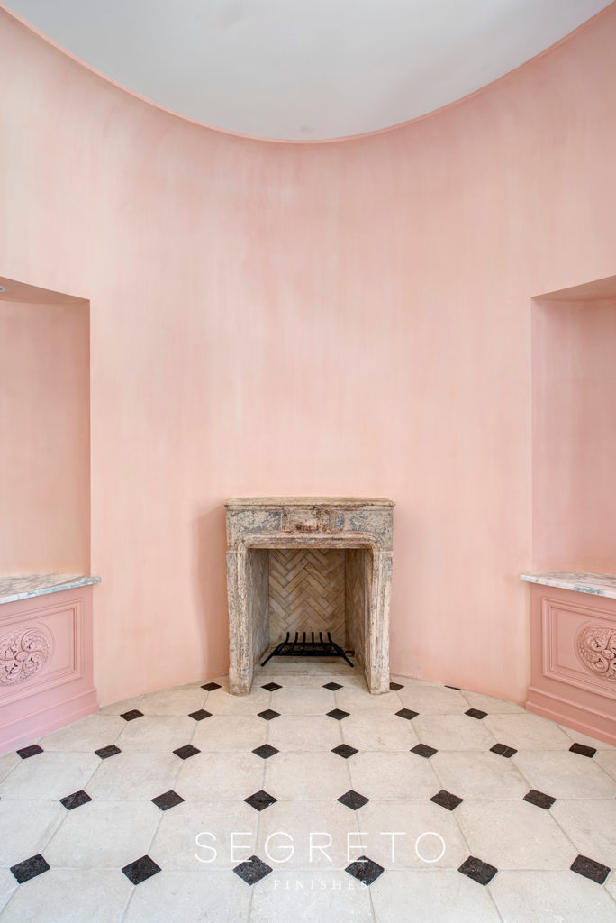
In the dining room which graceful oval shape is so unique, it the first time we have done lime washing on walls! Wanting a chalky water color effect we applied two layers of a luxurious apricot.
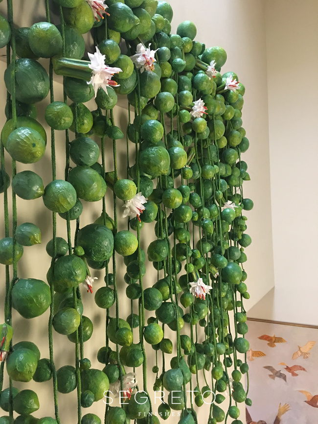
Next we were so excited to work on an update to a home the team had designed together years ago. We applied the lime finish throughout the main areas of the home creating a wainscot effect!! The homeowner and designers tasked our creative Segreto designer, Andrea Condara to create a unique installation sculpture to grace the main staircase.
Her masterful creation was made from a combination of materials including paper mache, fabric and Segreto plaster and hangs 6 ft wide and 7 ft tall to make a big statement!
And now for the new project!
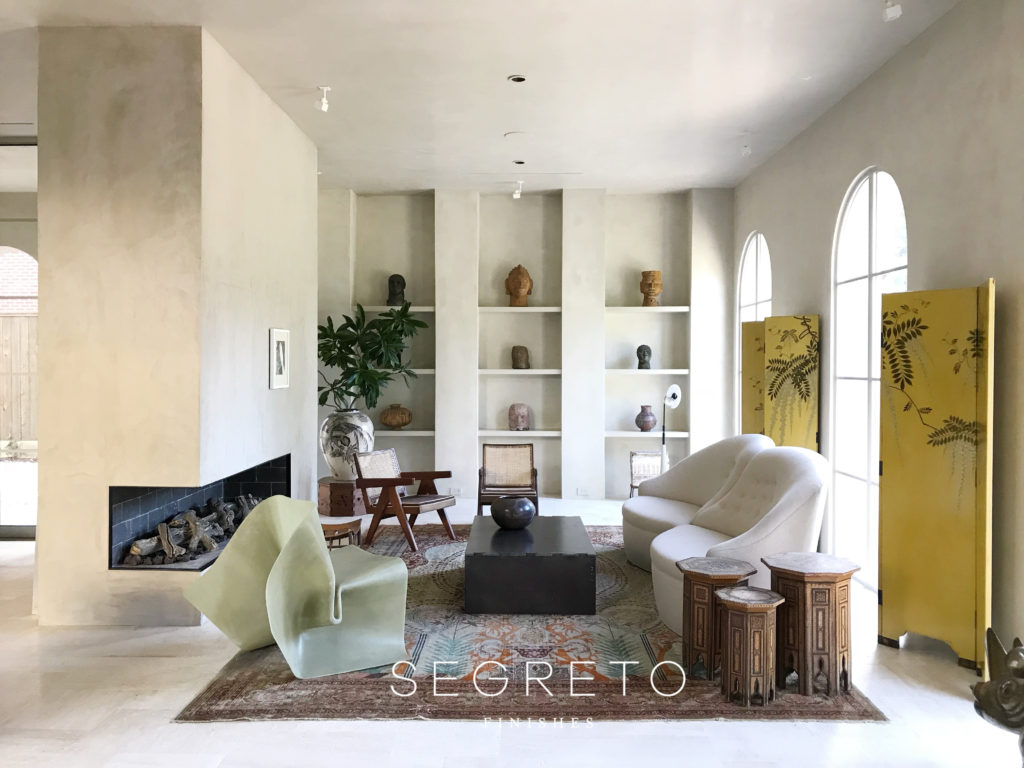
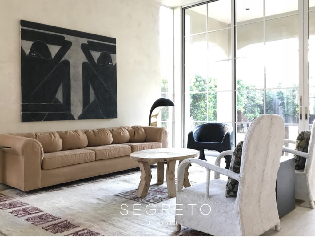
This home looks like it is right out of Architectural Digest or Elle Decor. This contemporary take on Spanish colonial has an – “airy and time transcending” design style–love that. Composed of the collected look which Landrum and Hunter are so known for I am really drawn to the stunning Oliviere Gregorie “fold series fiberglass chair” designed especially for the fashion label Acne. Ps. Morris Hullinger was the builder on this one and the combination of this team, I know you can’t wait to see more!!.
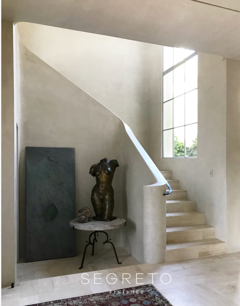
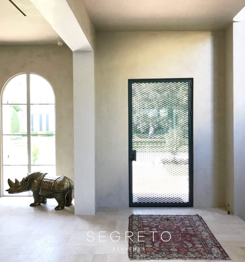
Walking in your are greeted by a graceful staircase coated in plaster! (which we installed–hehe!) Its architectural feel complements the statement art and bronze piece creating one focal masterpiece vs individual pieces.
I was so happy to see a chair I adore from Garrett and Michael’s own line. The Ginkgo chair from their Tienda X line!! It is so comfortable! And that Charles James sofa–to die for!!!
No detail is left without thought and attention. The grill work over the door allows for more privacy while flooding the space with light- a chic version of the steel door!
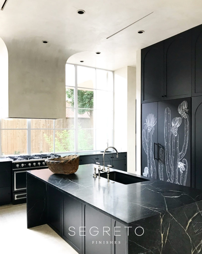
The kitchen is amazing and some of it quite a team effort to achieve. The floating hood in front of the window rolls right into the ceiling. Because it is plastered on both sides our work on this part had to be completed before the hood was installed. Then it was fastened on to the ceiling and when we came back later to plaster the rest of the space we had to blend it in seamlessly-difficult? Yes, but well worth the effort. The refrigerator panels were commissioned by Jaime Lorera, and what a statement they make!!
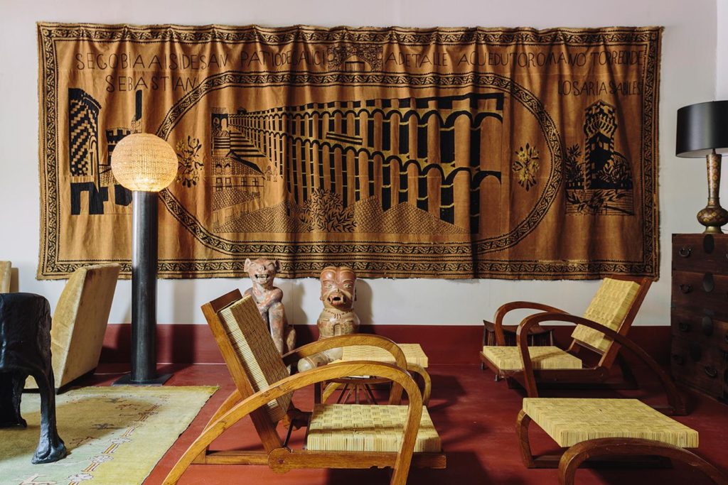
As if their projects have not kept them busy enough, Michael and Garrett also own together the super chic art and design boutique Tienda X at 1420 West Alabama. Steps away from the Menil Collection museum, if is a carefully curated collection of art, furnishings and objects, which also showcases their own line of studio furniture, resin chairs and limited edition lighting made of steel and vintage sphere crystals. I loved this excerpt from Wallpaper * about the shop. As for the name? ‘The name is meant to be somewhat anonymous or generic,” explains Hunter, noting the Brand X concept behind their tienda (or small, specialized shop) is really about ‘not conforming to an identity’.
Just like all that they do–All styles are perfectly curated and masterfully combined to create beautiful spaces in the way their clients like to live! Keep an eye out for these two! A big thanks goes to Garrett and Michael for sharing a bit of their work with us all!!
Tuesday is the last day to vote!! A big THANK YOU to all for your votes. Segreto Secrets is up for the International Amara Design Blog Awards “Best Company Blog” and we are up against some amazing talent. If you could take a minute to vote I would be so appreciative. Our goal is to obtain enough votes to secure the top 5 blogs out of a 100 and make the shortlist. At that point the blogs will be evaluated by a curated panel. Go here to vote! I am wishing you all a wonderful week! Till next time! xo Leslie





Courtnay Tartt Elias
Posted at 05:11h, 17 SeptemberThey are the BOMB + inspire me to no end!!!!!
xxooo
Courtnay
Leslie Sinclair
Posted at 06:55h, 17 SeptemberThey are so creative and so cool!!! Just like you my friend!! xo
Melanie Kershner
Posted at 07:35h, 17 SeptemberFabulous Leslie.