Wow What a Difference a Great Renovation Makes!
Hi Friends!! I can’t wait to show you this amazing transition of a renovated home we just completed. Although Houston still is going gangbusters with the tearing down and building new phase, there are still many homeowners, loving the bones of their home, who decide to renovate instead. The one below is so well done that I just had to share!
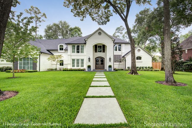
This is a shot of the after. Stunning isn’t it? The homeowners put together JJ Design Group and Goodchild Builders to help them with the renovation. Collaborating with both groups on many previous projects I was excited to be brought on board. What a difference the outside is. The red brick was painted white and new doors and shutters were added and finished by us!!! The front porch and walkway were also given a face lift. I love the way the porch now goes to the outside edge of the front part of the home where the sconces are. Notice how the shape of the door and window are different as you scroll down and see the inside of entrance as it was before.
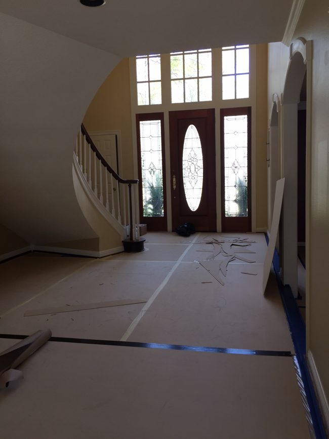
As you can tell the home before was very nice- it just needed an update. See how the old door and window changed? Tips on painting–If you look at the staircase, the underneath and lower ceiling is painted white. In situations like this, I recommend to apply the same finish on these surfaces as are on your walls. The staircase becomes the focus rather than the color change between the underside, walls and ceiling. Look at the below pic for the difference.
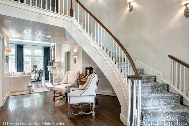
In the front entry dining and living, the changes were just cosmetic! Refinished floors, fresh paint and plastered walls and ceilings made such a big difference. Of course on the interiors, the furnishings were either recovered or new.
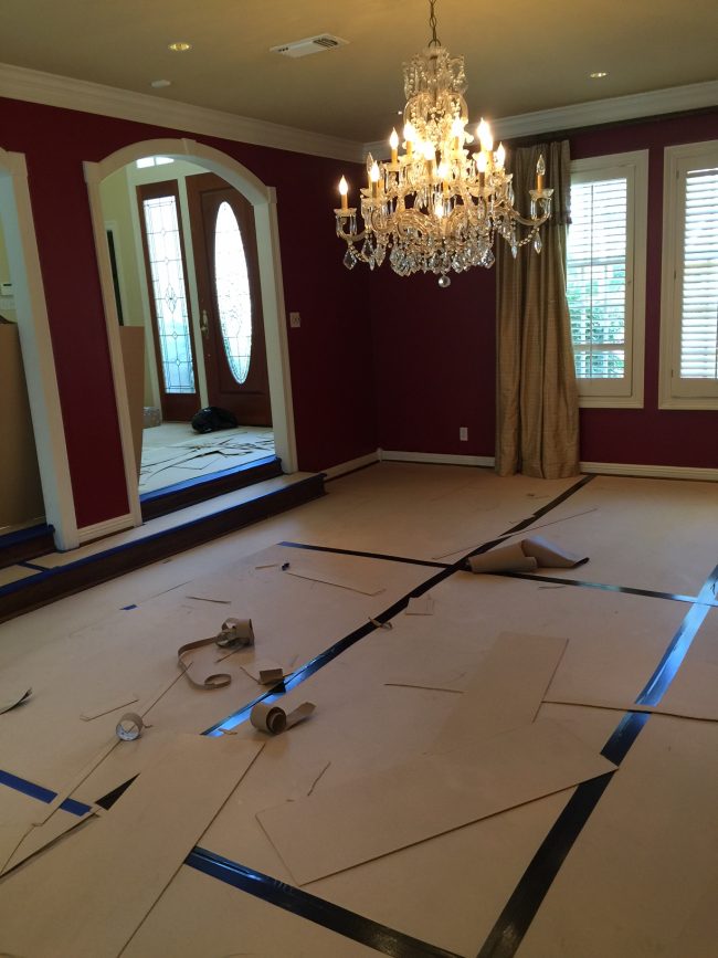
Off the entry is the dining room. You can see here that the entry was painted gold and the same color carried onto the dining ceiling. The red dining walls and the gold ceiling create a major contrast with the trim. Appropriate for a traditional home, this team wanted the space to feel more open and lean to the French in style.
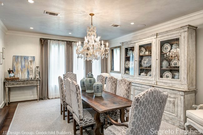
So the trim was blended with the plaster, making the room feel taller and putting focus on the furnishings rather than the contrasting stripe around ceiling and cased openings. Kathy and Heather from JJ Design Group did a fabulous job with the interiors!! I wish that I had taken a close up of the dishes in the cabinet. They were so beautiful!
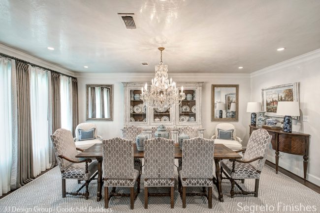
By using the same plaster as in the front entrance each space feels larger and the floor plan more open. The existing chandelier remained, and the chairs were given a face lift with new fabric.
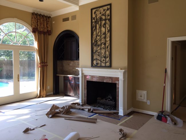
Here is the living room before!
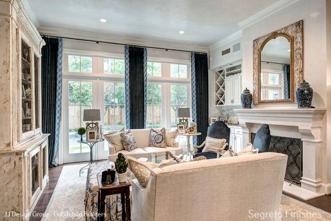
Besides the beautiful furnishings and drapery, can you spot the changes that went into this room? The fireplace, paint, plaster and windows! Huge difference I would say without moving any walls! Notice how the drapes are hung right below the crown molding–a super trick to make the ceilings feel taller! I’m loving the trim on the drapery– a trademark of Kathy’s.
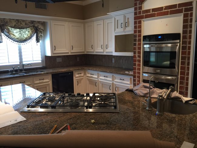
Moving into the kitchen here is the before!
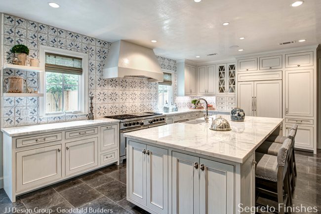
This space was gutted and totally rebuilt–quite an amazing transformation. The island being moved really opened up the space. I love the tile from ADR–it not only makes an interesting art wall but installed to the ceiling the room feels taller. We plastered the walls, ceilings and hood as well as glazed the cabinets softy to bring out their detail while still keeping them fresh and light. Plastered ceilings miraculously create the illusion of height on lower ceilings.
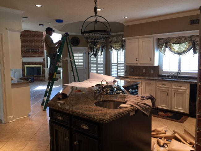
You can see the kitchen flows into the breakfast and den.
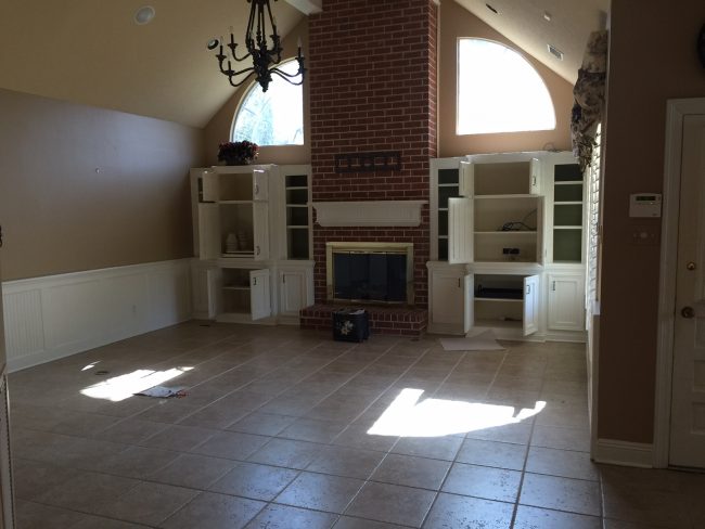
It’s fun to play I spy the changes!!
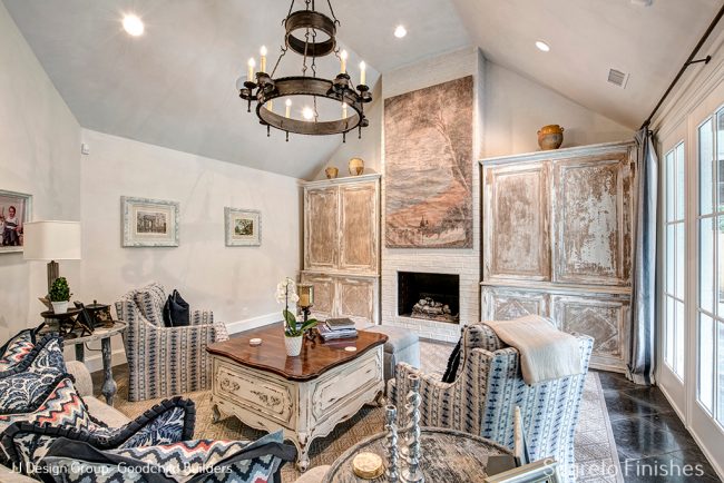
In this case we slurried the brick and continued the plaster into the space, again creating a more open and airy floorplan. Notice how they took the built ins out and replaced them with these amazing antique cabinets. The mantle was taken down so their art piece would fit.
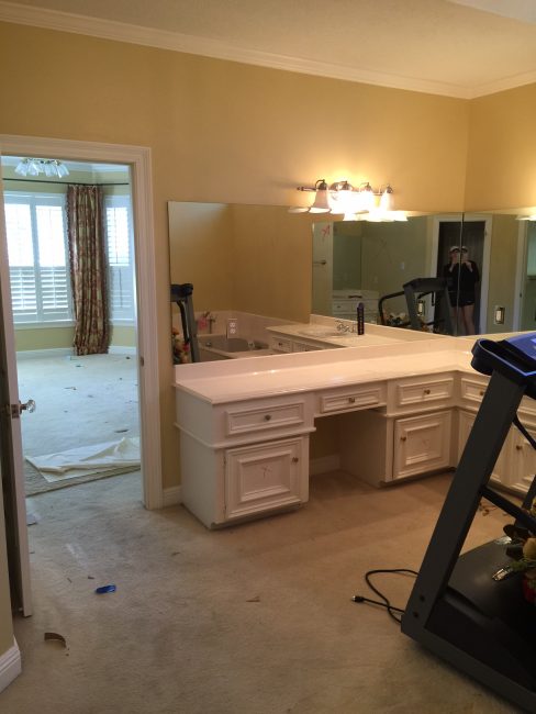
Here you can see a snippet of the master bedroom and part of the master bath.
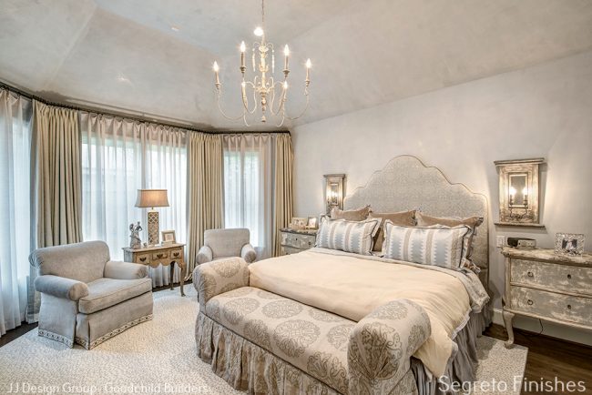
I do see that they removed the crown in this area — With the plaster and furnishings, it is quite the soothing retreat now!
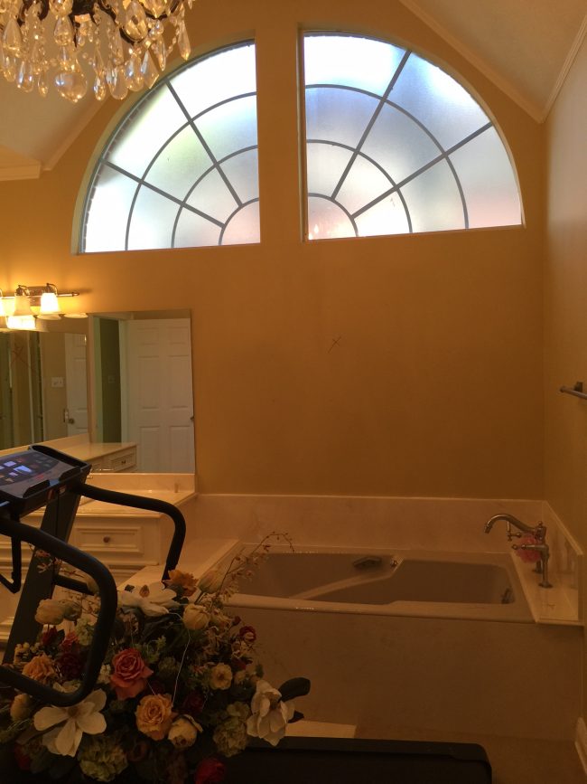
The bath before, and…………….
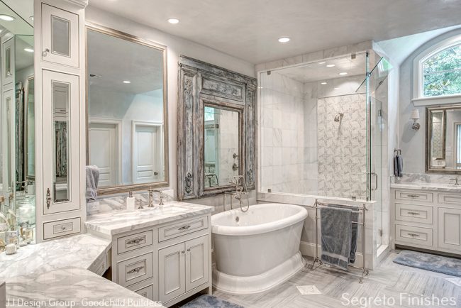
…………..after! This is such a major change and all within the same footprint! Not only is their more storage but raising the mirrors, cabinets and shower to the ceiling visually made the space feel so much larger!!! We applied the finishing touches with plaster, cabinet glazes.
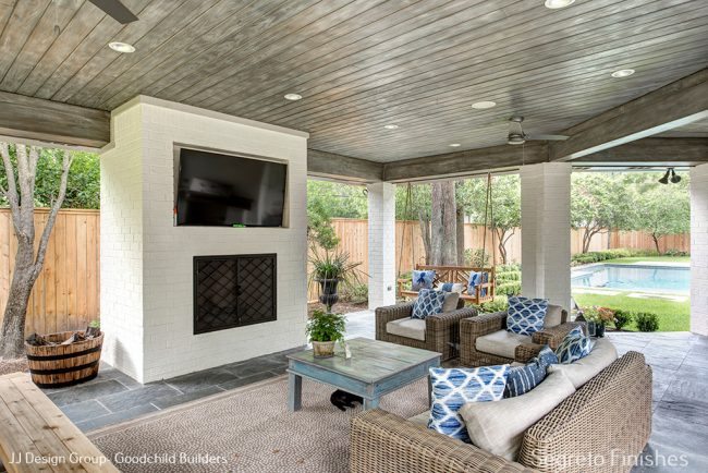
The outdoor spaces are as pretty and functional as the inside is!! What an amazing project to be included on. With super sweet homeowners, JJ Design Group and Goodchild Builders, this is a home for this sweet family to enjoy for years to come!!! Thanks to Wade Blissard for the wonderful Photography.
Exciting News!
I am so honored to find out that Segreto Secrets has been nominated again for the Amara Blog Awards. Last year, because of you, we won the Best US Design Blog. This year we are in the running for Best Design Inspiration Blog ! With your help maybe we can win for a second time running. I would be so appreciative if you could take a minute to vote for Segreto Secrets! First we have to make the shortlist so spread the word.
Its fun to look at all categories and blogs from all over the world nominated, you can do that here. BIG THANKS TO ALL! xo
I hope you all have a wonderful week!! Till next time!

________________________________________________________________________________
If you are interested in hosting an event or carrying the book please don’t hesitate to reach out! Email Karly@segretofinishes.com for all inquiries! We love to visit new cities!!!


Design Chic
Posted at 07:24h, 07 AugustWhat an amazing transformation and I can see your touches everywhere! The kitchen is stunning – think it could even convince me to cook a little, Congratulations on the nomination – we cast our vote!!
Leslie Sinclair
Posted at 07:30h, 07 AugustCook? Haha! This was a super fun project! You are so sweet for the vote! Thanks!!! xo
Lidy@FrenchGardenHouse
Posted at 08:18h, 07 AugustSuch a gorgeous transformation Leslie! Your beautiful work is evident everywhere, and it elevates each room to a new, gorgeous look.
Voting right now! xo
Leslie Sinclair
Posted at 05:22h, 09 AugustHi Lidy!! Thanks so much!!! Hope you have a wonderful week!
DK
Posted at 16:28h, 12 AugustBeautiful work! So amazing to see the huge transformation that occurs when removing or remodeling those double story “lawyer foyer” entry windows. So many homes around here have that, naturally, given how popular it was at the time. It’s hard to envision how to fix that design flaw. Also great to see the before and after results when removing those pie shaped windows. We have two hideous trapezoid shaped windows in one of our rooms; may need to look into a similar remedy.
Leslie Sinclair
Posted at 07:09h, 14 AugustI love looking at how differently renovations can change a home! I had the same windows at my house! I’m glad you enjoyed!