An Exterior Facelift!!!
Hi Friends!! People always ask me what is my favorite project I am working on and its hard for me to say because honestly I love them all. This one, however definitely comes to mind–not only did I love working with the owners-really loved!!– but it was an incredible before and after and was so fun being a part of it!!
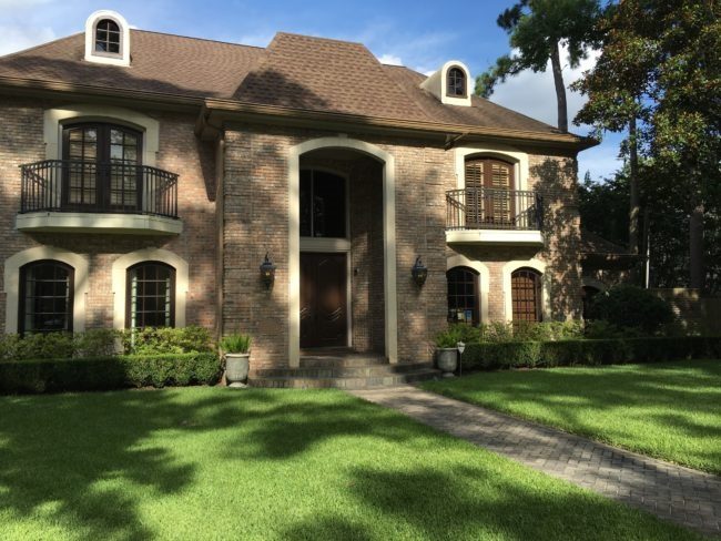
Here is the home before!! Beautiful? Absolutely!! I had worked with this couple when they moved in years ago on a few interior finishes, but now as their children are getting older their home isn’t as functional for them. After looking for a new home and not finding the perfect one, they decided to stay and renovate. So I came over to consult. There are some amazing transformations on the interior underway with Parker House Inc. and Newberry Architecture, but while the renovation was taking place inside an exterior facelift began!
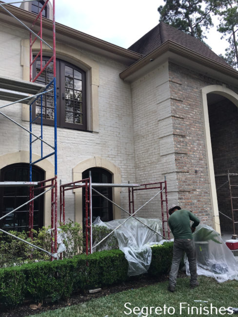
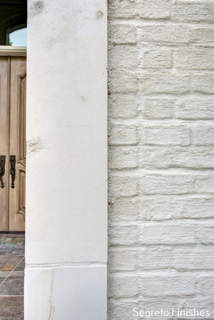
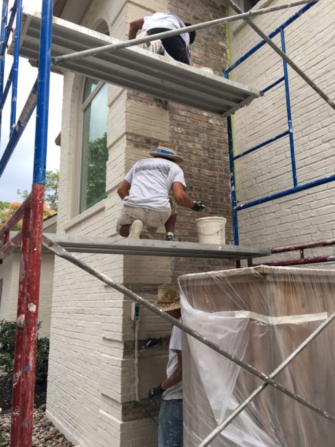
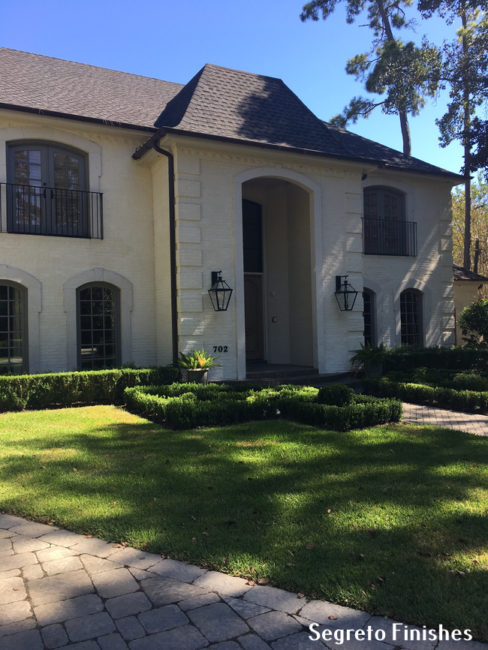
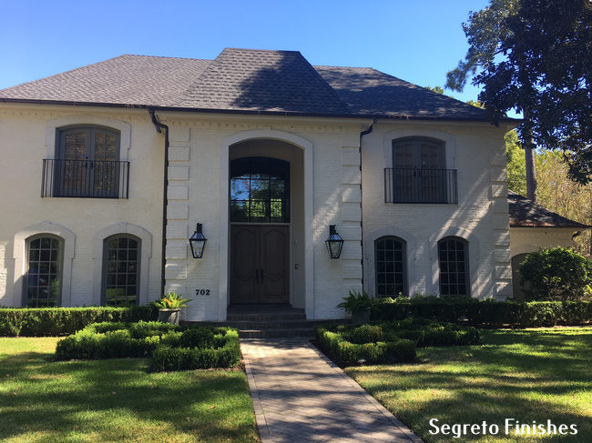
They wanted a French style home and never really were fans of the exterior brown tones. The architecture was easy to work with, giving a few minor tweaks. Notice the balconies were taken off under the top window. They will be replaced with simpler clean line ones. And we have begun first with a slurry over the brick. Versed in many different plaster products, I felt the best fit for this home was Domingue Architectural Finishes‘ plaster. Because their brick did not have deep grout, we were able to accomplish the look she wanted with just one coat saving money. Notice how the stone surrounds golden tones are now much more apparent with the homes new coloration.
As a solution we glazed over the stone with a transparent wash, allowing its natural variation to show while masking its yellow undertones. An easy process, this application holds up to weather and is cost friendly.
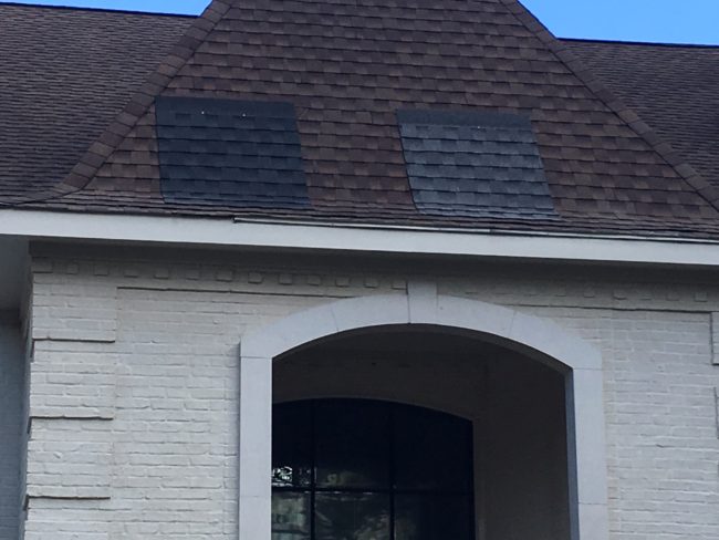
The roof was next! Staying away from brown, we narrowed the choices to two. Both would look great but the darker one was chosen.
Many people assume that all your exterior trim (windows, door trim and wood under the roof) needs to be painted the same color. Before you make that decision, walk the exterior and decide which parts should stand out as architectural assets and what items would look better if attention were not drawn to them. Notice this window, not being a feature element it was painted the tones of the slurry. We will circle back around with this concept, but first let’s talk iron windows and doors!
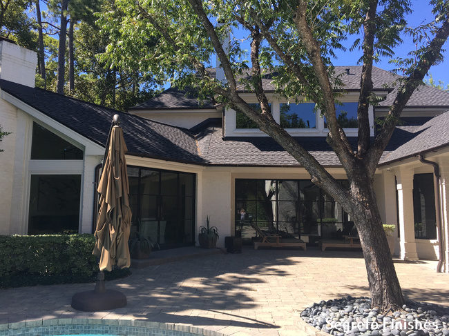
This is the back of her home, off her den which leads to the pool. These are her existing windows. Loving the look of iron window, we wanted to add this feature to her home so we called ACI Metalworks to consult.
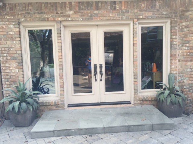
You can see we started adding steel windows in many areas. The above ones are in the breakfast room. When replacing windows that are custom, any size is possible, so don’t forget to look at the scale of what is there. We made these larger, updating the look and allowing more light into the home. The large French doors you see that lead to the living room will also be changed.
Look at the difference! AMAZING! ACI Metal Works‘ windows and doors are stunning and are a game changer!!
Now let’s get back to the trim! With the knowledge we were changing some windows to steel, I did not want to draw attention to the ones we did not change. Look on the second floor-they are the plaster color-now look over to the left-these angled windows also are painted to blend with the plaster. It was also decided to paint the fascia boards the color of the plaster as to not break your eye at a lower plane. Your eye now goes to the roof line which is about a foot taller. The fascia board is the one mounted at the point where the roof meets the outer walls of the house.
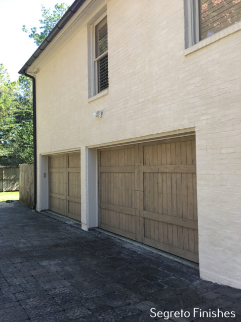
Behind the patio, resides the garage. The new garage doors, finished like the front door became our accent element. Notice their surrounds and the windows above are painted the plaster color!-They go away!
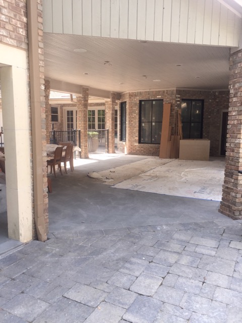
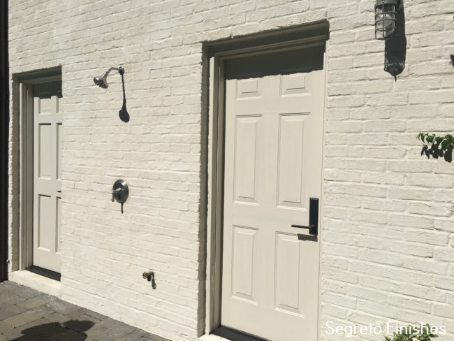
On the other side of the garage is a pool bath and outside shower! We also didn’t want to draw attention to these doors. The shower is pretty cool and because this is an exterior plaster there is no need to tile. The wall will hold up to water.
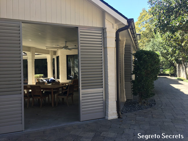
Before we go back to the front, I wanted to show you this cool idea the husband had. This side of the house, where the summer kitchen is, is close to the neighbors. Wanting more privacy at times for family cook outs and entertaining, he had the brilliant idea of putting up shutters, which could stay open or be closed. We had them painted the same color as the front windows, bringing a bit of the gray to the back of the home. These are powder coated and very durable!!! Love the new gutters as well! The rounded style is really cool and the color just blends with the roof!! So many decisions!!
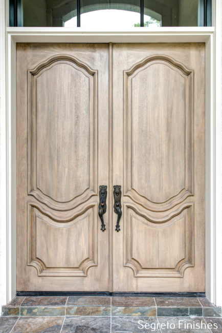
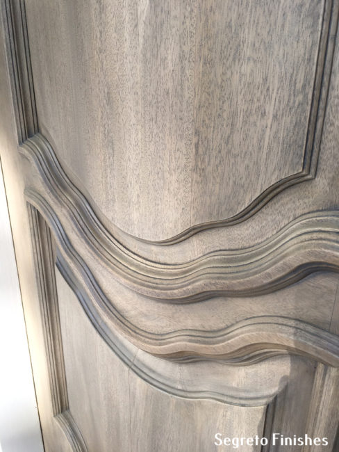
OK now let’s go back to the front of the house!! The front door is stained brown, but is done so heavily it just looks painted. Also notice the wooden window above the door! It was discussed to replace the entire door with the metal but these homeowners were concerned about not having enough privacy. Their current door was fab! It was a custom, solid mahogany door which would be expensive to replace. Soooo..
…….I suggested the door be stripped, bleached and finished to have a more natural appearance. I did this at my house and really liked the effect. See here. You can see a snippet of the new metal window above!
I love the doors new look! Its beautiful carving really shows now and it has hints of both gray and blonde wood coming though!
When picking exterior paints, put up samples on surfaces on each side of the home. The lighting is drastically different and you need to make sure you like it in all lights and at different times during the day. After you select a color, make sure a sample is then put up in a gallon of the exact product you will use on your home. I have found that colors vary slightly from product to product even within the same company. Do you notice something else that is different from the original facade?
The front windows were painted gray and the dormers on the roof were removed! I hope you liked this exterior facelift! Greentouch Landscaping-they are amazing- has already started the yard redesign, I love how the front elements are being brought out, I know there are new pots on the way!!
This was certainly a wonderful team working on this project. Stay tuned next week for the final reveal of the home’s interior!! Thank you Parker House Inc. , Newberry Architecture, ACI Metalworks, and Greentouch Landscaping for your team spirit and wonderful ideas! But most of all a big thanks to this sweet family for allowing us to follow your vision and giving me so much leeway in the design!! To all my wonderful blog followers, have a special week–be good to yourselves-each of you deserves it!!!




Elaine
Posted at 06:17h, 29 JanuaryI love it! It really turned out great, Can’t wait to see the inside.
Leslie Sinclair
Posted at 06:39h, 29 JanuaryHi Elaine!! I can’t wait to show you. It has a whole new look! Have a great week!
Debbie Walker
Posted at 06:55h, 29 JanuaryWhat a beautiful transformation! Love, love everything ❤
Leslie Sinclair
Posted at 16:38h, 02 FebruaryHi Debbie! It did turn our so pretty!! Sometimes is hard not to say can I just move in!!!
Gina Diamond
Posted at 07:29h, 29 JanuaryThe changes you made certainly updated the exterior and I love everything! The change in the front door is amazing and you are so right about being able to see all the details. Wow! Beautiful job!
Leslie Sinclair
Posted at 16:38h, 02 FebruaryHi Gina!! I did love the front door–such pretty lines and when you have such a pretty wood–its ashamed to hide the grain! I hope all is well with you!! xo
Martina Babine
Posted at 07:31h, 29 JanuaryMy goodness, what a project —and what a beautiful transformation! It looks like a totally different house.
Thank you for sharing.
Leslie Sinclair
Posted at 16:36h, 02 FebruaryHi Martina!! So good to hear from you!! I need to come photograph yours!! Hope all is well!
Kathy
Posted at 07:33h, 29 JanuaryOh my—– I love it and would love to do mine this way. Before I continued reading, I thought it was too pretty to change but it definitely looks like a home in France. Great job Leslie !!:)
Leslie Sinclair
Posted at 16:37h, 02 FebruaryHi Kathy!! It was pretty before!! I do agree! It is just a whole new style of pretty!! Have a great evening!
Linda Lyons Ewing
Posted at 09:39h, 29 JanuaryLeslie! I love the change and wish all these type of Homes could brighten their look! Fantastic job!
Leslie Sinclair
Posted at 16:35h, 02 FebruaryThank you!! I am having so much fun with exterior transformation since I did mine! It made such a difference for me pulling up every day!! Thanks, Linda for following along!
Janine
Posted at 09:52h, 29 JanuaryYou really turned it into a stunning looking home with a beautiful, classic French style. Nicely done!
Leslie Sinclair
Posted at 16:30h, 02 FebruaryAhh so sweet Janine! She wanted French!! Enjoy your weekend!
classic casual home
Posted at 14:27h, 30 JanuaryThis looks so much fresher. Great job.
Leslie Sinclair
Posted at 16:30h, 02 FebruaryIt was so much fun to do!! I love seeing a good transformation!!! Have a wonderful weekend!!