A Week With Segreto!
Hi Friends! Spring is here and it’s been another fun filled crazy week!! Let’s see what went on!! The first has an amazing before and after.
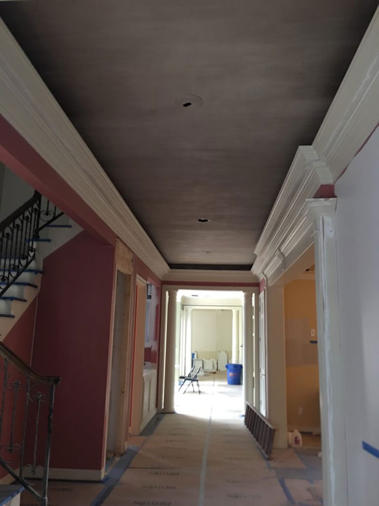
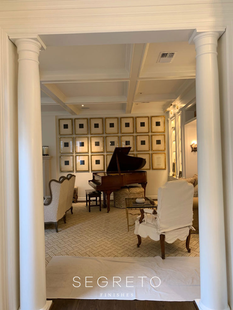
This house has been so much fun to work on!! Here is the before, right when they were getting started with the construction on my first walk through! Wanting to lighten things up we chose Benjamin Moore Sea Pearl to paint the walls and trim throughout the house. The goal was to remove the different colors used for different rooms and lessen that sharp contrast between the trim and walls. This will give a fresh more open look to the spaces.
Wow what a dramatic change the right colors make! Her beautiful furnishings and collections become the focal!
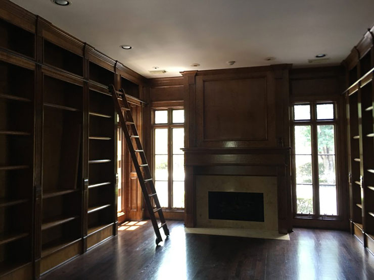
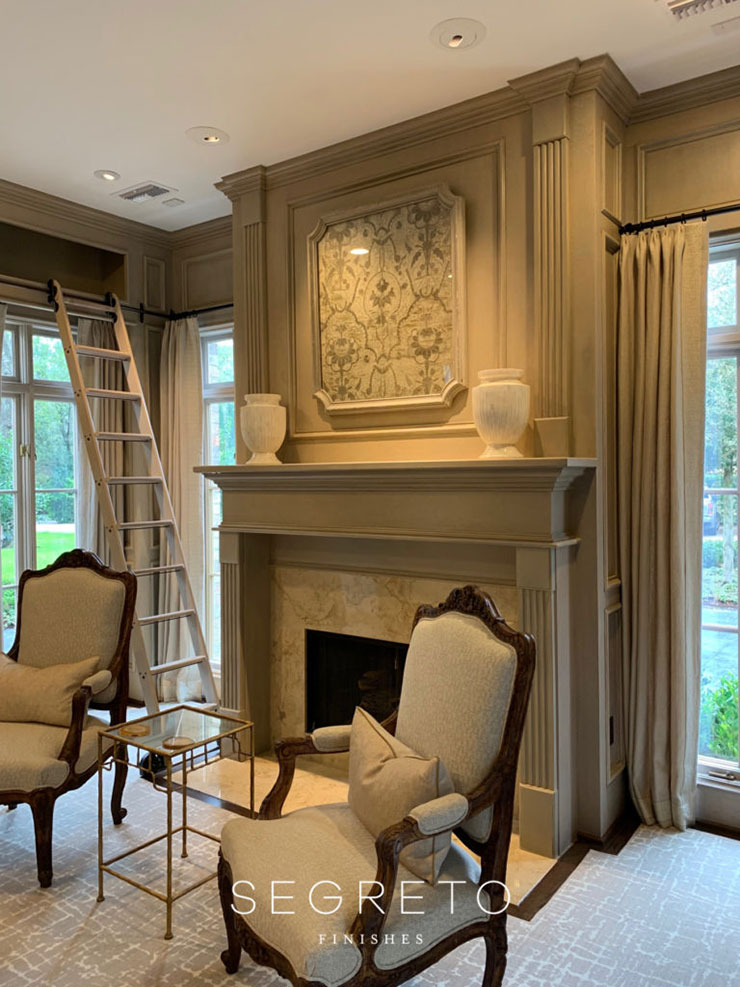
As you enter the home the study is the first room to the right. She has an amazing antique book collection that was gifted to her by her father and she really wanted to showcase them. Although she liked the thought of stained wood, the dark paneling felt oppressive to her.
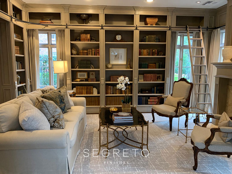
Here is the after. By sanding it and applying a creamy toned and thinned down primer wash, we were able to glaze it rather than paint which allows the natural grain to show though while lightening the entire space.
Thrilled with the outcome this has become one of her favorite spaces in her new home. Hope Dad is happy!!
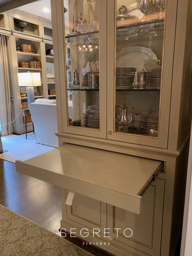
In the dining room Gunn Construction and Building crafted two China cabinets. I love this pull out! It works so well as serving when she is hosting a dinner party!
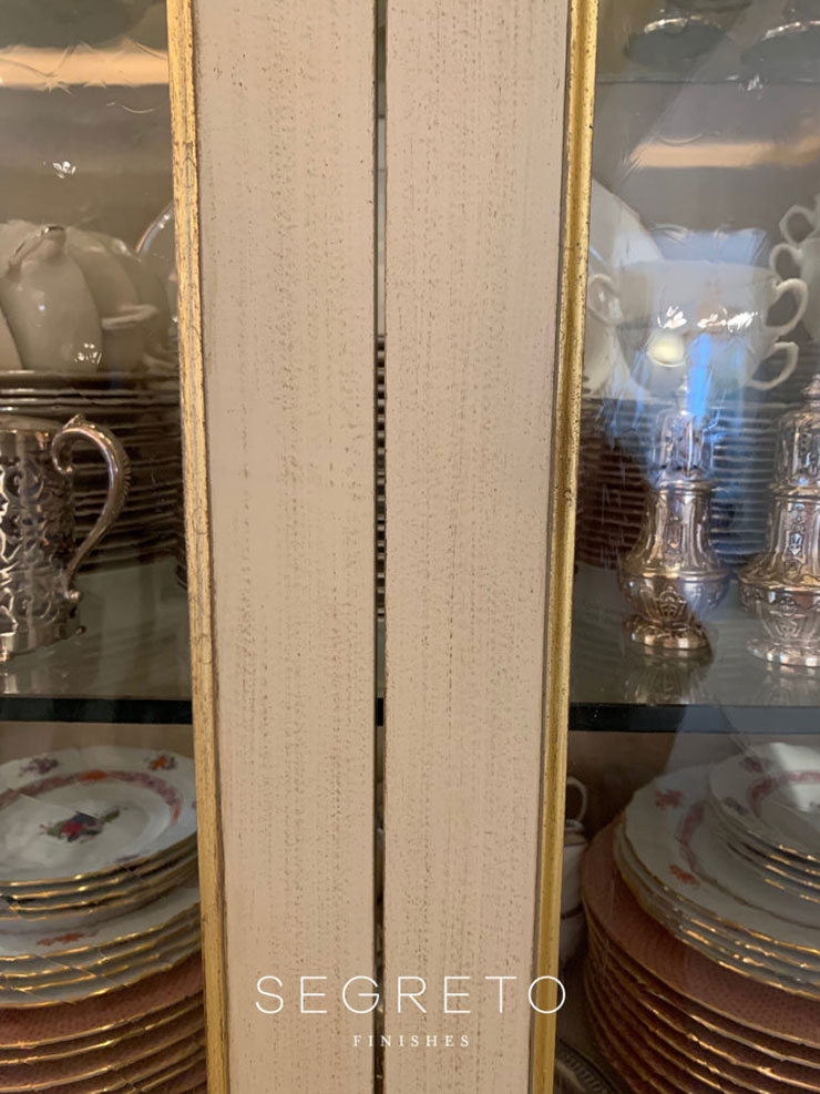
We finished it with a painted technique which pulled the tones from the adjoining study and applied gold leaf to the bead detail to dress it up for the space.
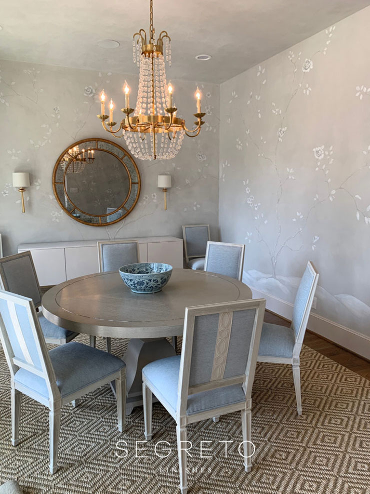
This dining room, in one of Kirby’s client’s homes for Designer Shannon Crain, took a major turn with the wall finish. We plastered it in the most soothing tone of blue gray and hand painted a tone on tone mural giving life and interest to the shape!! Don’t worry you will see better pics in Book 4!!
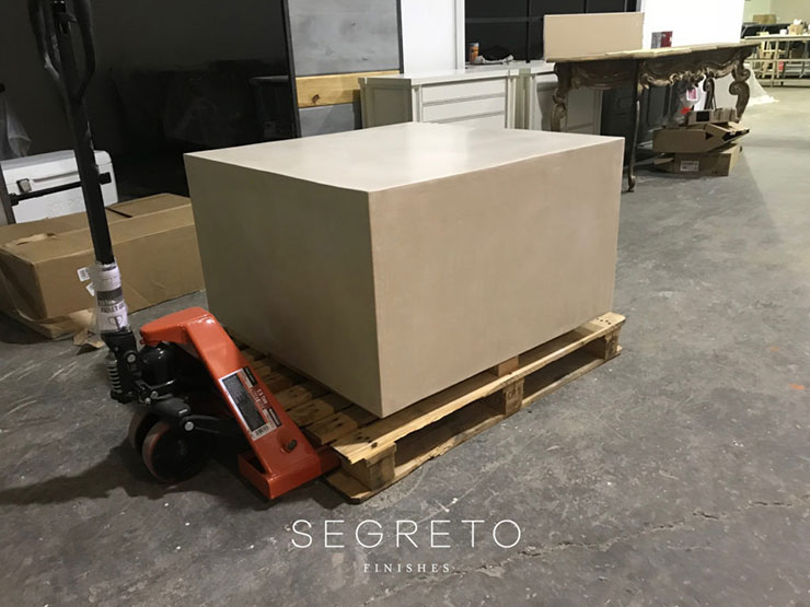
Back at the warehouse we are sending off a massive SegretoStone side table for one of Eleanor Cummings’ projects!! I hope they have lots of people on the other end to help move it as this one is REALLY heavy!!
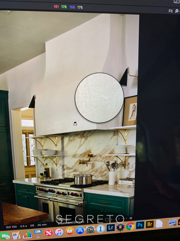
I thought this was such a cool shot that we took for the kitchen section of Book 4. It was so fun working with designer Lindsey Herod as she is a master of styling!! I love the detail close up of the hood in this screen shot! The photographer uses her computer screen to look and check if everything is in focus. I think this would be a great idea for book 5. A room shot with close ups of the finishes! Wait… did I just say that!!
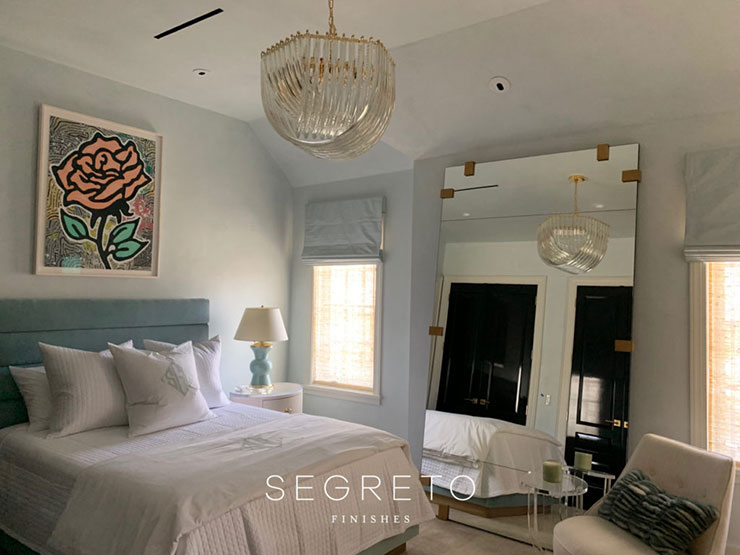
I rounded off the week at a home we collaborated on for Chandos Epley with Chandos Interiors! We did not have time to photograph the bedrooms so I took this snapshot of one of the girls’ room!! It is so beautifully furnished and the tones of the plaster really enhance this space. Lucky girl who gets to move into this room!! The rest of the house will be featured in Book 4. It is one you don’t want to miss. It’s so well done!
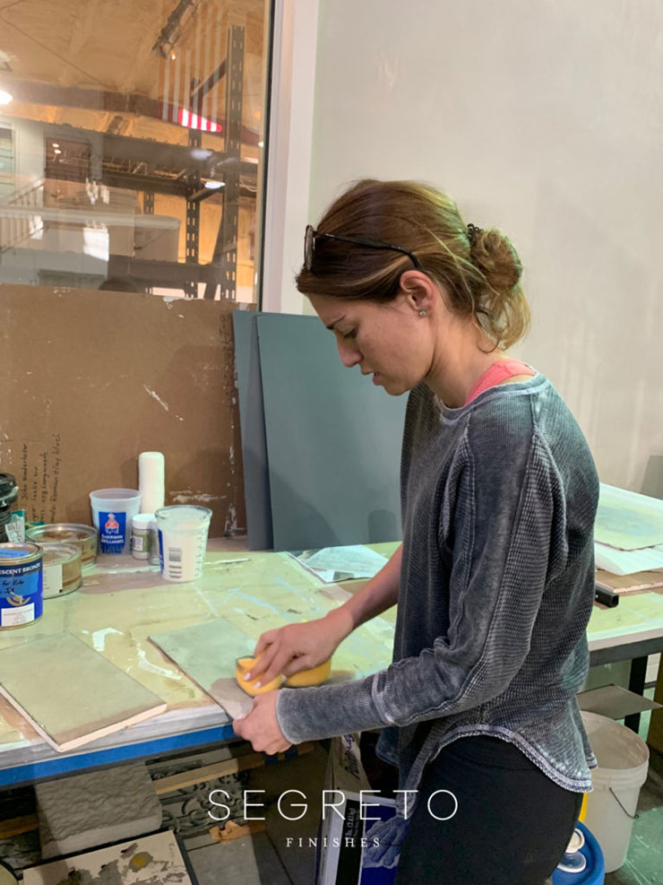
Its definitely been a whirl wind week! Even designer/daughter Kirby is creating her own samples to meet a project deadline!! Take care, take a breath, and enjoy some moments!! Till next week! XO Leslie



No Comments