A Masterval Renovation-Interior!
Hi Friends! Remember last week we looked at the incredible before and after of the exterior renovation of this lovely home? The dream team of Parker House Inc. and Newberry Architecture really worked their magic! Today we will look at the same home’s interiors!
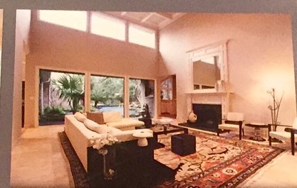
This is a picture of the living room from the real estate brochure when my clients bought the home. Although the two-story ceiling is dramatic, by making this room, two rooms-a living room below and game room above- square footage could be added at a lower price per square foot than if they were pouring a new slab and adding on. This idea was what spurred staying put and renovating!!
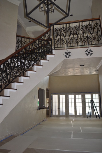
In a look from the other direction you can probably already guess that this railing will not fit the clean line new look this young family was moving towards. Fortunately ACI Metalworks was already on site for the steel windows and doors so it was easy for them to revamp the staircase as well.
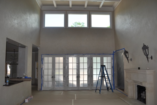
Ok, you are all going to see a big change from this picture to the next so be sure to take it all in! From two stories to…..
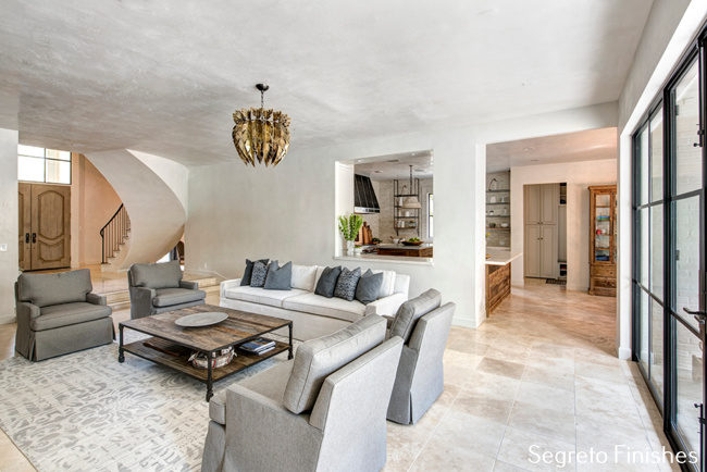
one…….Here is the after of the interior with the lowered ceiling. Still 10 ft., the furnishings feel more in proportion to the room. The original floors were left and honed to give them a more casual feel. The openings to the kitchen and breakfast areas were also enlarged to increase the openness between the spaces. And look at the new iron doors from ACI Metalworks. The original wood windows were replaced with iron ones above the front door, over the sink in the kitchen and out to the back patio from the living room and den. If you missed last week’s post on the exterior renovation go back and see how these new iron windows were seamlessly mixed with the original wooden ones by painting the window trim to match the walls on the home’s interior and the tones of the new brick slurry on the exterior.
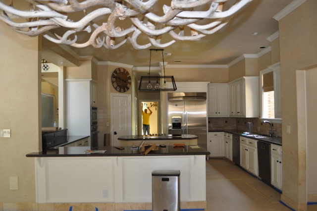
Here is the kitchen before–I will show you some major changes but first……..
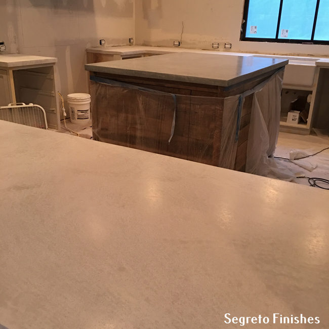
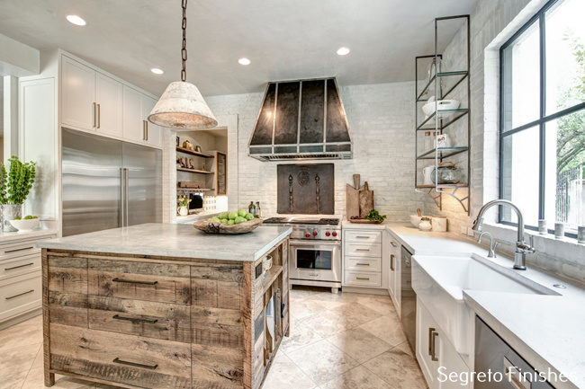
………I wanted to give you a glimpse of the new SegretoStone counters. LOVE! The island darker than the perimeter, she had her three munchkins test them for staining before she gave us the go ahead!
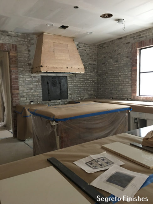
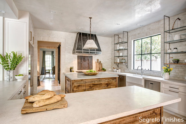
Newberry Architecture and Parker House Inc., definitely made a dramatic more functional space with re-positioning the pantry, refrigerator, stoves and range. You can see the new brick with inset with a fire-back from Chateau Dominque-stunning!!
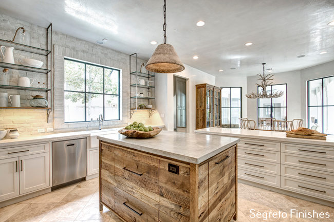
Originally the homeowners wanted to have their entire kitchen built from reclaimed wood. Although it would be beautiful, I felt that it would not coordinate as well with the homes open floor-plan and might get a bit heavy, so………………….. we decided to leave the perimeter cabinets painted solid to blend with the limed brick and plaster. This way the reclaimed wood becomes the star. In getting ready for the photo shoot I swung by to see my friends at Back Row Home and pulled the wonderful cutting boards, white ceramic wear and center wooden bowl on the island.
Daughter Kirby swung by Central Market and got the flowers, apples and bread. The iron shelving on either side of the sink and the range hood-certainly complement the kitchen’s re-design.
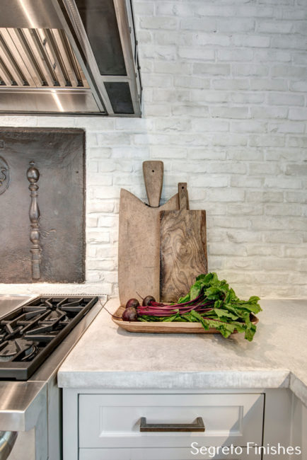
I love this shot, it shows how pretty the SegretoStone counters look with the plastered brick and amazing wood tones of the antique cutting boards from Back Row Home. If you haven’t been there lately stop by and see all their new things. It was stressful for me because I had to shop so fast and just wanted to stroll and take it all in.
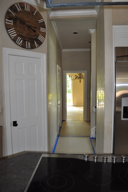
The before has the pantry though this door on the corner. Go back to above and you can see this has been removed. Look closely at this hallway before. Now?….
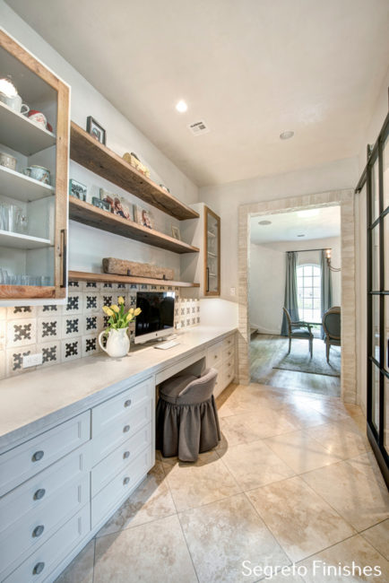
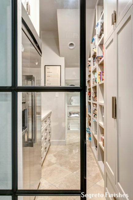
….it has become such a functional, wonderful space. Taking a closet out, this became Mom central, with lots of storage! I love that the shelves and inset cabinet doors are reclaimed wood and the boxes and the lower cabinets are painted white. Another SegretoStone counter gives her so much work space and the concrete tile from Chateau Dominque marry so well with them!! See the sliding barn style iron doors to the right?-ACI Metalworks strikes again!
They are the opening to a wonderful pantry coffee bar. This space was a closet coming from the dining room combined with the room under the back stairs before. When renovating look in every nook and cranny–there is open space that can be re-purposed for a new more functional use!!
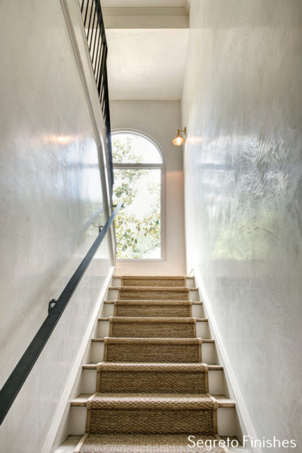
The plaster looks amazing going up the back stairs and is so much more durable than paint to all the little hands that brush these walls.
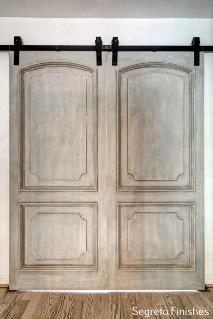
At the top of the stairs is the entrance to the new game room. It is the large space gained when putting a second floor above the living room. These super cool barn doors were built new and we finished then to read old! It serves as artwork when viewed from the first floor and barn doors offer such an easy way to close off a messy room.
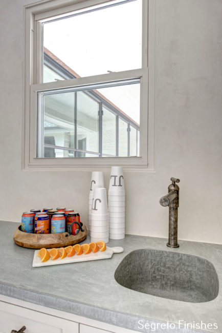
For the bar we created and integral sink with our SegretoStone plaster. Kirby who helped style the house for the photo shoot was the most proud of her game day bar display. I didn’t know you ate oranges with wheat beer! Learn something new every day!
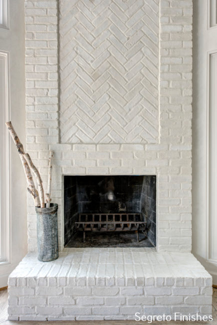
The existing fireplace was plastered over to lighten it and tie in the new kitchen. This is a wonderful, affordable way to treat brick you would like to change!!
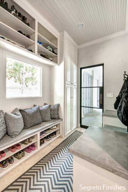
Even the mud room looks great–look at all the cute shoes!! SegretoStone is the bench and tops in this organized space.
I hope you enjoyed the renovation of this home! For me, it was a joy!! Not only was I able to be involved in all aspects of the project, but I simply adore the homeowners. Fun, sweet, so open to ideas. The relationships I build are truly the biggest joy of my job!! I hope you all have a wonderful week and remember our resolutions–what did you do to take care of yourself today?!




Luisa Patterson
Posted at 07:50h, 05 FebruaryYes! Love it 🙂
Leslie Sinclair
Posted at 06:08h, 13 FebruaryHi Luisa!! Good luck on your utube videos!! They are amazing! I sent them along!
Suzanne
Posted at 08:02h, 05 FebruaryOMG Leslie you are so talented. Your gorgeous plaster and stone come together and make the house come alive. Kirby has such a beautiful eye for detail!!! Love this before and after!!!
Leslie Sinclair
Posted at 06:07h, 13 FebruaryHI Suzanne!! Kirby does have a great eye and we had fun working togther with the homeowner on this one!! You are so sweet to follow!!
Carole Orr
Posted at 08:52h, 05 February~ Hmmmmmm! Liking the reflection on that kitchen ceiling – so nice for a change in space . . .
Leslie Sinclair
Posted at 06:06h, 13 FebruaryHi Carol–Good to hear from you!! My favorite part of the plaster!! I hope you are doing well! Keep on painting!! xo
Harriet
Posted at 09:46h, 05 FebruaryThe changes are dramatic! I would love to know more about plastered brick techniques. Is there somewhere I can read about it? Thank you.
Leslie Sinclair
Posted at 06:05h, 13 FebruaryHi Harriet!! Google is always good! I have some some posts on Lime washing which we also use a lot. Home depot now carries the brocut we always used. In this instance we took the plaster used on the walls thinned it and brushed it over the brick. Hope this helps!
Jaquilin Brown
Posted at 10:10h, 05 FebruaryWhat a beautiful redo! I love the clean white accented with just enough warm rustic wood to keep it from being too cold and formal. Amazing!
Leslie Sinclair
Posted at 06:03h, 13 FebruaryHi Jaquilin! It is warm just like the homeowners! It really reflects them!! I am so glad you enjoyed the share! Have a good week!
Shelley
Posted at 10:46h, 05 FebruaryThis is beautiful! Love the “mom” work space! I need this in my home!!
Leslie Sinclair
Posted at 06:02h, 13 FebruaryHi Shelley!! It is wonderful!!! So pretty and so much room for organizing!! This was a hall closet–maybe you have room to squeeze one in!!
susan patt
Posted at 08:06h, 16 FebruaryLeslie…i, too know and love the homeowner (and and witnessed the transformation as my daily driving route includes their street.) The project looks AMAZING…and you are amazing…keep up your beautiful work…i LOVE seeing all of it on your blog…xoxo, susan
Leslie Sinclair
Posted at 08:22h, 16 FebruaryHi Susan!! You are so sweet to comment! Of course you are friends you both are so much fun!! So happy you follow the blog! thanks!
John Mercilliott
Posted at 21:29h, 18 FebruaryGorgeous!
Leslie Sinclair
Posted at 05:19h, 19 FebruaryThank you John! It was a super fun one to be involved with!!
Lee Lindsay
Posted at 19:32h, 20 FebruaryFabulous renovation. I would love to know the company that made the sliding French doors.
Leslie Sinclair
Posted at 03:59h, 21 FebruaryHi Lee . They are not sliding doors, but fixed with the center doors opeing. Certainly beautiful. Its ACI Metalworks. http://acimetals.com/
Have a great day!
lydia canova
Posted at 16:26h, 08 AprilHi Leslie,
I would love to have you look at a picture from our Victorian home and give me any suggestions on how to update a unique fireplace. We hate to remove it. There is a plaster picture of Eve above the mantel and a spread of the Garden of Eden. Would you mind taking a look at it? I have looked for ideas on the internet but I have never seen anything like it posted before.
Thanks!
Leslie Sinclair
Posted at 13:24h, 25 AprilHi Lydia, I would love too. You can email me pictures at leslie@segretofinishes.com have a great day!