Picking the Right Paint Color!
Hi Friends. I hope you all had a wonderful week! I wrote this post for the blog Hello Lovely and I thought I might share it with you! As you know Segreto provides finishes on walls, floors ceilings, beams and cabinetry, however, finding the right color palette is where most finish designs begin.
Choosing the right paint colors and finishes can be an overwhelming decision. There are thousands of colors available, each with different tones and intensities, and the perfect combination of paints is so critical to the overall success of the design. Here are five helpful tips on selecting colors for your own home.

Step 1: Look through magazines and books to determine your own personal design style. As you flip through the pages, pay attention to different color combinations of floors, walls, trims and ceilings. Notice whether the pictures you like have bold contrast or a lack thereof. In my Segreto book trilogy of coffee table design books, clients have shared that the images are a wealth of inspiration in picking finishes in their own homes.
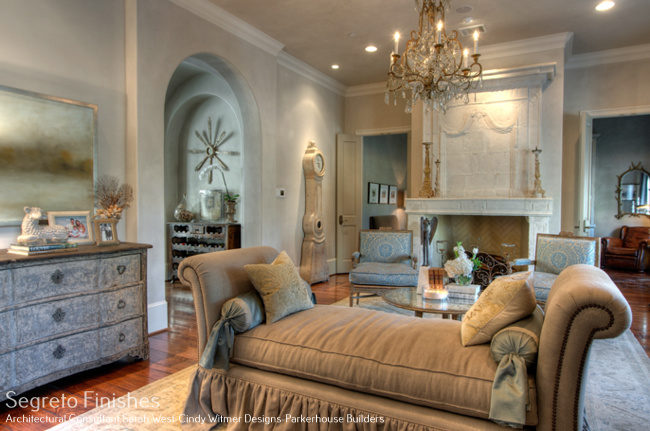
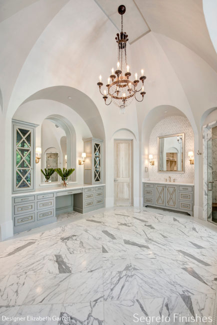
Some rooms may have distinct colors that set apart the walls, trim and ceiling……….
………………….. while others may have similar tones and each surface blends effortlessly into the next. Which look do you prefer? Do your favorite rooms have strong colors on the walls or in the fabrics, art and accessories instead?
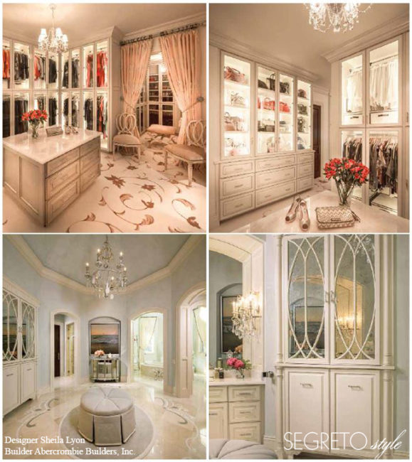
Step 2: Think about which elements in your home are permanent. Your counters, backsplash, flooring, rugs or fabrics can serve as great starting points to dictate your palette. In an existing home, the perfect paint color can highlight tones you love in a countertop or rug and downplay less desirable hues in these elements so that they will work in the new design scheme.
Step 3: Make a list of your home’s best and worst architectural features. The proper paint combinations and finishes will not only enhance the aspects in your home that you love but also disguise your least favorite attributes. For instance, by using the same color as the walls on elements like fur downs, smaller trim pieces, spaces with too many angles, and doors, you can make these unwanted details disappear.
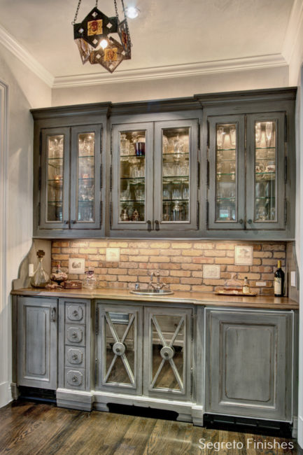
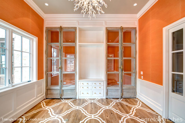
To emphasize the elements that enhance the room’s design such as furniture-like built-ins, interesting ceiling details, elaborate crown moldings or paneling, choose a contrasting color, sheen or specialty finish. 
Rather than painting smaller rooms a light color, give them a warm and cozy feel with rich, deep tones and……..
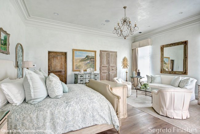
……….. let your big rooms expand with lighter hues.
Step 4: Look through your closet! One of the best ways to determine which colors and styles make you feel the most comfortable is to study your own wardrobe. In what colors do you think you look the best? What are you wearing when you feel the most beautiful? Do you tend to incorporate pop colors in jewelry and accessories or do you layer different textures in the same color? Are strong colors worn on a daily basis or just occasionally? You can apply these same principles to your paint selections.
Step 5: Pick up a color wheel from two of your favorite paint stores. Lighting has a powerful effect on color so it is important to always choose the final paints in the space. Armed with your answers and insights from the steps above, you are now ready to select!
Starting with the main parts of the home, pick a color that blends in and uses the tones of all the surfaces. The background color of fabrics, tiles or counters is generally a safe color direction. Depending on how much contrast you like, the trim and ceiling hues can come from the same color strip, just lighter or darker than the wall color. Special cabinetry, interesting ceilings and adjoining rooms are ideal for coordinating or pop colors.
By establishing a particular mood, well-chosen paint colors and finishes form a beautiful backdrop for fabrics, art, furniture and accessories. Through these five steps, you can develop a palette that showcases your home’s architecture, flatters your own color tones and gives your surroundings an ambiance that makes a house feel like your home.
I hope you found some helpful tips with this post! Have a wonderful week! Till next time.

If you are interested in hosting an event or carrying the book please don’t hesitate to reach out! Email Karly@segretofinishes.com for all inquiries! We love to visit new cities!!!
Kelli Smith
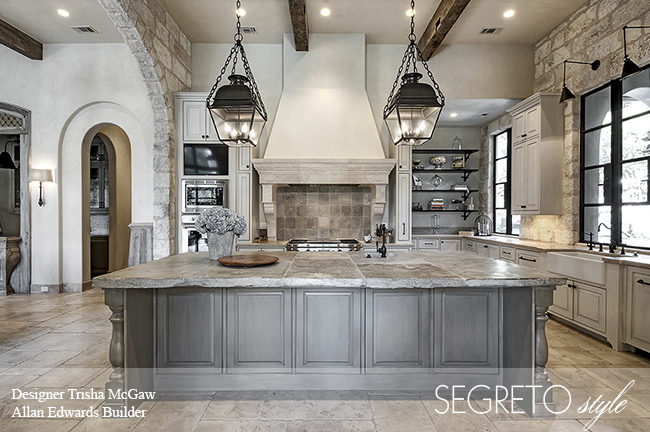
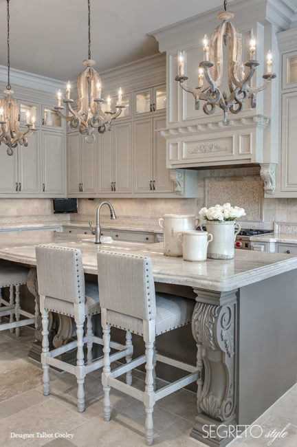
Posted at 06:16h, 30 JanuaryIn the Trisha McGaw Designer / Allan Edwards Builder Kitchen photo above … What large stone tiles are used on the walls? And also, are you able to tell me the pendants that used over the kitchen island? This kitchen has been the inspiration for the new home we are currently building and I’m not finding what I want to replicate these finishes. Just Beautiful..!!
Leslie Sinclair
Posted at 04:17h, 08 OctoberHi Kelli, I just saw this comment- I am so sorry. The lanterns are from Circa lighting. I am not sure where they got the stone, I am so glad you found inspiration in this photo. It is a beautiful kitchen. I am sure your new home has turned out beautifully!!