Becoming a ‘Blaygeen’ Believer!!
Discovering that perfect shade of neutral “blue” can be rather difficult. My clients are often looking for the ideal blue, gray or green. Not too blue, but a little muddy, sophisticated, but not depressing. I take a deep breath in as they describe their ideal color, and then I recommend what I’ve come to call “blaygeen!”
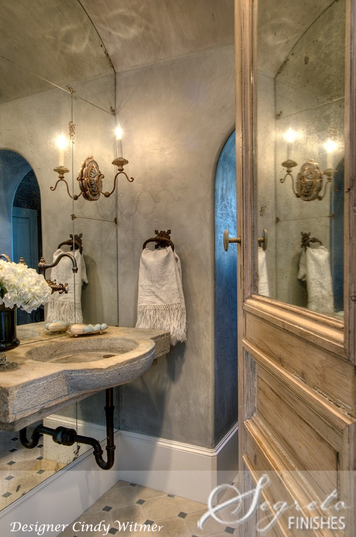
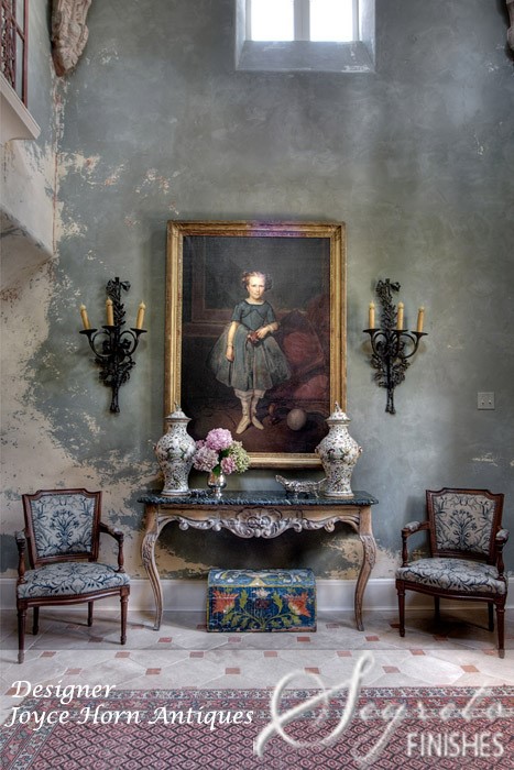
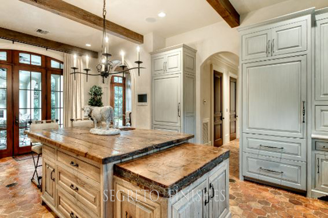
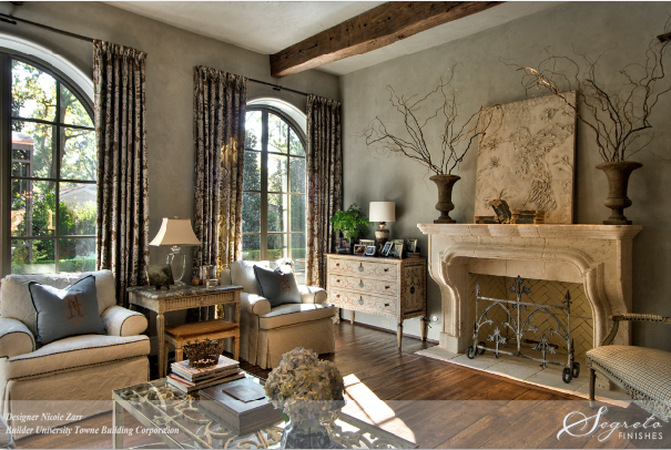
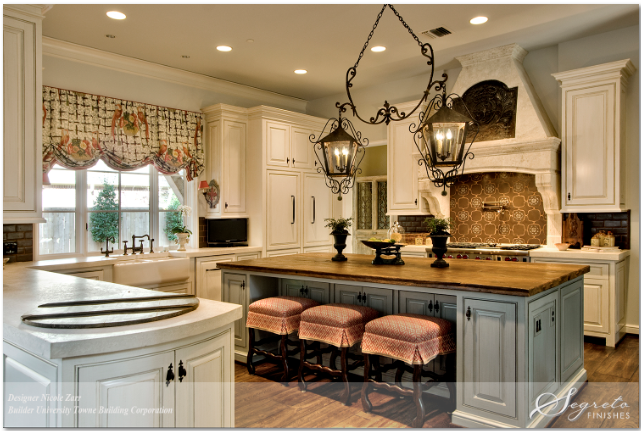
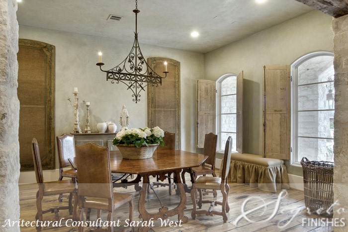
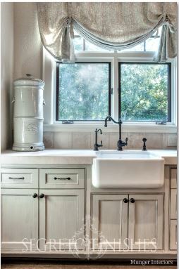
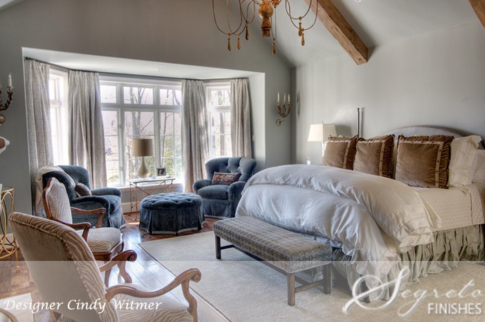
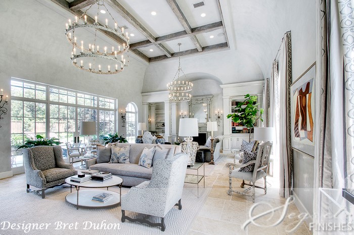
Whether on walls, cabinets, trim or accessories, every design magazine, book and blog seems to be incorporating this elusive but much sought-after shade. It may appear as your favorite French blue on an accent island in the kitchen. It could adorn the family room walls as a beautiful “greige” with a hint of blue or that just right tone that complements Calacatta and Carrara marbles.
Yet how do you find this picture-perfect paint color? Blue is always a tricky color to work with – it can easily be too bright or too childlike. In my experience, blues intensify when painted on the wall, so I typically suggest muddying them with green and gray to create blaygeen.
The genesis of the term “blaygeen” stems from countless times when I have picked the softest shade of blue, but the client fears that it’s too green or reads gray. However, once this color is applied to the wall – no matter how large the space – its tones magically transform into the ideal color that meets their wishes!! Blaygeen is that perfect color: blue tinged with subtle notes of green and gray in equal parts warmth, serenity and depth.
The base of blaygeen is blue, appealing to both men and women, and overwhelmingly cited as many people’s favorite color. It reads as trustworthy, dependable and faithful. Soft shades of blue calm us, keep us feeling cooler, and have even been said to connect us with our intuition.
The color of the ocean and sky, blue is perceived as a constant in our lives. Kept in its softer variations, blue invokes rest and enables the brain to produce chemicals that relax our bodies and minds. In this computer age, we’re overloaded with high technology and a bevy of daily tasks, so coming home to a peaceful color palette is an enticing and inviting choice!!
Blaygeen’s second and third components – gray and green – also contribute largely to the creation of a peaceful mood. Gray gives the blue a bit of elegance and subtlety, creating a neutral slate that stands up against the more intense accent colors in the room.
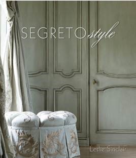
Green, on the other hand, means growth, security and harmony, lending a sense of tranquility to the other two colors. This dressing room, which is the cover of my second design book, Segreto Style, was designed by Kara Childress and is a perfect example of how adding a hint of green to the mix lends sophistication and quietude.
I custom mix my own blaygeens for each client when plastering walls or glazing cabinetry; however, there are ready-made colors that work well for painting walls and wood a solid color!
A few of my favorite commercial colors that present as beautiful ready-mixed versions of blaygeen are Sherwin-Williams’ Silverpointe, Lattice, Tinsmith, Repose Gray, and Mineral Deposit; Benjamin Moore’s Gray Owl and Silver Lake; and Farrow & Ball’s Skylight, Borrowed Light, Light Blue, Lamp Room Gray, or Blackened. For a slightly greener tone, try Sherwin-Williams’ Sea Salt, Rainwashed or Tradewind; Benjamin Moore offers Woodlawn Blue or Pale Smoke. Going one shade lighter on any of these colors gives great results too!!! And I love using these hues for blue ceilings or porches as well.
In any space, with the perfect blaygeen shade, you can add a quiet sense of serenity while still highlighting treasured accessories. I love it so much I used blaygeen for my own living room redo (check it out here)! Go ahead and give it a try… you may become a blaygeen believer, too!!! I wish you all a very happy (and safe) New Year’s! See you next week!!




Teddee Grace
Posted at 06:55h, 28 DecemberI don’t like blue, but I could certainly live with whatever is going on on the walls of the initial bath photo. Love it.
Leslie Sinclair
Posted at 07:41h, 28 DecemberHi Teddee! that is one of my all time favorite baths!!! I hope you have a wonderful New Year’s and thanks so much for reading!!!
Lory at Designthusiasm
Posted at 10:32h, 28 DecemberHi Leslie,
I’m a new subscriber to your blog and I’m just delighted with everything I see! I love your taste and you hit all the right notes for my personal design sense – the underpinning of pedigree and European influence, the influx of some more current touches, and just the right amount of sheen and glimmer. Such complexity, yet simply presented. I am really crushing on your look and can learn a lot. I absolutely love the glazes and paint finishes, which is something I’ve wanted to add to my home for a long time. (We recently moved to a new home, so the first go ’round was just getting it set up. Need to add more lush layers and paint finishes next, which will add that complexity I so enjoy.) I tend to go lighter and cleaner in color, but your blaygeens are looking wonderful here. Definite food for thought. Anyway, wanted to say hi and let you know a new reader is very much enjoying your posts! Have a very Happy New Year!
Best,
Lory (from Designthusiasm)
Leslie Sinclair
Posted at 07:00h, 29 DecemberThanks so much for following! I am so glad you enjoy the blog! I pulled up yours and am a new follower! Happy New Year!!!
Karena
Posted at 10:57h, 28 DecemberDear Leslie, I ope that you have had a joyous Holiday Season!
I adore this color, Blaygreen! I don’t know how you do it; you make every space so incredible!!
xoxo
Karena
The Arts by Karena
India Hicks Sale!!
Leslie Sinclair
Posted at 06:59h, 29 DecemberHi Karena!! You are the sweetest! I love your book pics! Happy New Year!!!
Rié / Portobello Design
Posted at 11:22h, 28 DecemberPerfect as always! I was just a Sherwin Williams as well as Benjamin Moore on Saturday. Your list of colors will make the process so much easier! Every room shown was gorgeous! xx Rié
Leslie Sinclair
Posted at 06:59h, 29 DecemberMy Two favorite stores!! I know you will make the perfect choice! Happy New Years!! 2016! Wow!
Joy Alpha
Posted at 15:01h, 28 DecemberThanks for the great list of colors, some new ones to add to my list. My bedroom is painted in BM Night Mist but I almost went with Pale Smoke! Also, you posted one of my all time favorite photos and that would be the second one, have always loved that treatment! Thanks for the great read and Happy New Year!
Leslie Sinclair
Posted at 06:58h, 29 DecemberHi Joy! I bet your bedroom is so pretty! You couldn’t go wrong with those choices!!! I hope you have a wonderful New Years and thanks so much for following!
Yvette
Posted at 19:06h, 28 DecemberWould love to know the name of a paint colour that represents Blaygreen? Any suggestions? These rooms are stunning!!
Lisa Terrell
Posted at 08:21h, 29 DecemberThese are all simply beautiful and soothing colors. How can I get the wall colors of the living room (4th pic) and dining room (6th pic)? Love the colors. Thanks so much.
Leslie Sinclair
Posted at 09:29h, 29 DecemberHi Lisa! All of these are plastered rooms so there is no exact paint color. If you look at the bottom of the post I have colors that are close with paint. I hope this helps! Happy New Years!!!
Terri Symington, The Countrypolitan
Posted at 09:13h, 31 DecemberHi Leslie,
I love your term “blaygeen” for the subtle and sophisticated blue. As you have mentioned, there are several colors currently available that are really beautiful that are part of paint collections. In the past when there were fewer color options and when trying to achieve the perfect color I have driven a few of my paint suppliers a little crazy. When trying to grey down a color they always wanted to add a touch of black…but to avoid the muddiness this creates I wanted to use the complimentary color to get a sophisticated greying with depth (which for those unfamiliar, is the color opposite on the color wheel). I was able to get the colors I wanted, but the other challenge was to document the recipe of the amounts mixed in order to be able duplicate it…we’ve come a long way with paint and color options!
Happy New Year to you and everyone at Segreto!
Jennifer Robertson
Posted at 22:07h, 01 JanuaryI just realized I hadn’t visited in awhile, and what do you know, a post about my color obsession! It was like you knew I was stopping by today 🙂 Seriously, I am on a constant quest for the perfect blue gray green for every room. It’s quite exhausting but worth it because it is the most soothing relaxing color ever. Thank you for this post and these gorgeous images!!! I will be pinning them all 🙂 Hope all is well!
Leslie Sinclair
Posted at 08:36h, 02 JanuaryThank you so much for stopping by again!!! It’s my obsession too!
Cathy Zimmermann
Posted at 16:05h, 03 JanuaryHello Leslie,
I have had the same problem with light blue paint color. It will look just perfect on a swatch, then I will start to paint a room. I did this with my dining room. The blue turned brighter as you said. It looked like a baby’s room. I then decided to paint it SW Soft Tan. I wish I had know about adding the gray. What paint colors do you like to use for the grays?
I have RH Silver Sage in our bedroom. I love the color. Sometimes it looks a little on the green side and sometimes more blue depending on the lighting. I had my husband put a Modern Masters paint on top of the Silver Sage. I think the color was Pearl. I was trying to make the Silver Sage a Metallic Color as the Paint was fairly translucent. It turned out a little streaky because my husband didn’t want to paint another coat. We have 10 foot ceilings and his arms got tired! I am glad that we did that.
Leslie Sinclair
Posted at 06:51h, 05 JanuaryHi Cathy! Yes grays are tricky!! I wrote a blog on grays with colors listed–hope it helps!!! xo ! https://segretofinishes.com/segreto/2014/05/05/gray-in-the-home.html