The Best of Resort Life and Italian Villas – Luxe Magazine
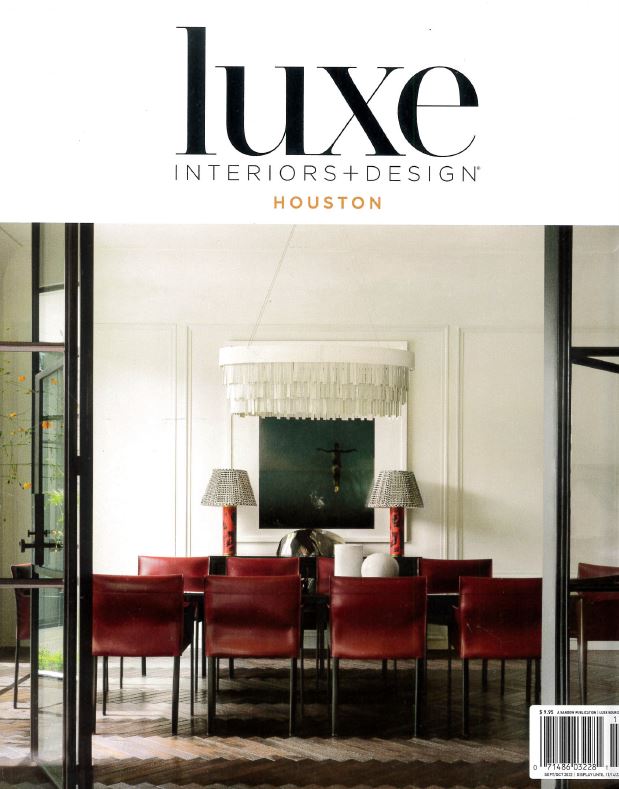
Hi Friends! I hope you all had a wonderful weekend! I was so excited to see this month’s cover of Luxe Magazine! This home was done in collaboration with Ashton Taylor Interiors, David James Custom Builder and Gordon Partners Design. My daughter Kirby led the design from the Segreto team and did such an amazing job! Christine Deorio wrote this fabulous article on this amazing showcase house! I thought you would love the tour as this is one of my favorite houses we have been a part of to date! Christine’s fine words are in italic followed by my adds in regular text!
What do sultry Cabo San Lucas resorts and classical Italian villas have in common? Both have a special place in the hearts of the husband-and-wife owners of this new Houston abode. These desirable destinations also informed the design of the residence itself, which marries the two sources of inspiration with nary a seam in sight.
I adore the architectural interest the paneling created in space. Our team created a technique to give the illusion of plaster moldings which flowed into the ceiling plaster! LOVE! We have created a similar effect in our new showroom so you can see this application up close and personal.
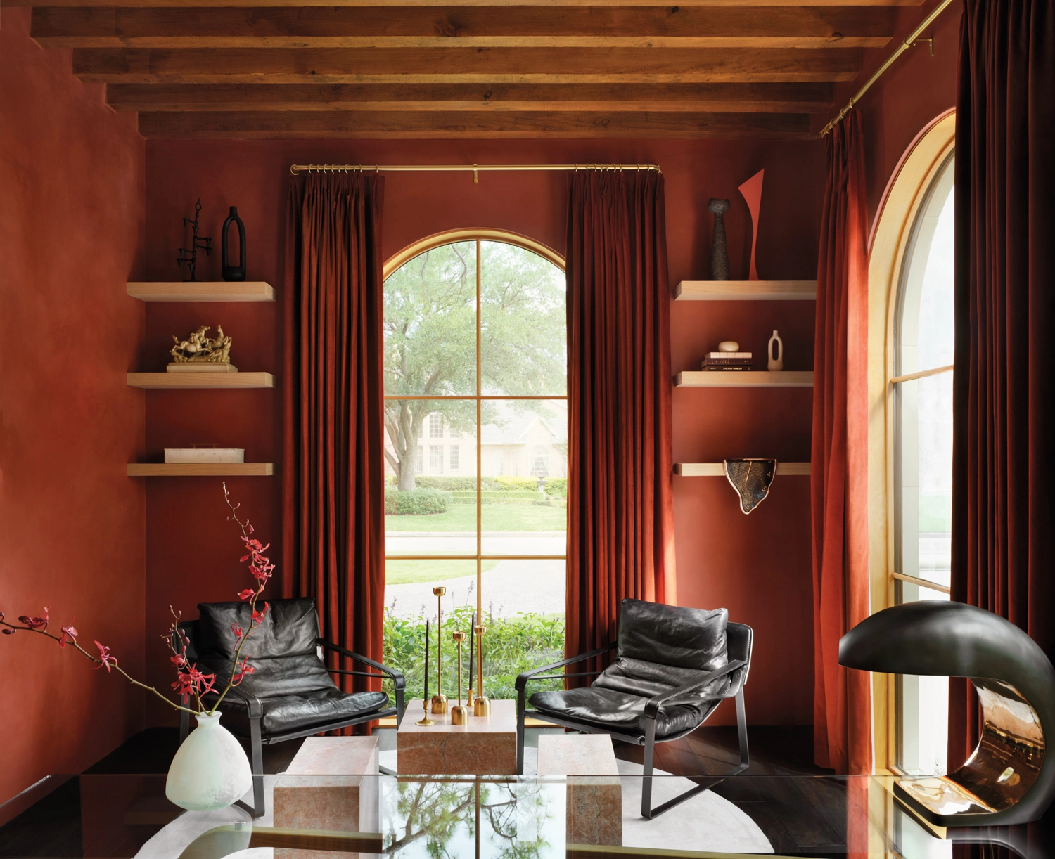
Wood beams and plaster, which was custom matched to Benjamin Moore’s Sienna and applied by Segreto Finishes, give the study an old-world feel. Lounge chairs from Industry West juxtapose sleek vintage stone cocktail tables from Found. A sculpture inspired by Salvador Dalí’s melting clocks appears to drip over a display shelf’s edge.
Only certain plasters can hold this rich pigment. In this application we chose Tadelakt, a Moroccan plaster which can also be used in showers!! It is an all natural lime plaster which is a two coat process!
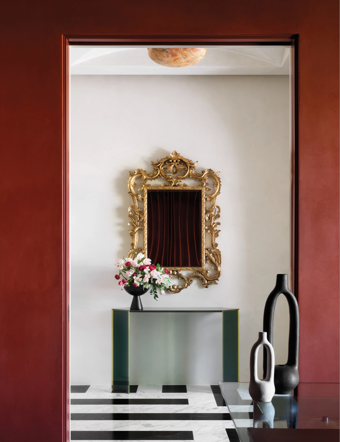
The study’s sienna-colored plaster walls frame a view of the entry featuring a custom floor pattern cut from both Pietra Grey and Statuario marble slabs. An ornate mirror hangs over Glas Italia’s Bisel console in green and yellow glass. The vintage alabaster chandelier was found on 1stdibs.
During the planning process, residential designer Ryan Gordon imagined how his clients might experience a day at their favorite Mexican seaside retreat: waking to the sight and sound of water outside their bedroom window; hitting the gym before skipping down a spiral staircase to the pool; and dressing for dinner in a spa-like bathroom with earthy plaster walls. Simultaneously, he conceived a design with arched windows and limestone walls, acknowledging the couple’s love of Palladian architecture “without being so literal as to put big columns on the front of the house,” he explains. And in homage to Tuscan country dwellings, he incorporated hefty rafter tails beneath hipped slate roofs as well as wooden beams on high ceilings.
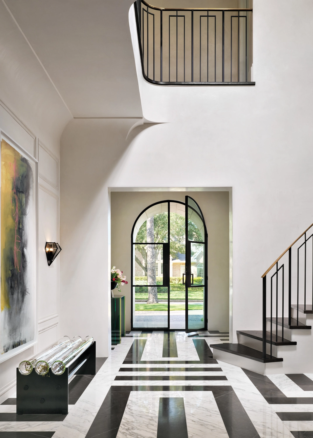
The foyer is coated with a one coat plaster made from gypsum, lime and marble dust. The softness of the product gives an uneven sheen which envelopes a room and even in white tones gives a warmth that can be felt but not always explained. We with our new space now have the equipment to create coved molding and coat them with plaster! This home’s architecture has such a wonderful mix of graceful shapes and square off edges.
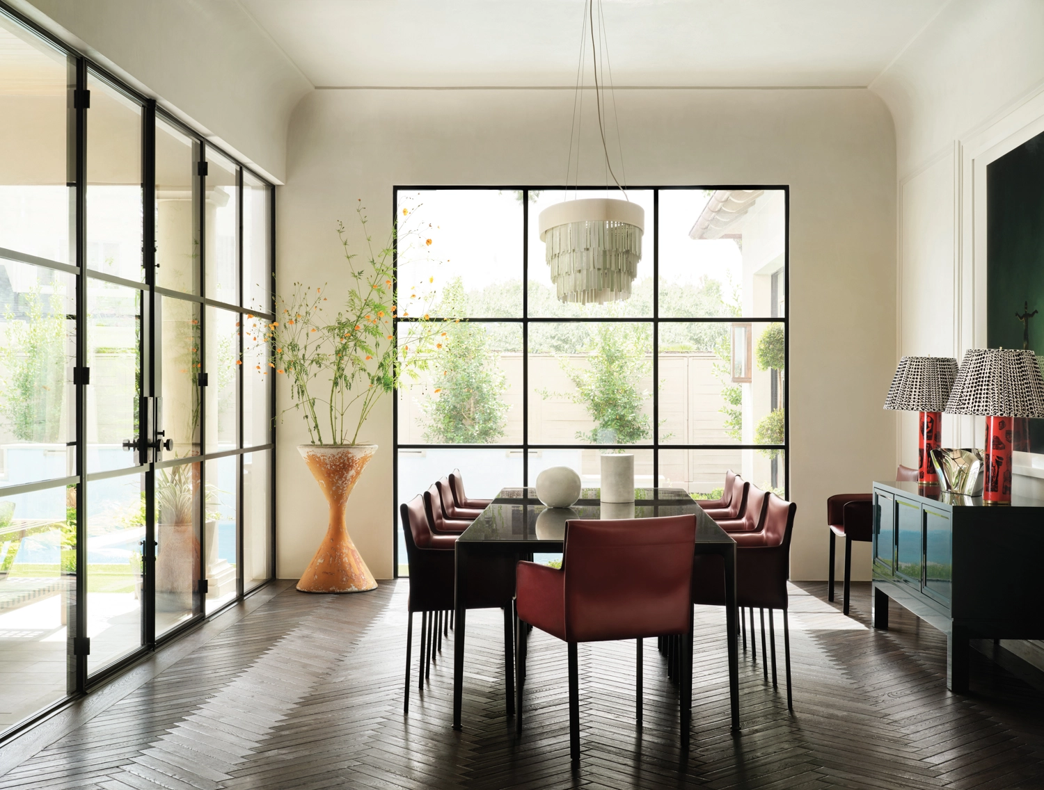
But there’s a bigger twist. “From the front, the house is tight and classic, and as you move toward the back, it becomes more transparent,” Gordon says of the steel-and-glass window walls connecting the open-plan living room, dining room and kitchen to the poolside terrace. This contemporary contrast hints at interiors brought to life by designer Ashton Taylor Oberhauser and builder DJ Palmore, who blended elegant, coved ceilings and paneled and plastered walls with clean-lined Italian modernism. “The homeowners’ personalities are at opposite ends of the spectrum: she’s outgoing, and he’s more reserved and regimented,” Palmore says. “This home’s aesthetic reflects both of them by being bold but also structured.”
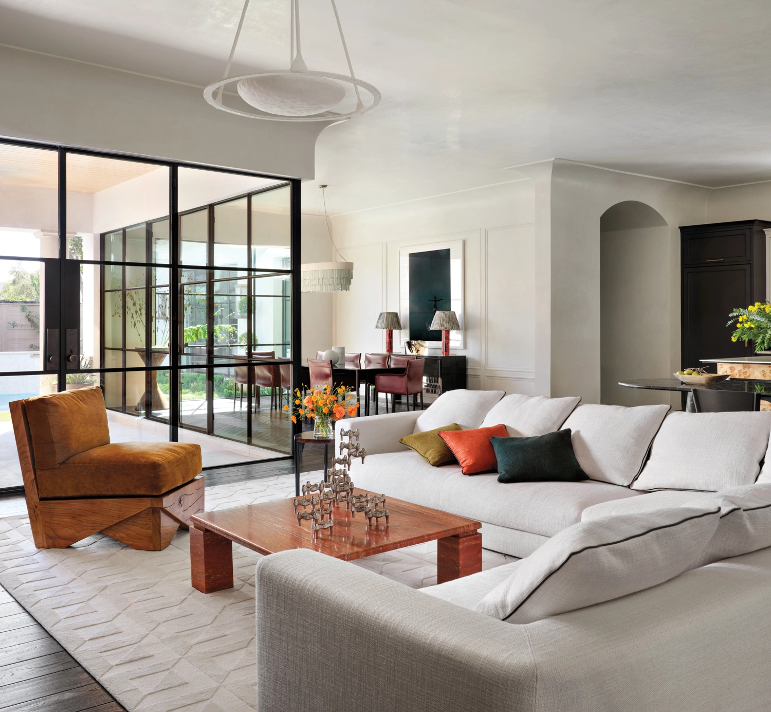
Living room neutrals include plastered walls by Segreto Finishes matched to Benjamin Moore’s Seapearl, a custom Tibetan knot Perennials rug and Giorgetti’s Skyline sofa from Casa. Mimi London’s Origami lounge chair from David Sutherland, in a Marvic Textiles striae velvet from Wells Abbott, pops below Ironware’s Celine pendant.
For her part, Oberhauser found inspiration for the dramatic spaces in a rare vintage black marble dining table by Italian architect and designer Angelo Mangiarotti. “The contemporary lines and beautiful stone, which is worn in the most perfect way, helped set the tone for what we wanted in the entire house,” she recalls. “My style leans more contemporary, but I believe in finding a way to roughen up those sharp lines for more of an aged patina, because you still need some soul.”
The stone’s moody tone inspired marble features throughout, including the entry’s black-and-white flooring, the powder room’s pedestal sink and the primary bedroom’s fireplace surround. Its timeworn finish—reflective of ancient Italian architecture—also helped inform the plastered walls, French oak floors and full-bodied velvets, moirés and bouclés on the furnishings. “There’s a lot of depth to the fabric colors we selected that you can’t get from typical cotton velvet,” Oberhauser explains. “The living room chair, for example, had to be a striae linen cotton to provide the richness we needed.”
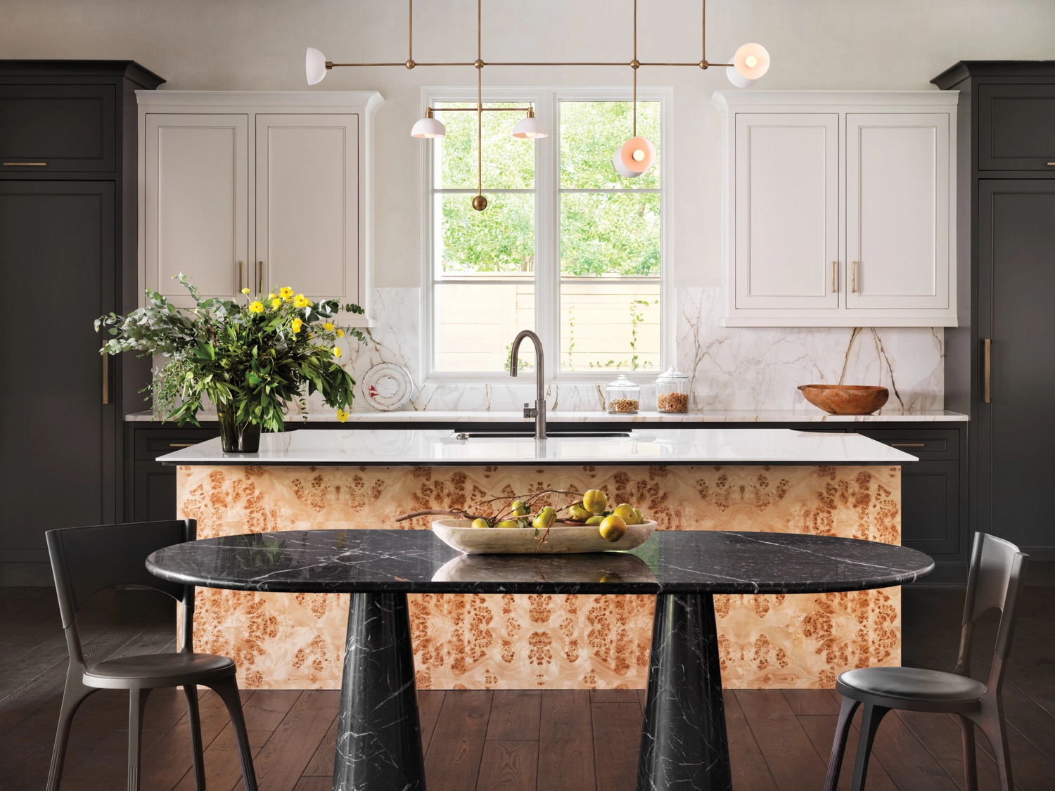
The kitchen island’s burl veneer is from Custom Plywood, Inc. Cabinetry painted Sherwin-Williams’ Tricorn Black frames a Calacatta Macchia Vecchia marble backsplash from Aria Stone Gallery. In the foreground, a vintage table by Angelo Mangiarotti is from M.Naeve. An Apparatus chandelier suspends above.
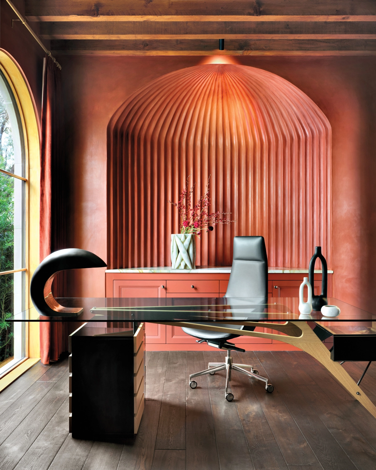
Throughout most of the interiors, saturated colors float in a plane between white ceilings and dark wood floors—from the dining room’s wine-colored leather chairs and emerald-green sideboard to the living room’s red travertine coffee table and orange velvet-upholstered chair. But in the study, the color is all-encompassing—much to the homeowners’ delight. “We’re not afraid of deep colors or strong elements,” the wife says. “As much as I love a serene feel, put a leopard print in front of me, and I’m good to go.” So, she didn’t bat an eye when Oberhauser had these walls plastered in a deep sienna hue and added tall velvet drapes to match, or when Palmore proposed a dramatic ribbed alcove behind the desk. “That was one of those details we winged,” he adds. “I’m a firm believer that there are some things you can’t design unless you’re standing in the space.”
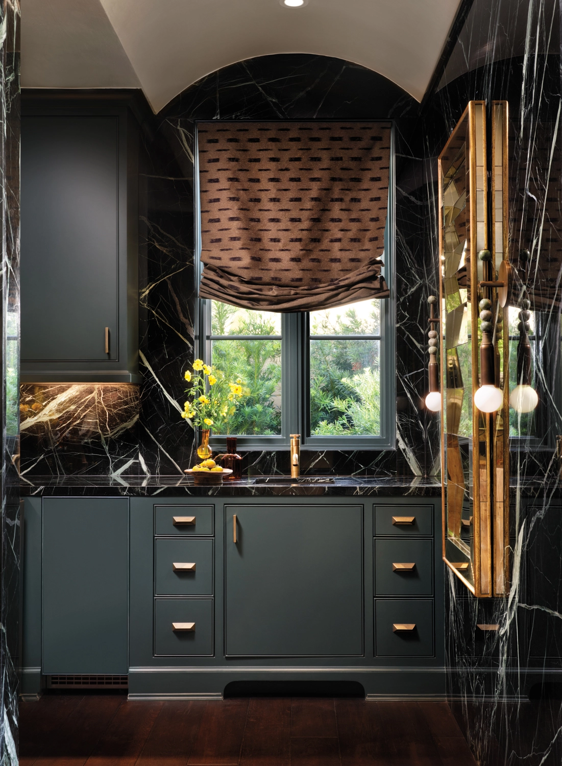
Custom bar cabinets donning Sherwin-Williams’ Rookwood Shutter Green complement walls clad in Verias Antique marble from Aria Stone Gallery. A custom shade in Lauren Hwang New York fabric from Allan Knight softens the space. Apparatus Talisman sconces flank an antique Italian accordion mirror found on 1stdibs.
A fluted wall niche in the study overlooks a Zanotta Carlo Mollino-designed Cavour CM writing desk and Arper chair from Debner. The Nautilus Study lamp is Christopher Kreiling Studio.
This fluted niche was a challenge to create but I can’t tell you how our Segreto Team beamed at the outcome when complete!
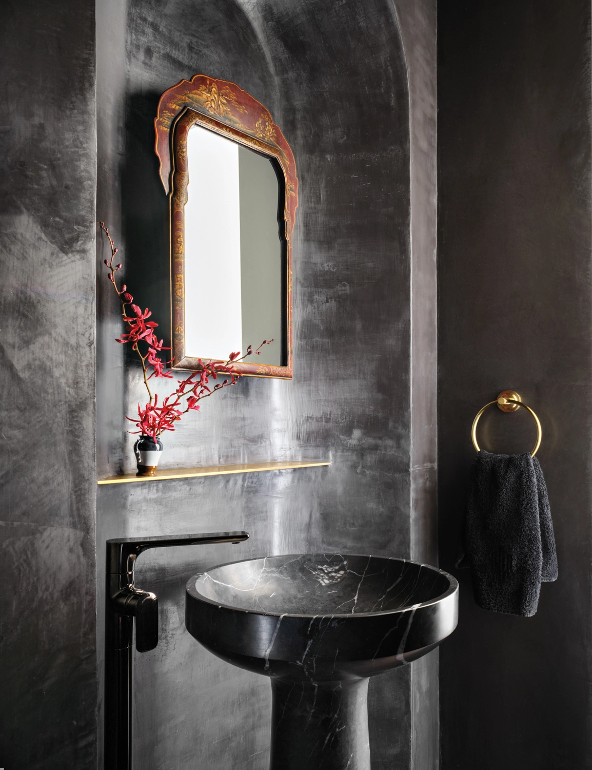
Black plasterwork by Segreto Finishes in the powder room backs a solid marble pedestal sink by Stone Forest paired with a Graff faucet, both from Acero Bella. The 20th-century mirror is a 1stdibs find.
Encouraged by the clients’ derring-do, Oberhauser and Palmore proposed a few more bold choices, including a Romanesque dome in black plaster over the powder room sink and the primary bathroom’s freestanding tub encased in a cube of quartzite. What’s more, the kitchen island was wrapped in the same species of burl wood Oberhauser specified for aircraft bulkheads in her former career designing luxury jet interiors. “I was scared about that at first,” the wife notes of the latter, “but we get so many compliments about how original it is. And the running theme with Ashton and DJ was, ‘We don’t want to do the expected.’ ” The result is as different—and yet perfectly suited to this couple—as Los Cabos and Tuscany.
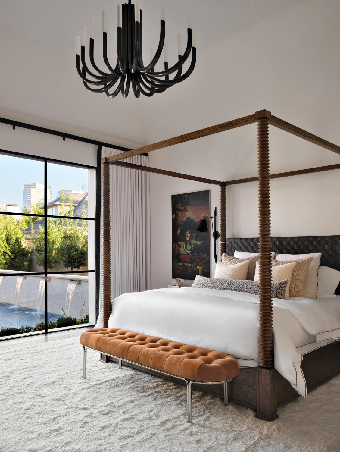
Matouk linens from Longoria Collection, a wool shag rug from RH and a circa-1840 folk art window shade, stretched on a frame, set the tone for the main bedroom. A CB2 bench and chandelier from Circa Lighting add touches of glamour.
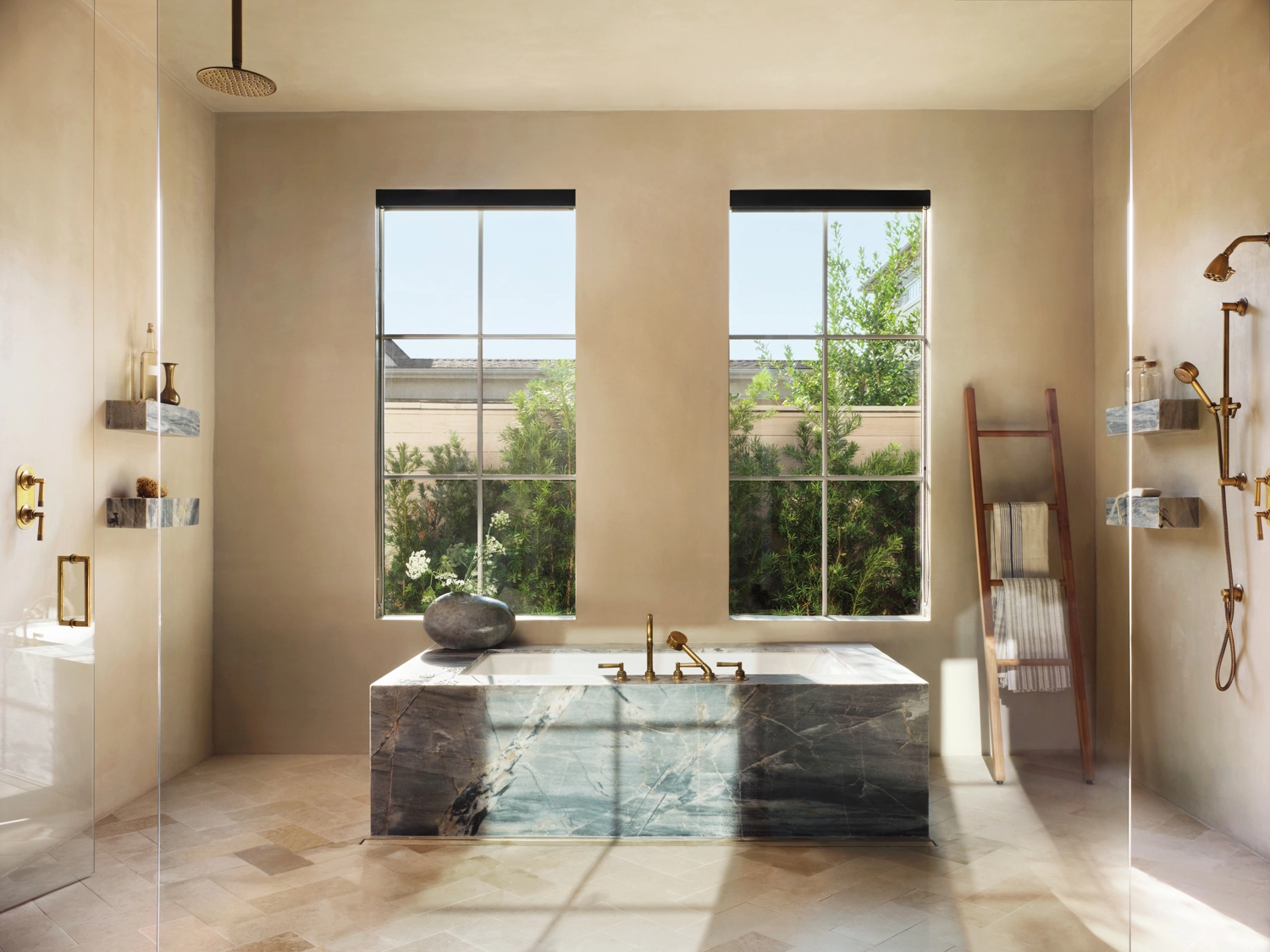
Walls in Tadelakt plaster bring a beach retreat feel to the main bathroom. A tub fitted with House of Rohl hardware from Acero Bella is encased in Ijen Blue leathered quartzite from Omni Surfaces. Limestone flooring from Alamo Stone runs underfoot.
This concept of having the tub and shower in one room is beautifully done. The plaster we installed creates a simplicity to the space allowing the other dynamitic surfaces to come front and center. The effect of floating shelves and beautiful fixtures without the grout lines or heavy veining creates a Zen feeling and brings the outside in!
We have worked with DJ Palmore, founder of David James Custom Builder many times and love his creative, innovative concepts. We were so excited to be a part of this talented team – Ashton Taylor Interiors, David James Custom Builder and Gordon Partners Design. They were magical together!! Thank you Lisa for really beautifully capturing the homes personality though your photography! I hope you all enjoyed the tour and that you have a wonderful week! Till next time, XO Leslie



No Comments