A Week With Segreto!
Hi Friends! I hope you all you and the family are having fun this summer and going to some pretty special places! How can I leave Houston with all of these super fun projects that are going on. Here are a few I would like to share with you!!
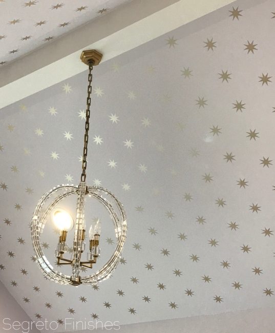
Twinkle Twinkle little star! That is what this little girl will say when she moves into her new room designed by Munger Interiors! This stencil application we painted will certainly last her through childhood. I would love it in my room!
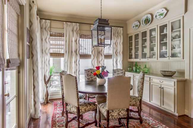
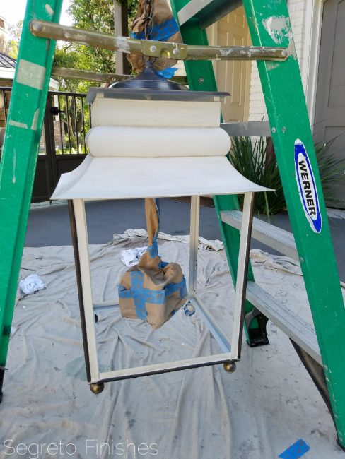
Its always great to use what you have. This lantern was over a breakfast table and was originally solid black. Hollie Landrith, the designer on this project wanted to add a contemporary feel to this traditional lantern.
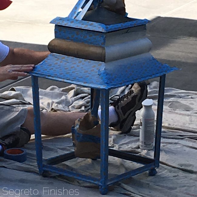
So we took it down and taped off the areas we wanted to leave black. The interiors and the middle band were to be painted a shiny gray white.
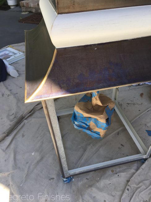
But you know how things evolve! We added gold and then painted the exterior framing as well.
But then the homeowner decided she loved the white-so the entire top was painted and then slightly distressed. I can’t wait to see it hung!! The gold paint is Rub & Buff. Its easy to apply and manipulate and great for altering frames and sconces!
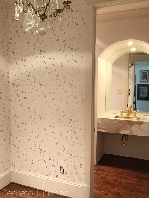
This powder room we finished for Chandos Interiors is both elegant and unexpected. The vestibule and the powder room was first plastered in white, then a random spattered design was painted in a sheer gold in the vestibule to the room. I loved the finished product, I am sure this powder will even be more spectacular after they furnish and accessorize it!!
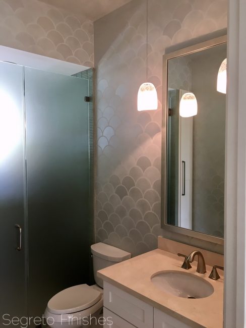
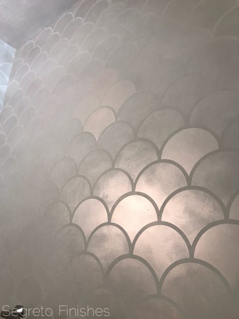
What is better in a pool bath than a fishscale inspired finish. Plastered first…………
The metallic was stenciled over the top in different transparencies, creating an uneven iridescent effect.
Plaster, even when the home is still under constructionreally creates such an effect of sheen and depth.
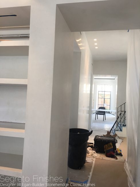
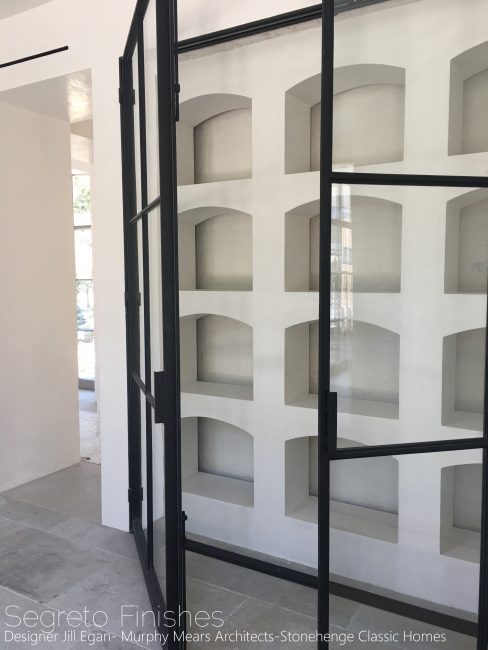
This project’s designer is Jill Egan and the architect is Kirby Mears with Murphy Mears Architects. This is the first home I have done with Jill and she is incredibly creative and talented. I love this wine room feature in the dining room. The back wall is slurried brick with plaster shelving in front. Look for more on this home in publications-it is truly fabulous!
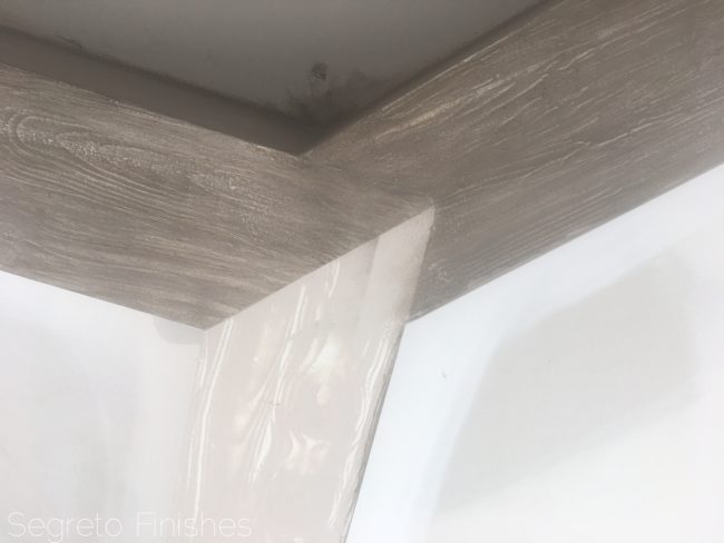
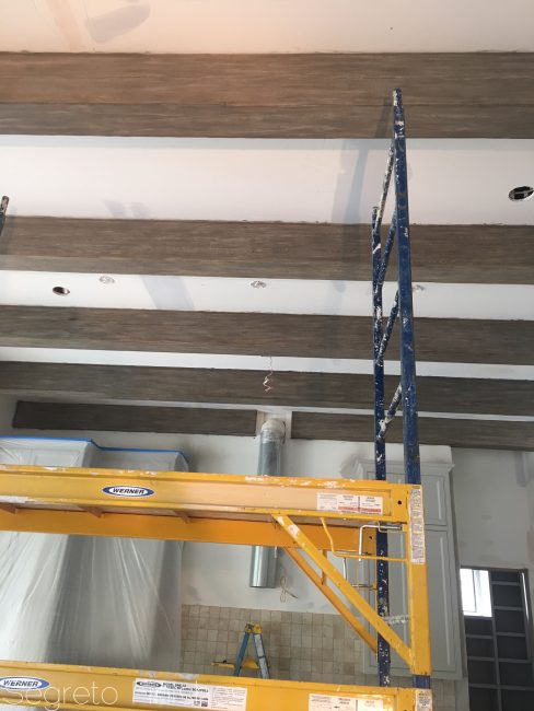
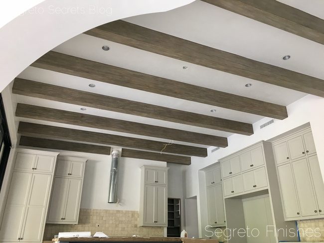
I know so many of us have white painted beams which we would like to read as reclaimed wood. Above these beams already have our first step applied they were originally bright white. We used a graining tool to imulate a natural wood look.
Here you can see the second step of a darker glaze on the top beam. It is very important to create just the right amount of grain as the second step enhances the pattern.
Adding two more glazes they are really taking shape!
What do you think? If I didn’t tell you they were painted would you think reclaimed?
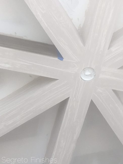
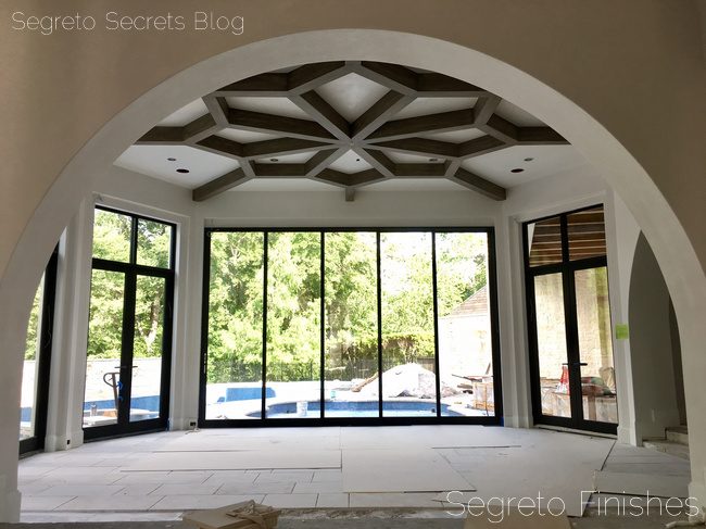
This is the design of the ceiling detail in the dining room in the same home. This cell phone pic doesn’t show the graining wood details. I will show you more on this home built by Allan Edwards and designed by Trisha McGaw. It’s a beauty!
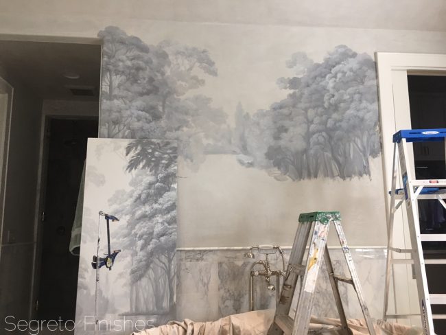
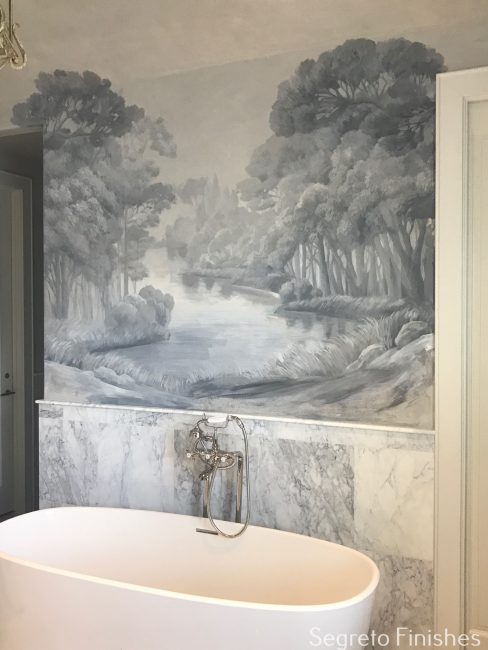
And to finish off the week, I am loving how this mural is evolving. The client fell in love with a large sample which in my showroom. Using this as inspiration we created her own scene over her tub. Painted over plaster creates such a soft effect.
Here it is finished!! I certainly could do a little day dreaming in this tub!
I hope you all have a wonderful week! Until next time!
_______________________________________________________________________________________________________________
If you are interested in hosting an event or carrying the book please don’t hesitate to reach out! Email Karly@segretofinishes.com for all inquiries! We love to visit new cities!!!




Michele
Posted at 14:16h, 03 AugustOh my, let the pinning begin! So much lovely to take in, Leslie!!! I am in love with the agelessness of the mural and those tranquil colors, yet the contemporary treatments make my heart beat faster because they engage my imagination and feel oh so fresh, yes? I ha my hands in plaster yesterday for a random art experiment thing here in the desert, and I loved every messy second. Thank you for showcasing your work and providing so many insider details–I never tire of the beauty. Hugs to you.
Susie
Posted at 06:04h, 11 AugustI’d love to know where I can find the wallpaper mural from the bathroom. Please and thank you