Segreto Mural for Nicolas Vincent
SegretoStone™ Table for Creative Tonic
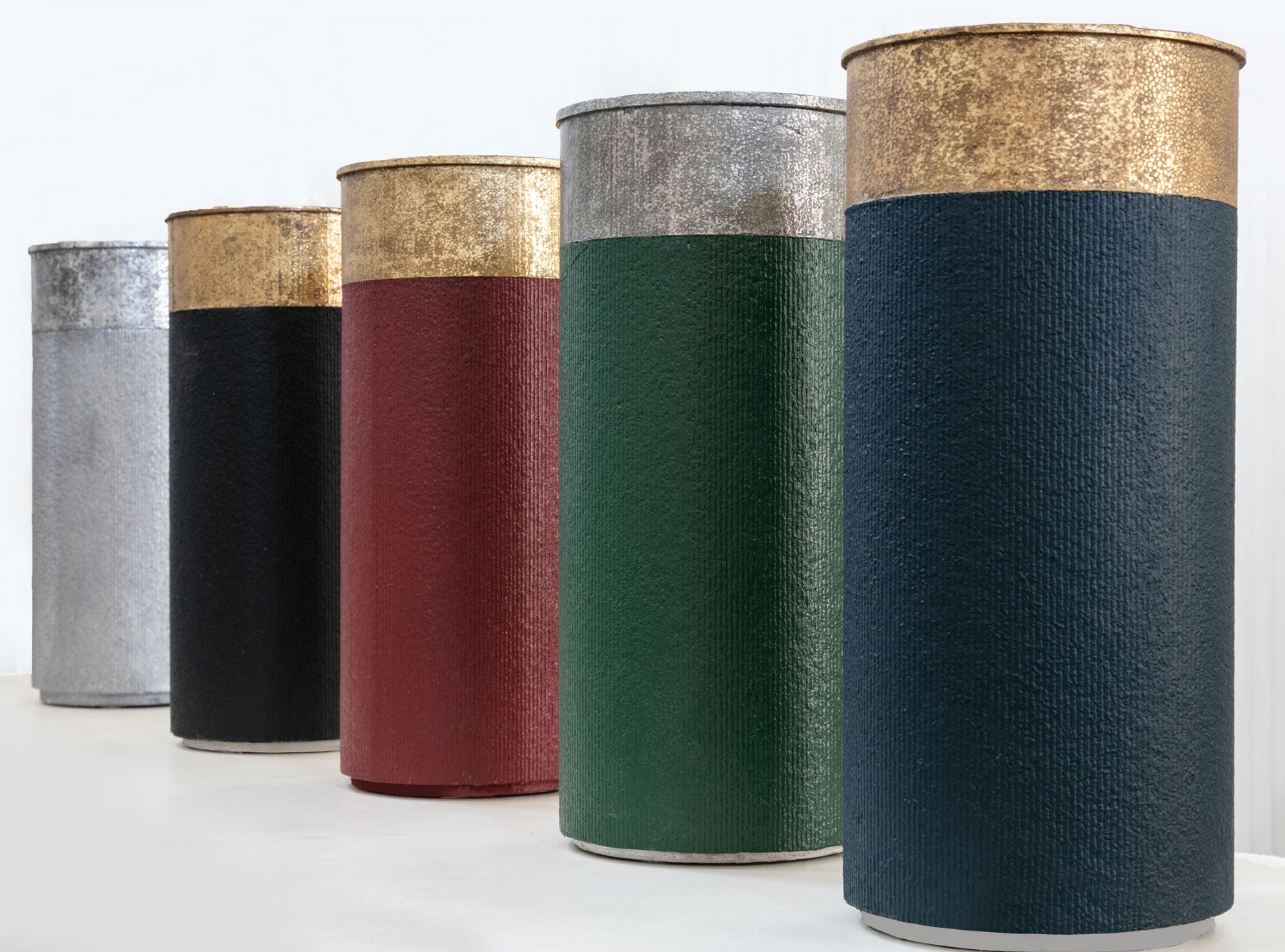
Shotgun Shell Tables
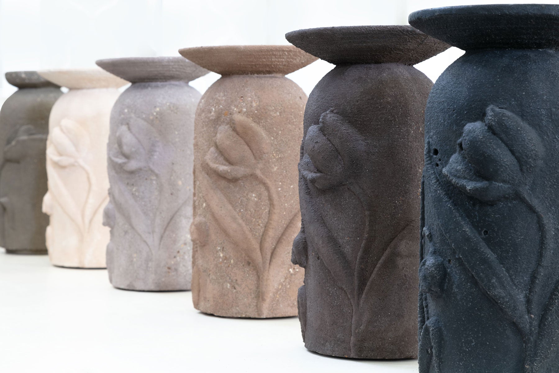
Tulip Martini Tables
Cart
Your cart is empty
in the press
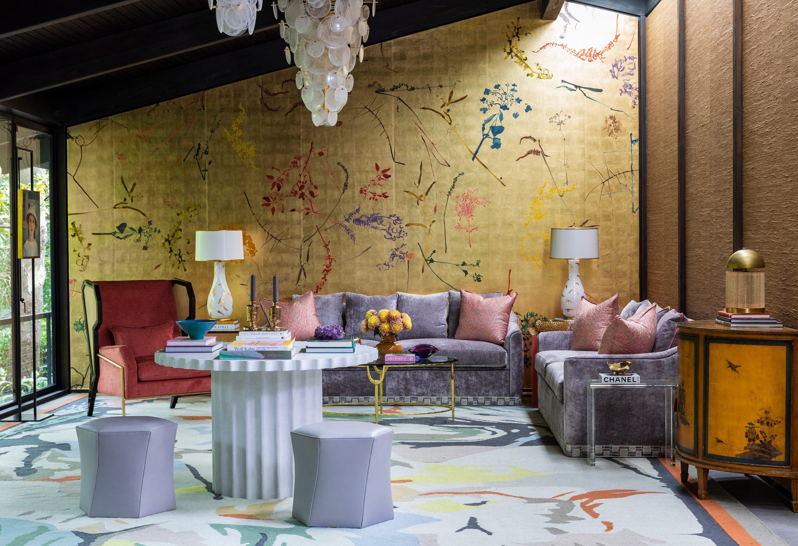
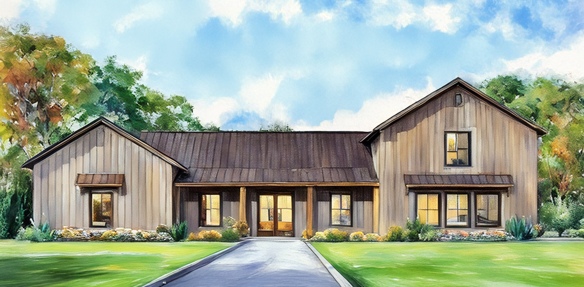
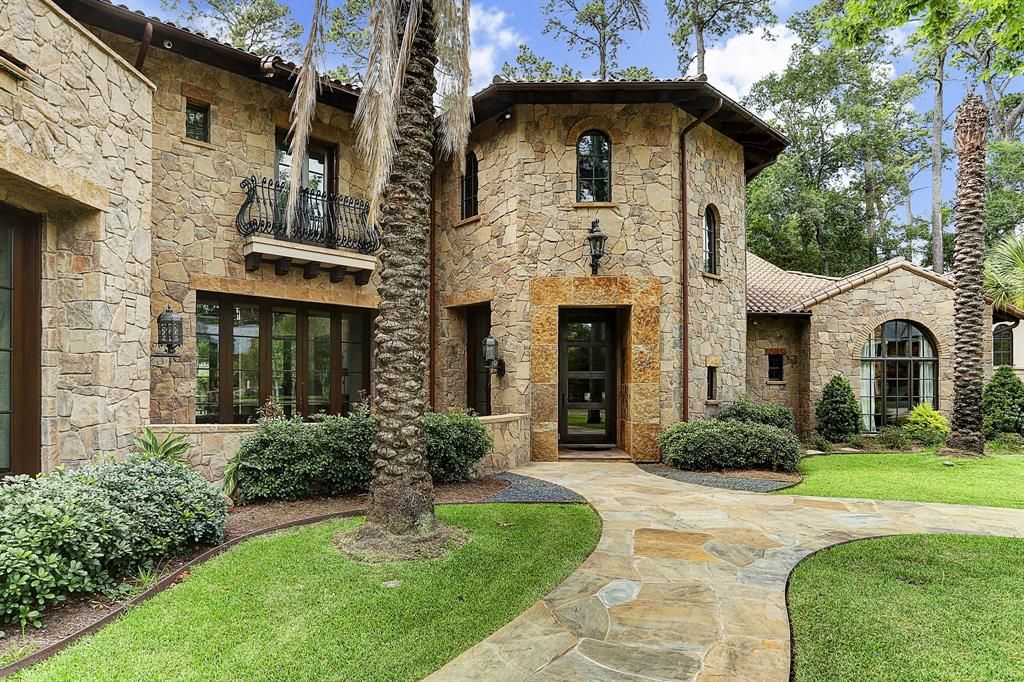
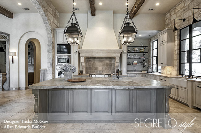
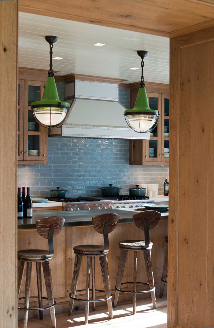
Southern Home: European Edit in Houston
March 5, 2024
Segreto Holiday Lookbook
Holiday Lookbook 2023 2024
Not Just A Door…
Kips Bay Show House- Dallas and Palm Beach Part 1!!
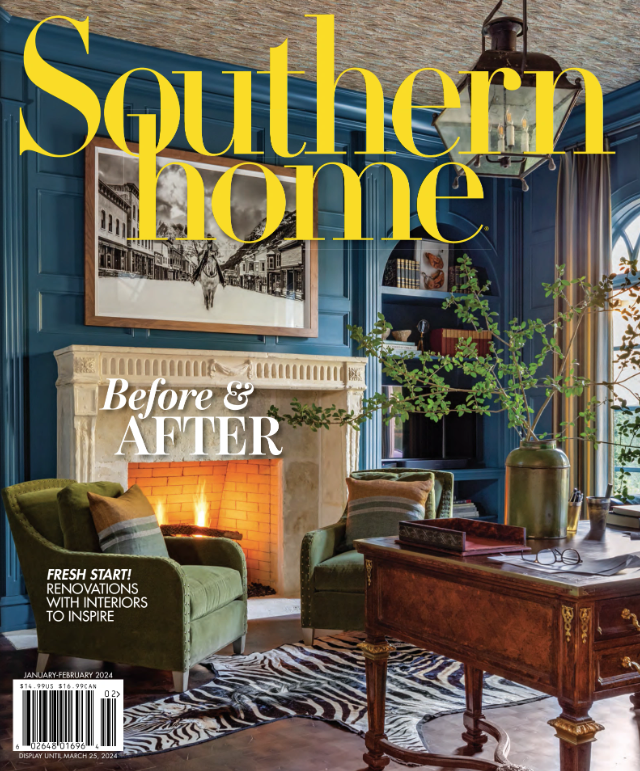
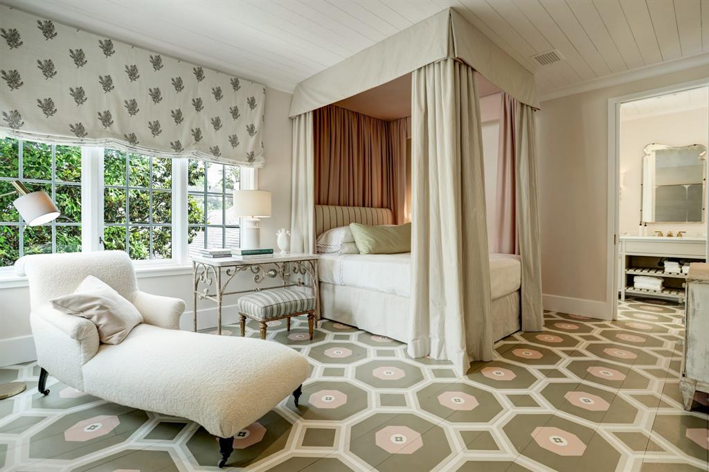
In The Limelight – Southern Home 2018 January/February – Segreto Secrets Blog
Round Top Designer Show House: A Stunning Showcase and Book Signing!
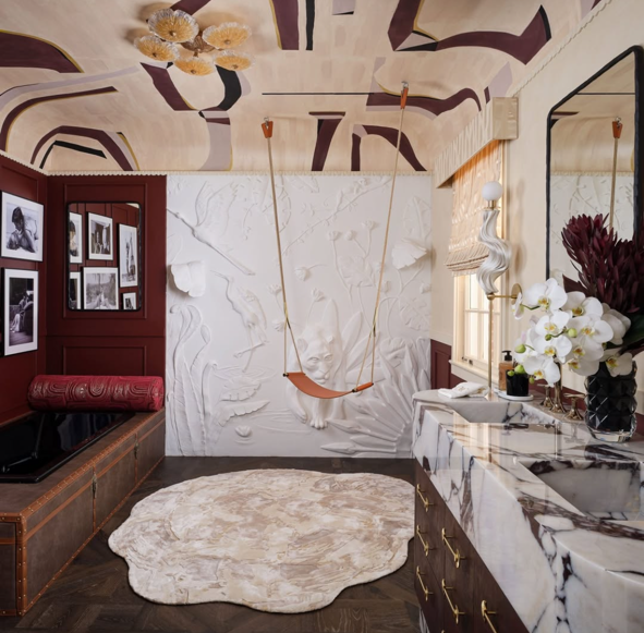
A Parisian-Inspired Bathroom with Timeless Elegance-Kips Bay Palm Beach!
A Palm Beach Dream: Our Collaboration with Meg Lonergan at Kips Bay
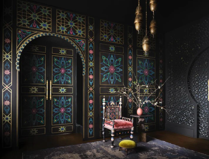
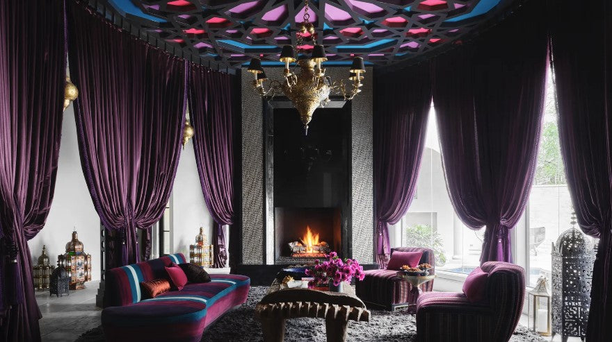
Morocco comes to Houston!
Selecting the Right Paint Sheen
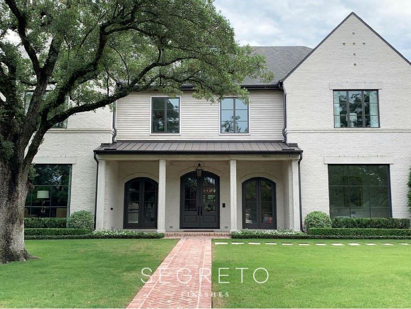
Southern Home - European Edit In Houston.
My Valentine's Day Tablescape and DIY Linens
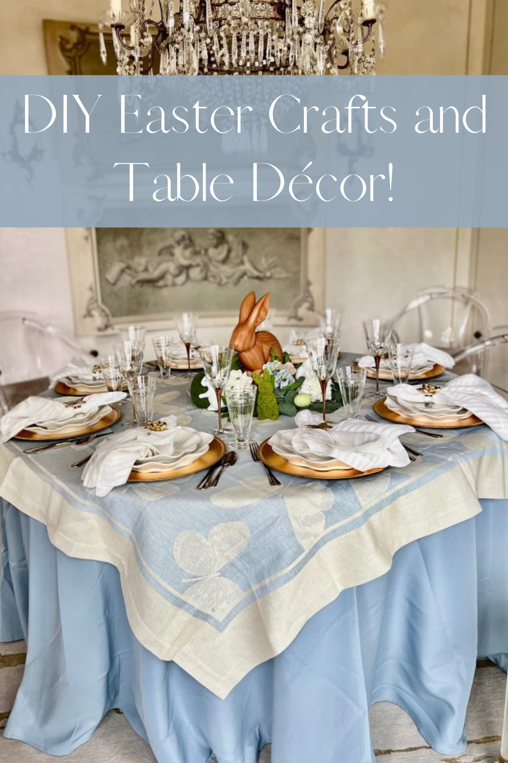
DIY Easter Crafts and Table Décor!
A Beautifully Eclectic Home- Aspire Magazine and Newberry Architecture!
The Flute! Its not just about Champagne!
Fun Facts about Paint!
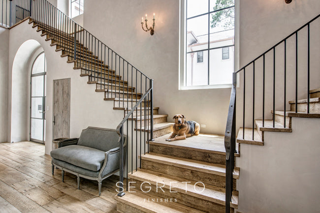
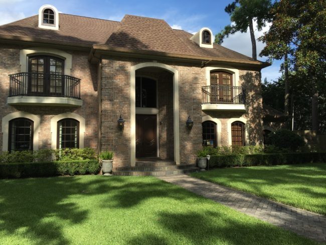
Is this the same house?-Treatments for Brick and stone
Is this the same house?? Part 1- The miracle of Limewashing!
Memorial Day-Grateful for those who have served!
SegretoStone- Natural, Seamless and Beautiful!
Imagine living in the Milieu Showcase House. It's for sale!
In the Limelight! Country French & Luxe
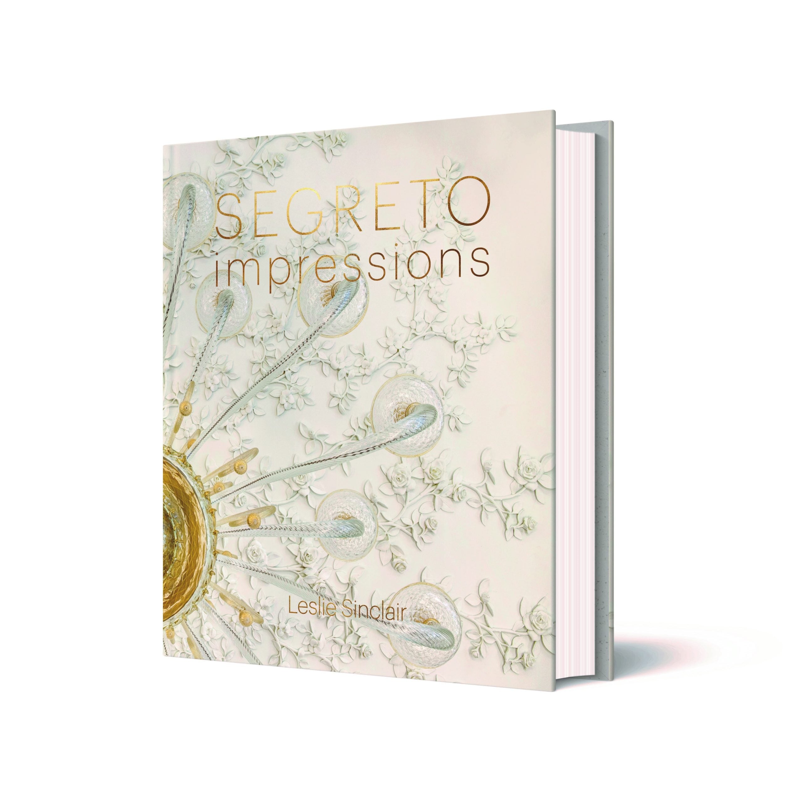
Segreto Impressions is Ready for Pre-Order!
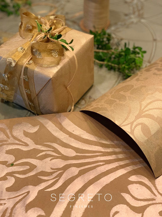
Create Your Own Wrapping Paper- Segreto Style!
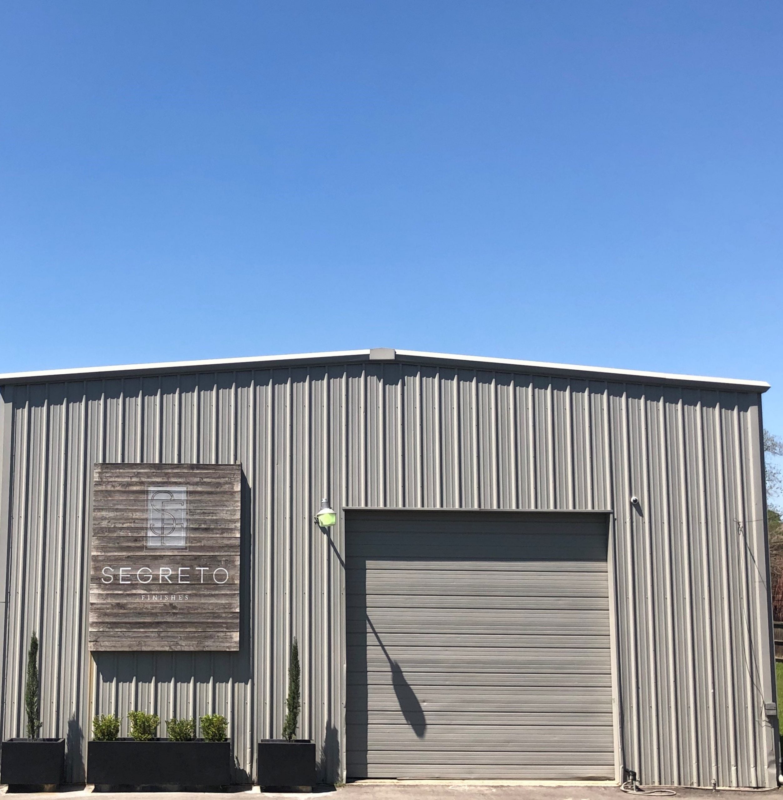
Warehouse-An Unlimited Space to Create!
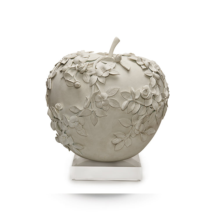
An Apple a Day!
The Power of Finishes-Exterior Edition and The Kappa Pilgrimage!
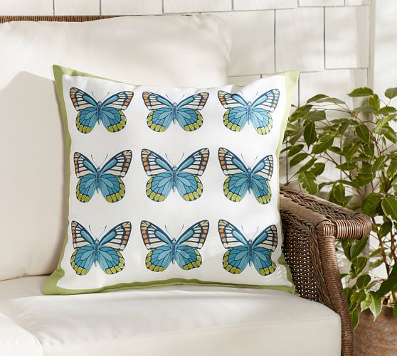
Why Do We Love Butterflies?
In The Limelight - Southern Home Fall/Modern Luxury
Infuse a Bit of Hollywood Glam Into Your Interiors!
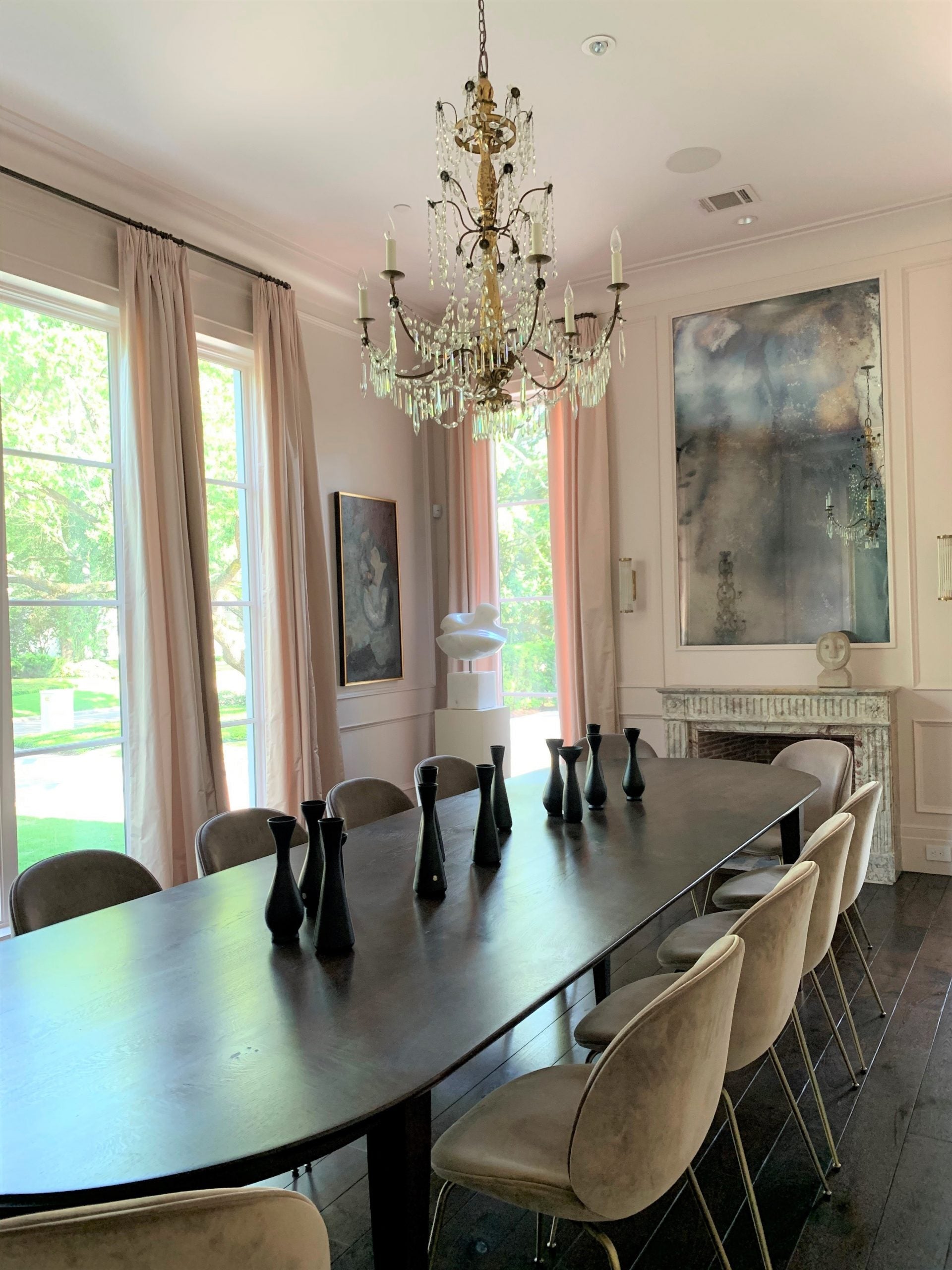
A Dining Room with the Wow Factor!!!
An Exterior Facelift!!!
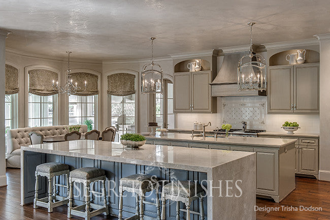
Two Projects With Dodson Interiors-Always Super Cool!
SegretoStone-Our New Line!
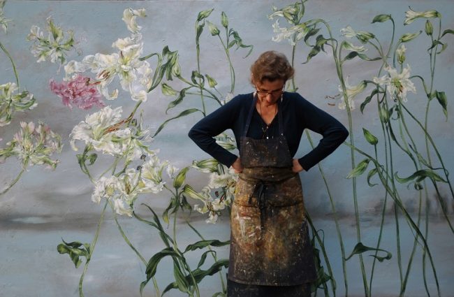
Artist Spotlight-Claire Basler!
Spring Limelight Edition
Picking the Right Paint Color!
Christmas Tree-Inspired Holiday Crafts!!!
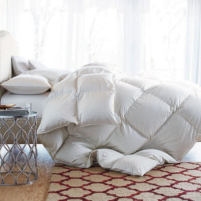
How to Pick the Best Down Comforter!
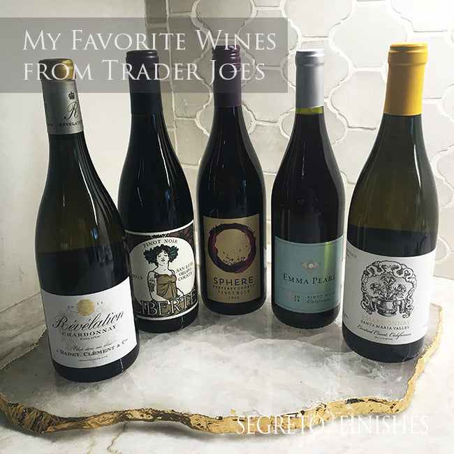
My Favorite Things from Trader Joe's!!!
Monica's Gingerbread Mansion
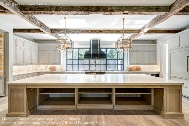
My Kitchen Update!
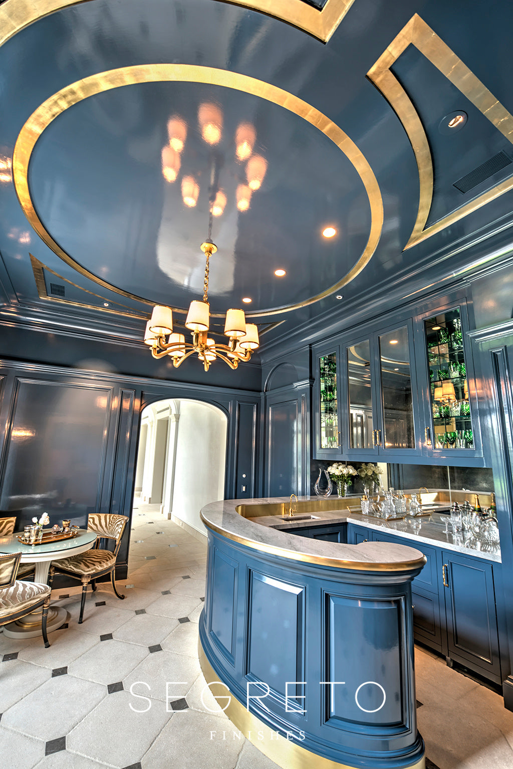
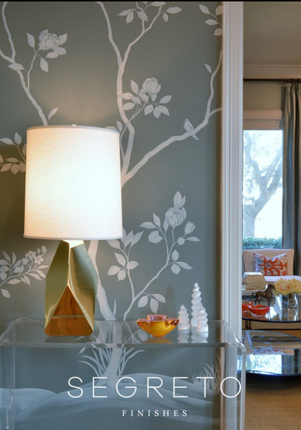
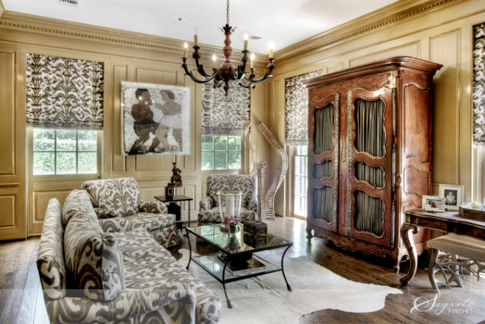
The Power of the Paneled Room
Not Just A Door...
The Thanksgiving Table!
A Spotlight on The Urban Electric Co.
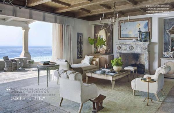
West Coast Splendor with a European Touch
Giving History a Fresh Twist!
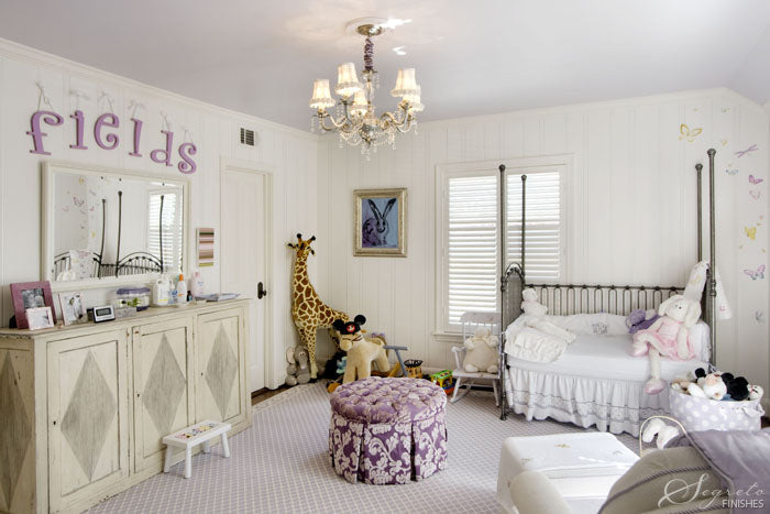
Kid's Rooms--It Brings me Back!!