From Traditional Mediterranean to Casual Elegance – Luxe Maison
HI Friends! I hope you are ready to walk into our new normal with a skip in your step! Andrea, one of our talented Segreto designers, completed a facelift makeover of a traditional Mediterranean home into a lighter and brighter elegant version with the talented duo, Monica Simpson and Alma Jane Aucoin, of Luxe Maison. She was so excited about the incredible transformation, she thought we all might like to take a tour.
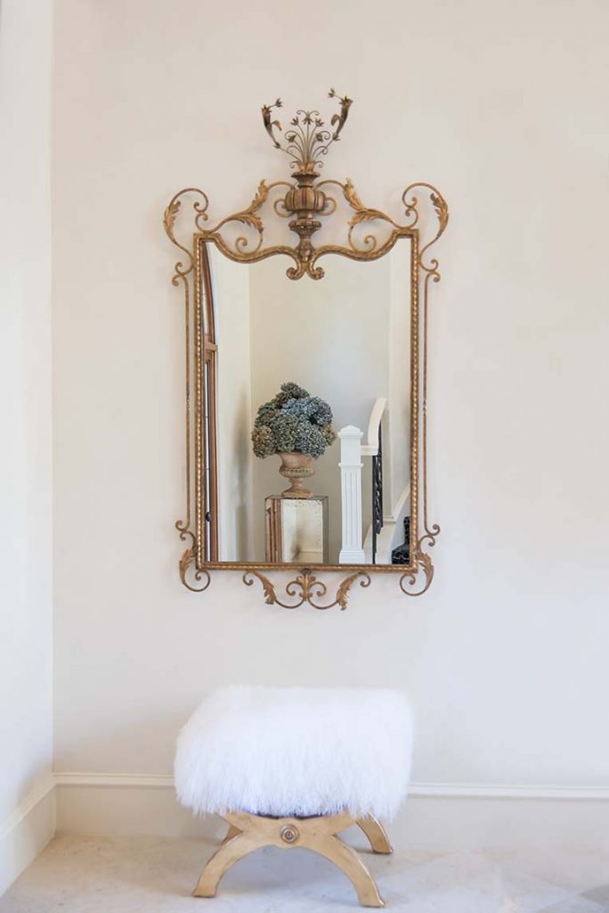
Specializing in creating chic, sophisticated spaces with a casual elegance, Monica and Janie work with each of their clients to tailor spaces that are both beautiful and functional for their lifestyles. The wonderful clients living in this home were ready for a big change! They wanted to move away from the traditional, darker Mediterranean color scheme to a more transitional and light space with minimal construction work.
Above is a sneak peek of the foyer. Let’s take the full tour!
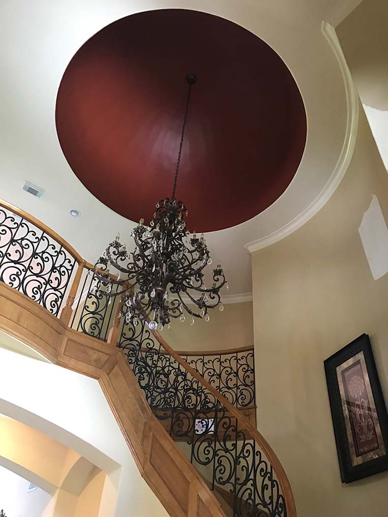
Before:The original foyer had many different elements which stopped your eye including the stained wood, red dome and contrasting colors on the walls and ceilings. Collaborating with Monica and Janie, we came up with a finish scheme to simplify and create elegance while being mindful of the client’s budget priorities.
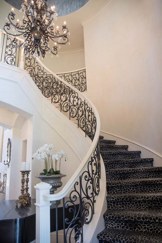
And After! To open the space, the walls were plastered in a soft neutral color and the woodwork painted to blend and eliminate the sharp contrasting tones which stopped your eye.
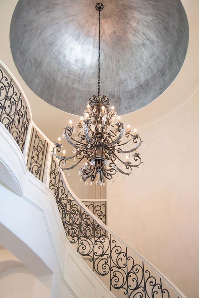
Monica and Janie wanted a chic, dramatic statement in the entrance that says “you’ve arrived”! The dome was first painted black and then layered with a silver metallic paper. Lending the same shimmer and sheen as a silver leaf, this budget friendly option left room to extend the lovely plaster walls into the formal living. To tie in the existing chandelier, aged silver accents and a translucent glaze were applied to lighten up it’s previous dark finish.
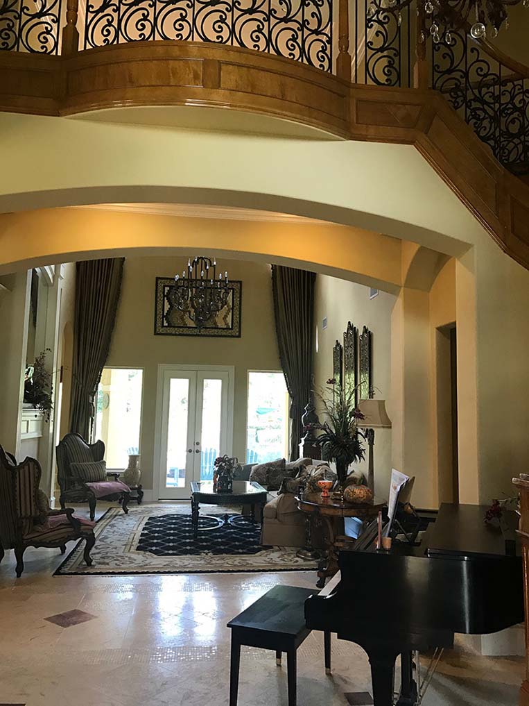
Before: Walking through the staircase is a dramatic two story formal living room with a breathtaking view of the backyard.
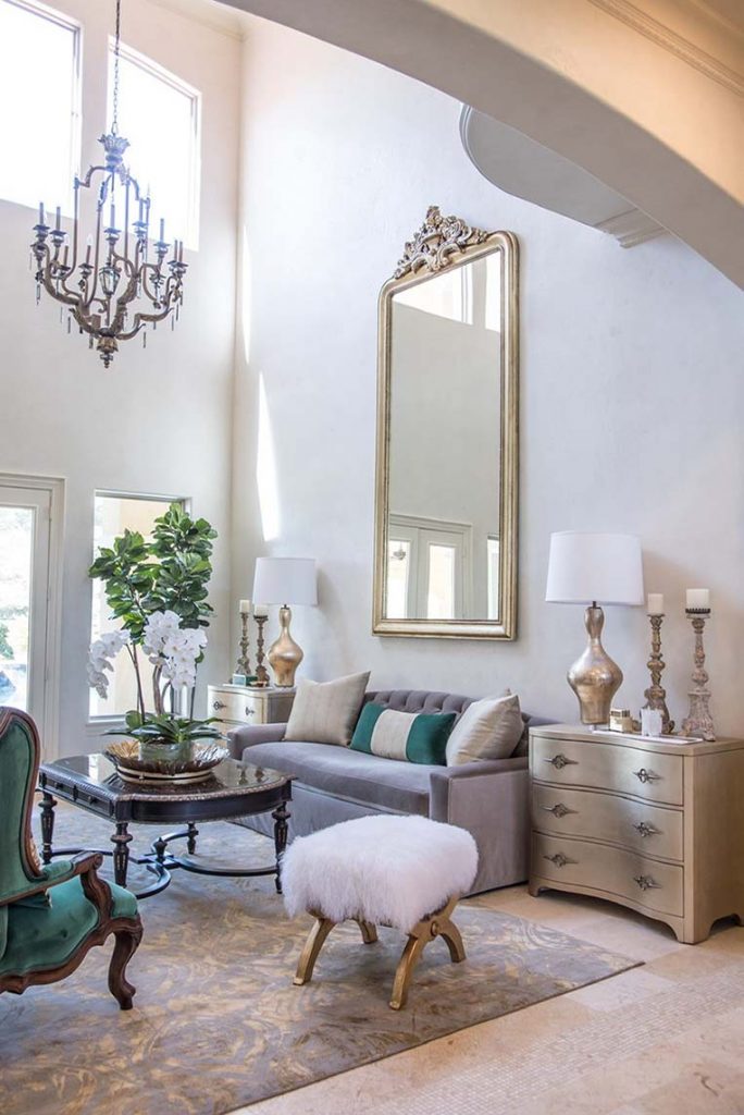
After: What a transformation! To open up the view and allow the light to reflect off of the newly plastered walls, the draperies were removed and a few new pieces purchased. The clients favorite jewel tone is featured as new upholstery on her existing chairs and a new throw pillow. The chandelier, also original, was redressed with gold accents to tie it in with the new statement antique mirror.
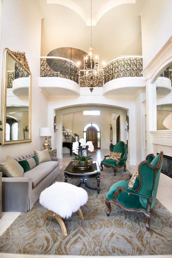
It is hard to believe this is the same room! I love the choices the design team made in what to keep and what to replace.
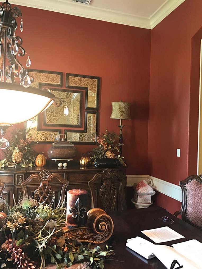
Before: Next up is the Dining Room…
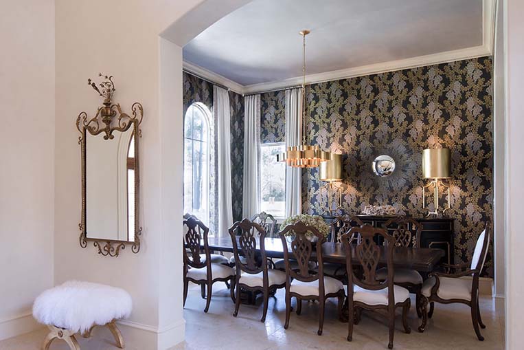
After: Expertly mixing in antiques and modern elements, Monica and Janie chose a gorgeous, bold Farrow and Ball wallpaper to dress the dining room. To complement the subtle lavender tone in the patterned paper, we customized a plaster color to match the floral motif and waxed it for a glowing sheen.
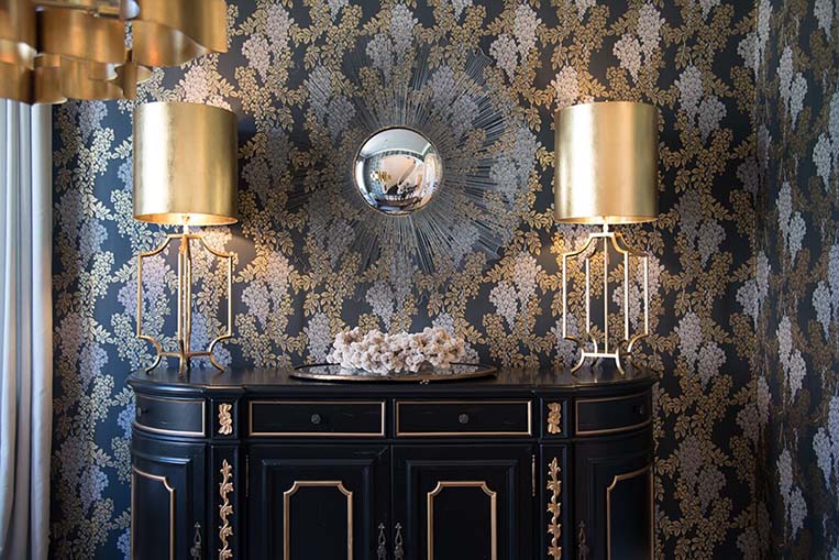
A strong pattern, strategically placed, can really elevate a space! Stenciling is another great option because you can find or design the perfect pattern and completely customize the color selection. On the trim work, we added gold accents and a glaze to give it some interest and pull in just the right amount of gold glitz.
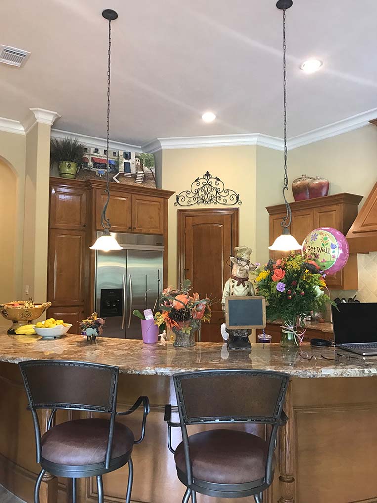
Before: The kitchen and family room are the heart of this home and were the starting place for the whole project. Monica and Janie developed a beautiful plan to transform the space with color and finishes and a few key new pieces.
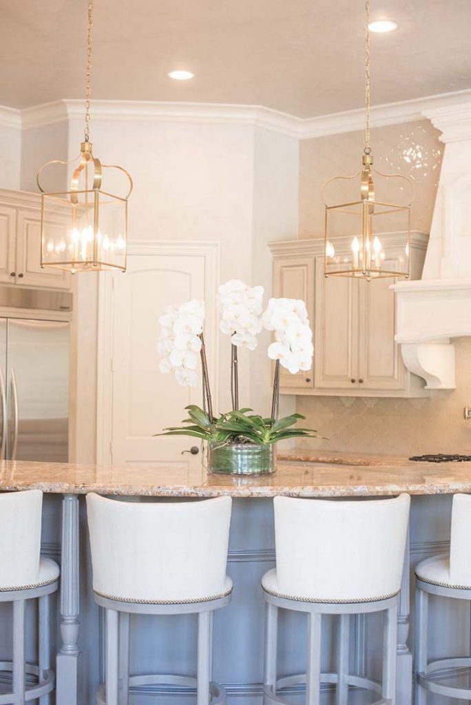
After: What a reveal! The countertops and cabinet boxes remained but they brought in a new stone range hood, accent tile wall and new custom lighting from Brown that adds a touch of glamour. The homeowners wanted the grain of the wood to show in the perimeter cabinets. After several samples, we came up with a layered glaze finish for the cabinets that does not completely cover the natural grain but achieves the color they were looking for. Savings were realized because the cabinets did not have to be primed and painted first. Wanting a completely different look for the island, it was painted a darker blue gray and glazed. Scroll back up and look at the pantry door. Notice the difference painting it the color of the walls made in the space. Look at the elements in your own home, if they are not something you want to highlight, then they can be painted to blend.
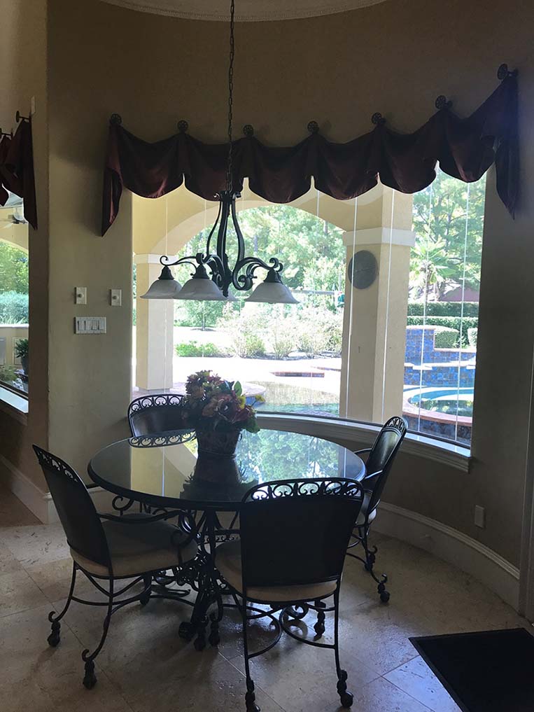
Before: Even though the breakfast room had lovely views to the back yard, it felt dark and closed in.
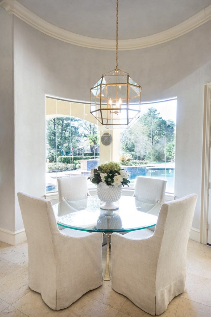
After: Now this cozy and bright update is the perfect spot for the family to enjoy the view of their backyard while comfortably sipping their coffee! Notice how just removing the drapes which blocked the view and created a visual line in the middle of the walls made. Soothing pale blue plastered walls and lighting from Visual comfort paired with a clean contemporary table and soft slipcovered chairs make a timeless combination. Monica and Jaime really brought the outside in!!
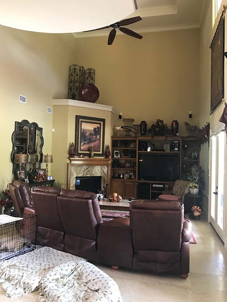
Before: The family loves to spend time together in this main gathering area with their crew of adopted pets, so Monica and Janie wanted to make sure the updates would make this room both functional and beautiful!
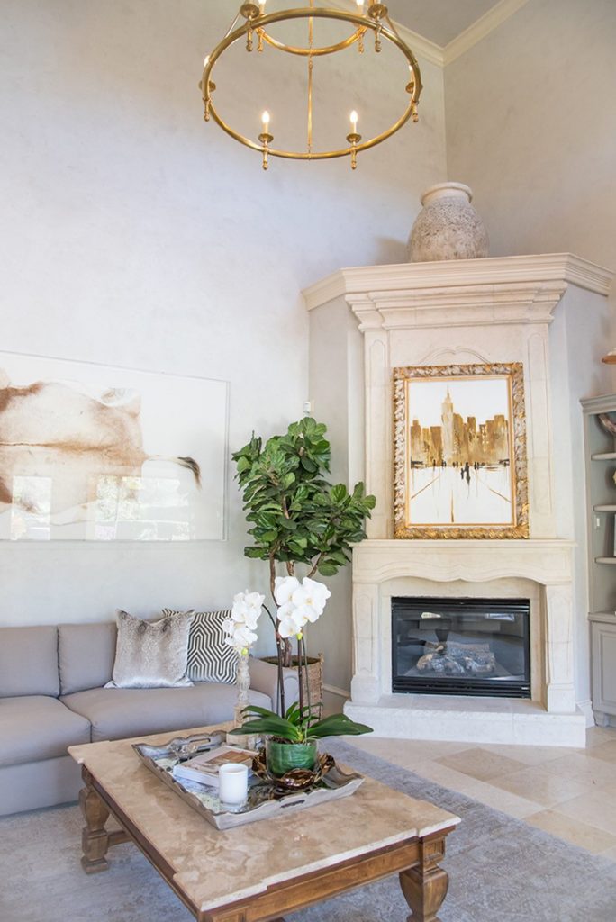
After: Continuing the plaster from the breakfast and kitchen opened up the space. They designed a stunning stone fireplace installed by Stoneworks which has a better scale for this two story room. What a game changer!! We refinished the built in shelving in a subtle contrast to the walls to take away that harsh division the stained cabinets created.
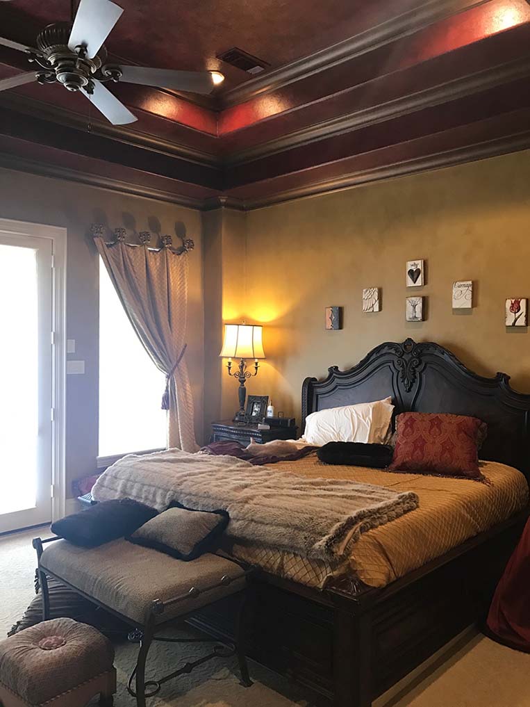
Before: Loving how the rest of their home had transformed, they want to do the same for their master bedroom and bath.
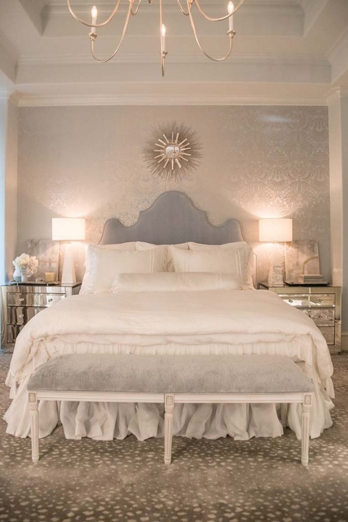
After: Carrying the soft blue grays and light neutrals in to the Master bedroom, they created a truly serene retreat! The layers of texture with the softly patterned wallpaper, velvet headboard, linens and hints of metallic make this space feel luxurious and comfortable.
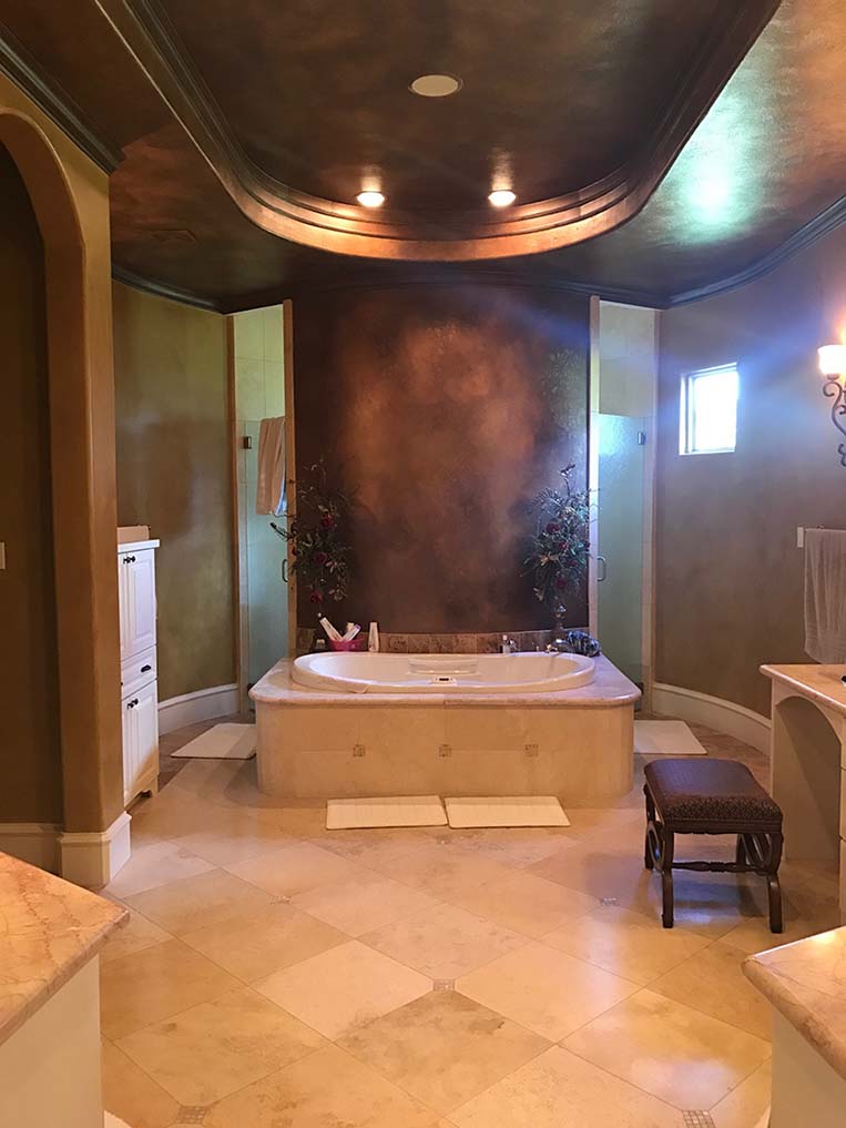
Before: The Master Bath originally had a dark faux on the walls and ceiling. Not wanting to do a major renovation, they opted to leave all of the original hard surfaces and use color and finishes to give then that spa retreat they wanted for their master bath!
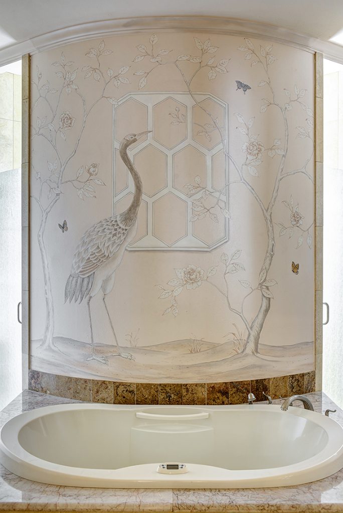
After: A beautiful mural by one of our artists inspired by a Gracie wall covering, accents the freshly painted master bath. It was such a joy to collaborate with Monica and Janie and the homeowners to add in unique details like their favorite butterflies to personalize this impact wall!
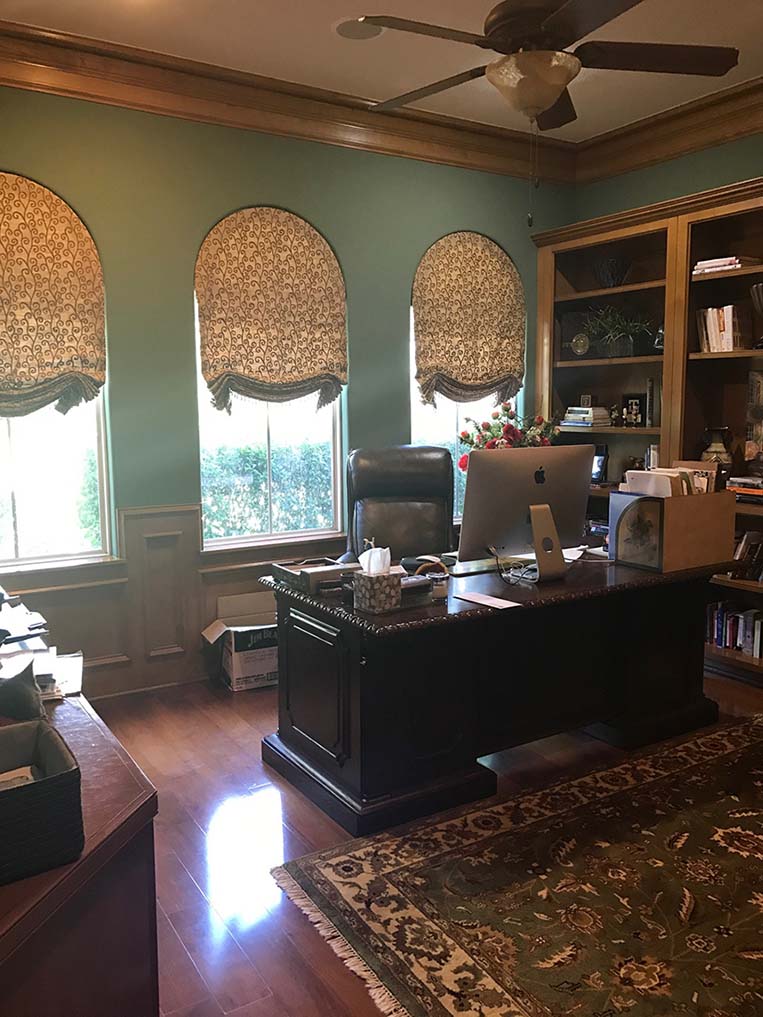
Before: And last but certainly not least, her office!
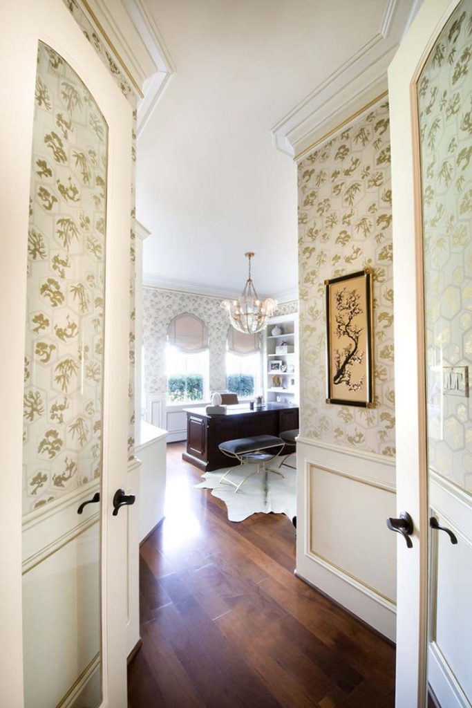
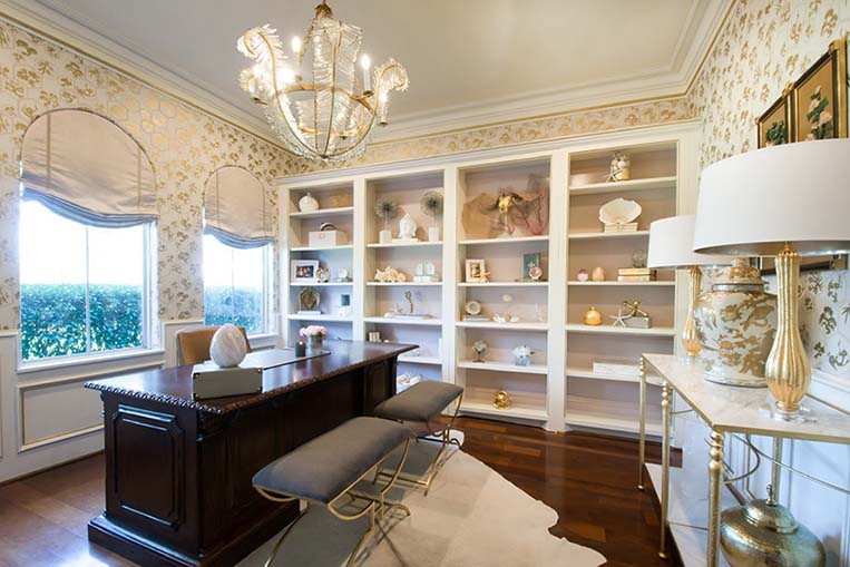
After: This office became Monica and Janie’s favorite room in the house and a beautiful oasis for the homeowner. They chose a Farrow and Ball Paper with pink and gold for the walls and we plastered the ceiling. On the paneling and woodwork we added gold leaf to the bead details and a light glaze to add depth. The backs of the bookshelves are painted soft pink in high gloss pulling out tones in the paper. The chandelier and styling give this room an extra luxurious jewel-box feel! I want to work in here!!
Beautiful job, Luxe Maison Interiors! You are such a talented team and Segreto and Andrea are so thrilled to be a part of this beautiful home and so many other of your amazing transformations! I appreciate the homeowner’s trust during the process and hope you all enjoyed this beautiful remodel tour with photography by French Blue Photography and Wade Blissard. To see more of Luxe Maison’s wonderful design work, you can visit their website here.

I hope you all have a wonderful week! Till next time! XO Leslie


Bobbi Jo
Posted at 04:43h, 27 AprilGorgeous transformation!!!
Debbie Walker
Posted at 07:59h, 27 AprilSuch a beautiful transformation! Thank you for sharing and always inspiring!
Leslie Sinclair
Posted at 11:26h, 27 AprilHi Debbie!! How are things there? It is amazing how many ways a home can look. Have a great week!! xo Leslie
Jennie Murphy
Posted at 05:12h, 28 AprilWhat a beautiful transformation. Always enjoy your work and look forward to your next post.
Leslie Sinclair
Posted at 03:23h, 30 AprilHI Jennie! Thanks so much for your comment!! It was so fun to see the difference. Such a beautiful house. Have a great week!!
Celia
Posted at 08:42h, 02 MayBeautiful transformation in every room!!
Leslie Sinclair
Posted at 17:01h, 05 MayHi Celia! I am so glad you enjoyed it!! The designers did such a great job and we loved working on it!! Have a great day!!
Kimberlee
Posted at 09:04h, 27 MayDo you have any idea who made the chandelier in the new family room?
Kimberlee
Posted at 08:42h, 30 MayOne more question, Leslie. I noticed that the ugly AC registers appear to be gone in the family room updated photo. I have those same, obnoxious registers high up in our formal living room; how did you get rid (or disguise) them?