Gray in the Home
Thanks everyone for the sweet supportive comments about the lime washing at my house!!! I will send you pics when we are done!! The new Antique Shops & Designer Magazine is out and I wanted to share a portion of my latest article about the Color Gray and give you a sneak peak of my upcoming book Segreto Style!!!!

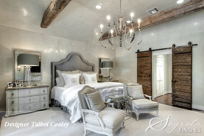
The room below, one of my all times favorites, is from the talented Talbot Cooley From TC Interiors!!! I loved the soothing polished plaster we applied in this bedroom!!! This house and the ones below will all be featured in their entirety in Book #2 Segreto Stlye which I have been working around the clock to get to press so it will be out for the fall, fingers crossed!!!!!!!!!!!!!!!
I love all the gray rooms and accessories that are in home design today. With the busy lifestyles of working parents and children juggling countless activities, I hear repeatedly during consultation with homeowners that they want their home to be a retreat – a relaxing haven separate from the hustle and bustle of their schedules. I almost always point these clients to tones of grays. After reading the definition of gray from the dictionary, though, I’m a little perplexed as to how the color became the chosen neutral of designers and homeowners alike. The Dictionary by Fairlex defines gray as “ Dull or dark: a gray, rainy afternoon. B. Lacking in cheer; gloomy: a gray mood.”
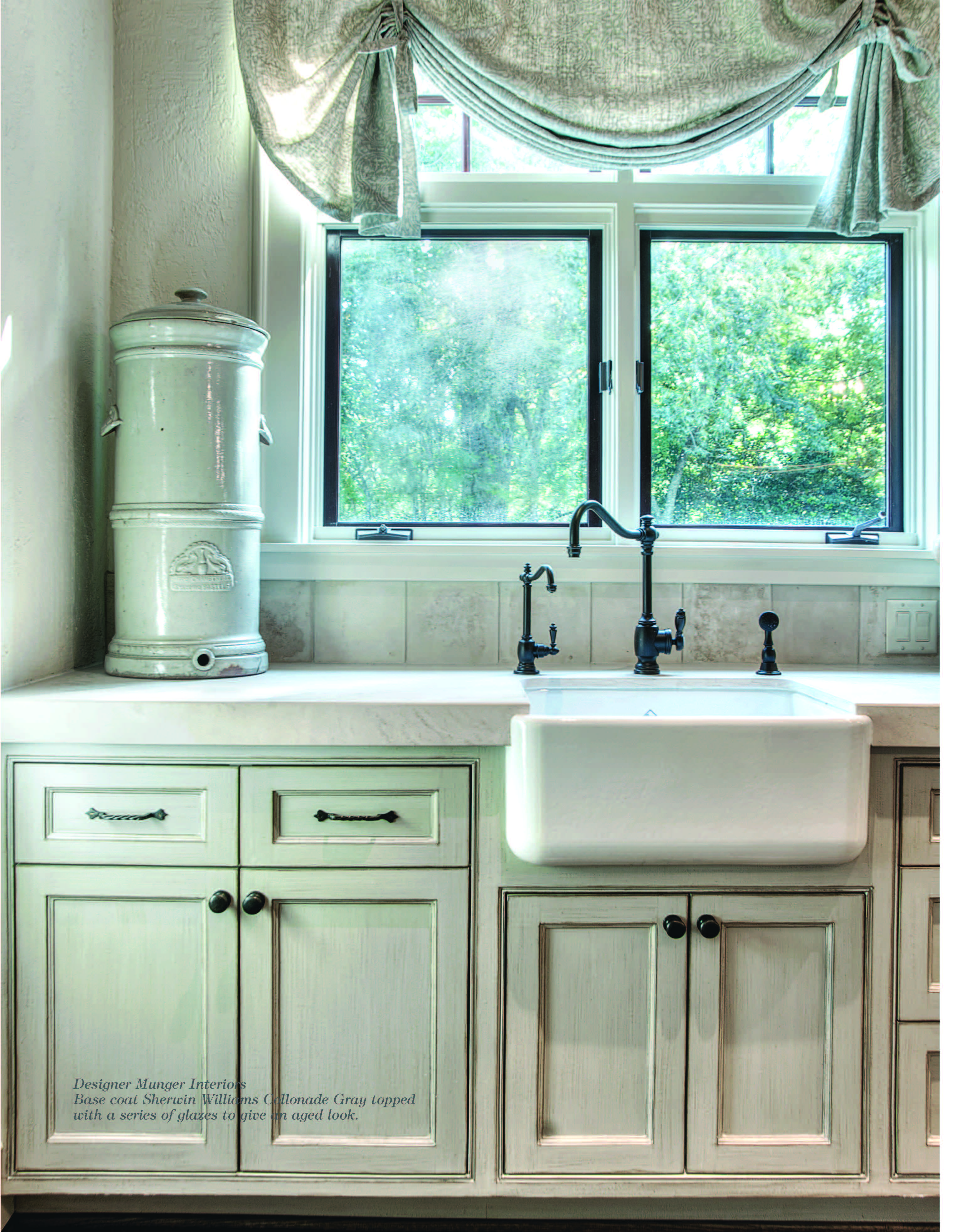
We glazed this amazing kitchen for the ever so talented Munger Interiors!! What a transformation it was!!
From this description, gray communicates a void of movement, emotions, warmth of any identifying characteristics. So why do I find homes using gray as a background color serene, soothing and elegant? I think this very lack of emotions is what makes gray so calming! Because gray isn’t expressing much of anything, it remains simply restful, quiet and tranquil. It not only allows different colors to pop while also cooling their intensity, but it gives the ability to layer textures and patterns without looking overwrought.
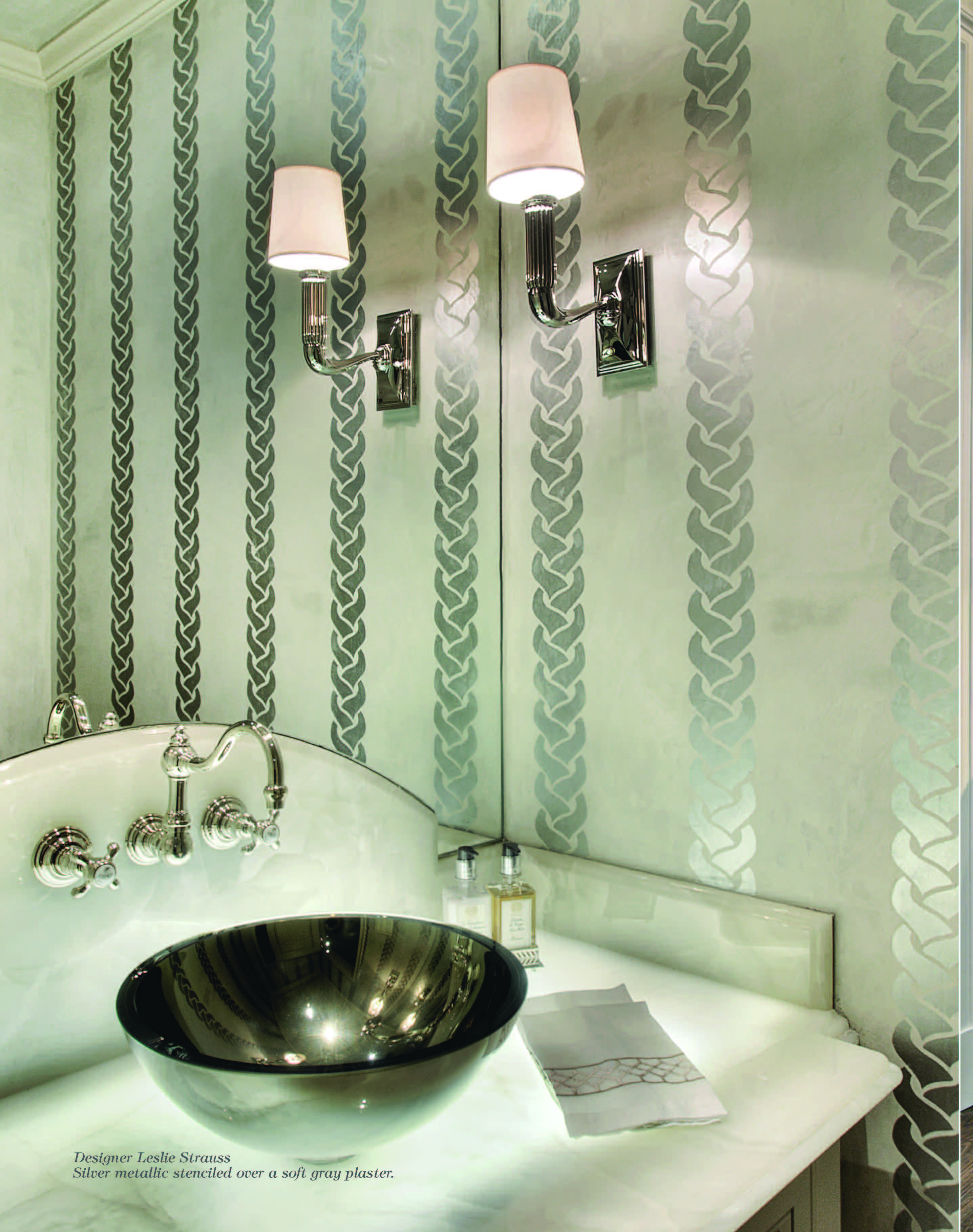
This bathroom which we did for cute designer, Leslie Strauss, has a metallic stencil atop gray plaster walls. I love the way the metallics layer over the plaster!!!
Think of the walls of your home as a sophisticated, all gray outfit. While it may be drab and dreary on its own, the ensemble comes to life when layered with jewelry, scarves, shoes or a jacket. The same basic backdrop can create entirely different tones and styles from dressy to urban, contemporary to romantic.
A gray dress can go from business casual to a night time statement ensemble, just as a home’s ambiance can change from room to room depending on the textures and accents of color. To subtly elicit the mood you would like your room to have, try mixing gray with yellows, teals, blues, greens, pinks, lavenders or my favorite “Blaygeen” color.
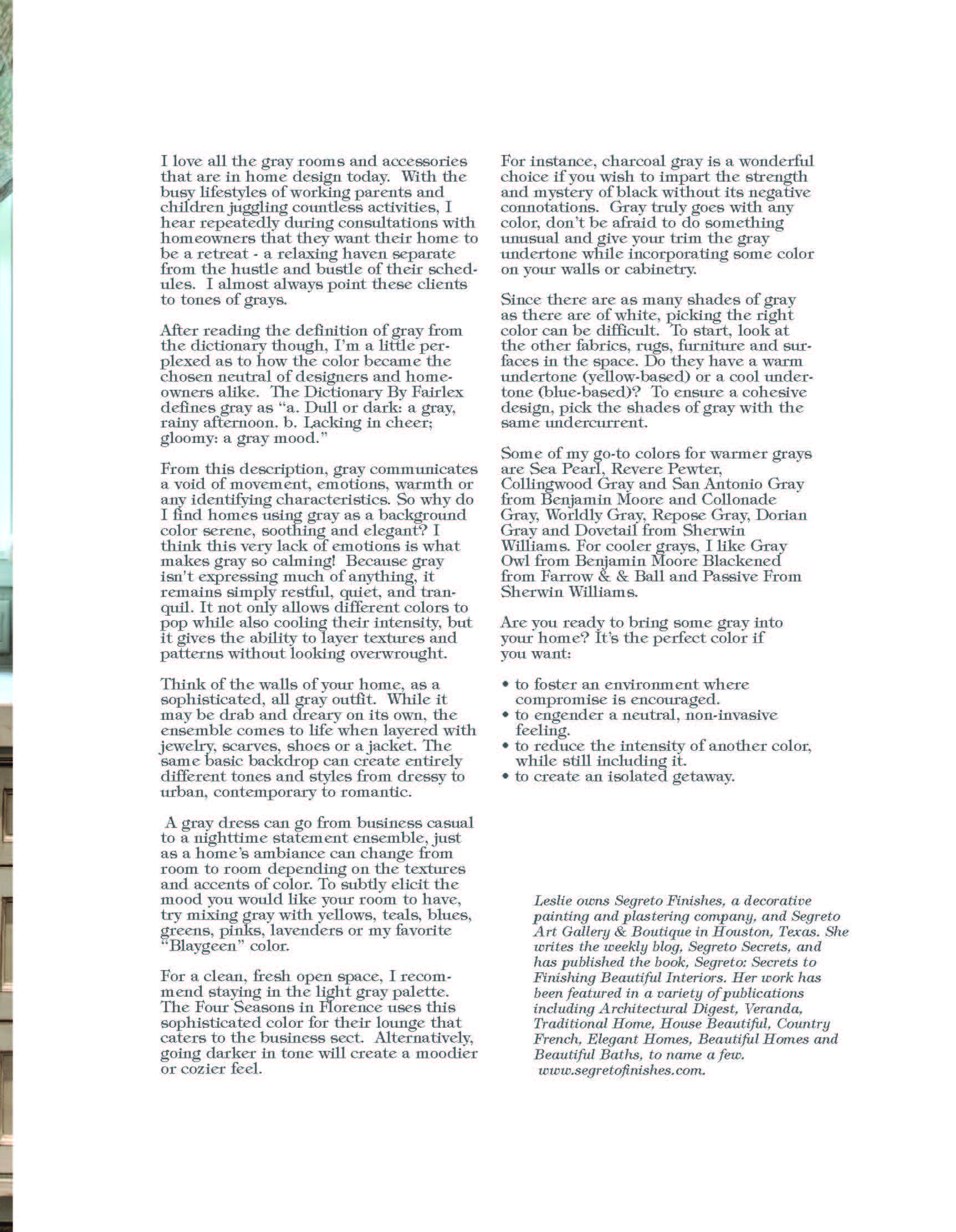
This newly built bar we did for Barnett Custom Homes. Full of age and character, it is truly one of my favs. The worn and distresssed look marries it well with the old brick and wine label tiles!!
For instance, charcoal gray is a wonderful choice if you wish to impart the strength and mystery of black without its negative connotations. Gray truly goes with any color, don’t be afraid to do something unusual and give your trim the gray undertone while incorporating some color on your walls or cabinetry.
Since there are as many shades of gray as there are of white, picking the right color can be difficult. To start, look at the other fabrics, rugs, furniture and surfaces in the space. Do they have a warm undertone (yellow-based) or a cool undertone (blue based)? To ensure a cohesive design, pick the shades of gray with the same undercurrent.

Left: Sherwin Williams Sensible Hue 6198, Right: Sherwin Williams Aloof Gray 6197
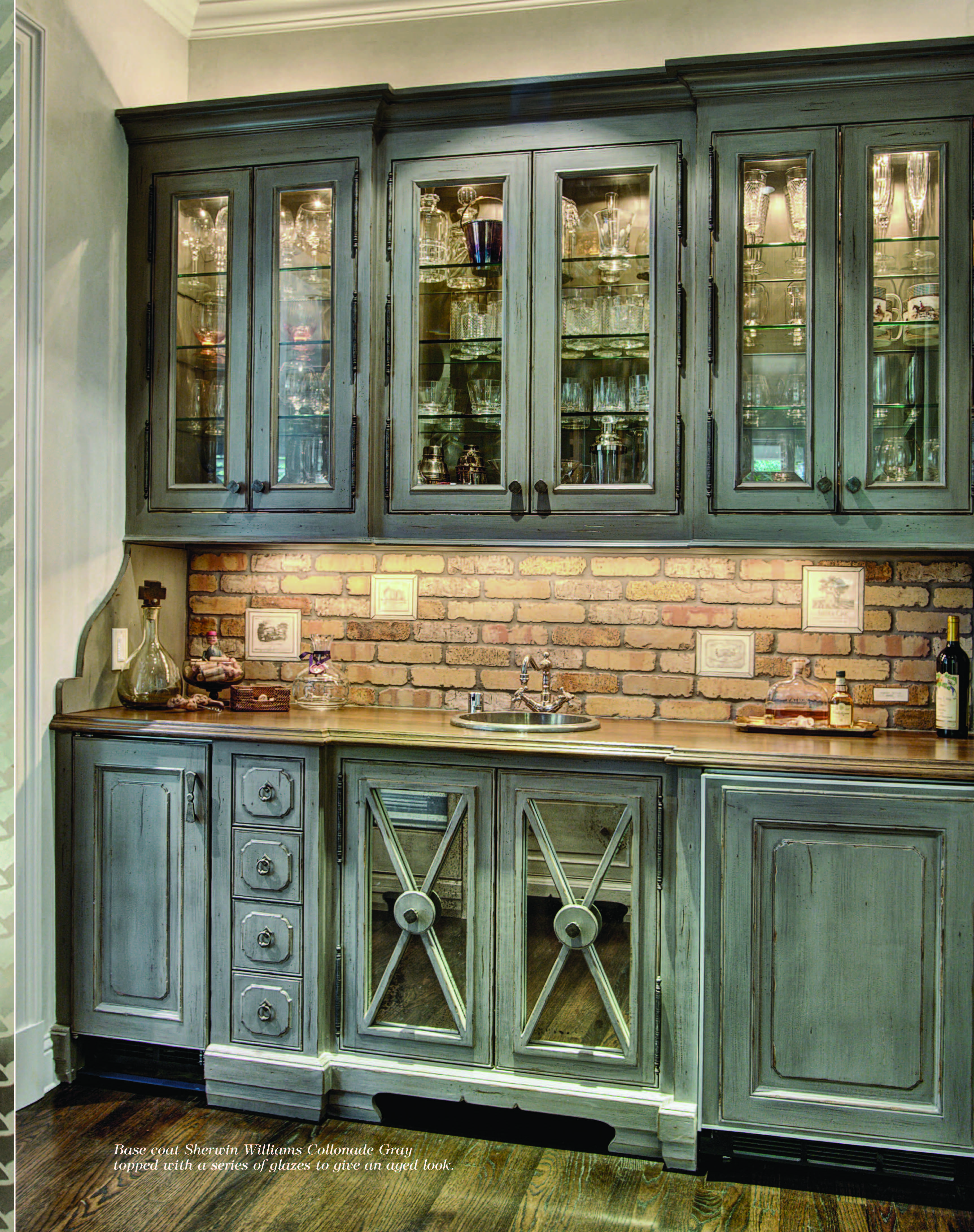
Sherwin Williams Colors: Dorian Gray 7017, Dovetail 7018 and Repose Gray 7015
Some of my go-to colors for warmer grays are Seed Pearl, Revere Pewter, Collingwood Gray and San Antonio Gray from Benjamin Moore and Colonnade Gray, Worldly Gray, Repose Gray, Dorian Gray and Dovetail from Sherwin Williams. For cooler grays, I like Gray Owl from Benjamin Moore, Blackened from Farrow & Ball and Passive from Sherwin Williams.
Are you ready to bring some gray into your home?
It’s the perfect color if you want:
- To foster and environment where compromise is encouraged.
- To engender a neutral, non-invasive feeling.
- To reduce the intensity of another color while still including it.
- To create an isolated getaway.
What’s New at the Segreto Boutique…

Moonstone and Aquamarine earrings: $150

Long Smoky Quartz and black necklace: $325

Left: Cork lace earrings: $49, Right: Cork lace bracelet with magnetic clasp: $89

Long dainty side cross necklaces: from $109-$189 depending on the stone
Hope everyone has a great week!!! Till Next Monday! xo Leslie
Lee
Posted at 00:24h, 06 MayI have read that grey can be depressing when you are surrounded by it for long periods of time…however I disagree with this statement as it depends on what other colours you mix with it. White and grey can be very relaxing as you have proved by that wonderful bedroom above. I wish we had the same brand of paints in New Zealand as I love those two Sherwin Williams colours.
I intend to use soft greys in my bedroom and hope I manage to get the right balance as in the bedroom above.
Lee