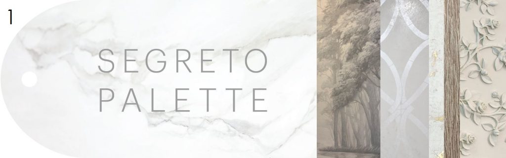
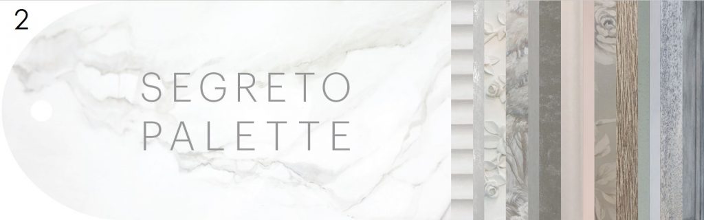
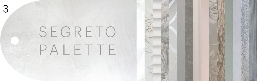
We need your Help! Let’s Play “pick that cover” and Win a gift!
Hi Friends! I hope you are having a great week! Remember when you helped me name colors for the paint line? Well now its time to pick the cover of our Segreto Palette Deck and I would like you all to be involved! I will share the journey and concepts behind the deck to give you the background so you can play “Pick that Cover” and enter to win to a gift from Segreto!
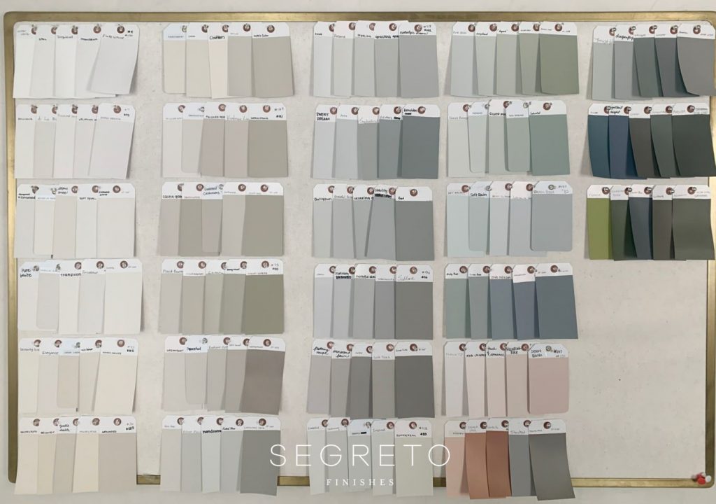
Wanting to be able to create that perfect tone to marry well with our plaster colors which are full of depth and warmth, I began a paint line. For years, I custom mixed colors for my clients, taking them to paint stores so they could match my colors to their paints for the clients to purchase. This process took lots of back and forth to get the color right so I wanted to bring that process in house. Being colorists, creating the colors was fun for me and my staff. Like mad chemists in a lab, we mixed different pigments in solo cups little by little altering each one into the perfect tone. Above became our Segreto Palette.
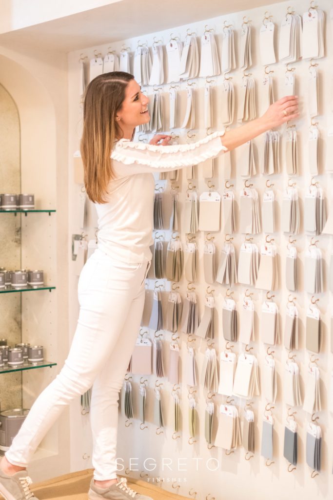
We looked into different ways to share and display our paint chips. Being shocked at how expensive it was to print a deck, more expensive than printing our design books, we decided to hand paint luggage tags, label them and hang them on hooks on our wall.
This was a slow process, so the only way our clients could select from our colors was to come into the showroom and select individual chips. Color to me is so important. It triggers emotions which can alter your mood, calm your nerves, and create a peaceful atmosphere at home. And I know we all want that!
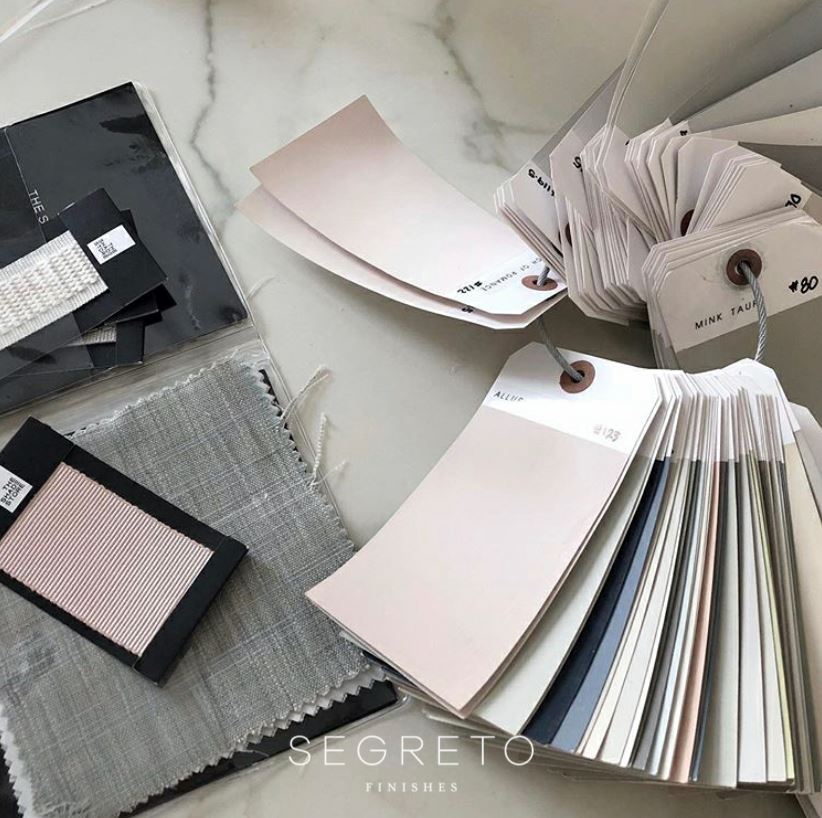
Providing that “this is home” feeling for you in your own home has been a mission of Segreto from the start. I thought we should not only have a paint deck, as its only shows part of how we transform spaces, but it should embody our entire product lines through a Segreto Pallet.

Whether plaster, Segretostone, lime washes, wood finishes, slurries and now paint, this deck can be used to create that ambiance in many products. The palette decks are made up of easy-to-view color strips that showcase many colors and corresponding SegretoStone options. It takes you through a spectrum of colors; we cover the whites, warm neutrals, grays, soft hued blues, greens and pinks as well as the newest addition of richer colors. The paints are offered in latex flat, latex washable matte and semi-gloss oil and the price point is just slightly above standard paint lines making it a great value and affordable for all.
So let’s play “pick that cover”!
Scroll through the cover options below. Think…what would draw me to the deck? Which design will stay current for years? What appeals to traditional, contemporary, transitional styles, multiple age groups and budget ranges? What embodies the Segreto brand? Please comment your top three covers below to submit your selections. We will randomly select ten entries and mail out a palette deck and gift when they arrive.

Thank you all for playing “pick that cover”! I can’t wait to see what your selections are. As always, I am grateful for you! I so appreciate your insight and value your suggestions! The palette decks are almost finished and will be available for purchase soon. Stay tuned to see the final cover and to see who our lucky 10 friends are. Till next time! XO Leslie
Cynthia White
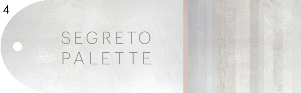
Posted at 05:52h, 05 October2,5,7
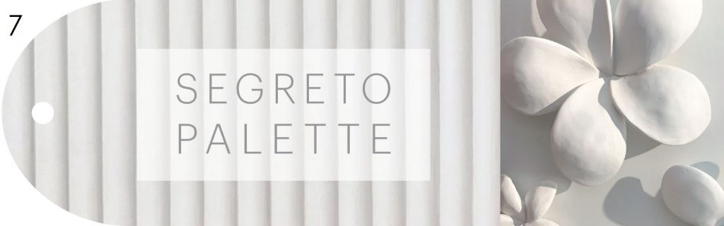
7 is my favorite and seems to represent your work in a creative way
Leslie Sinclair
Posted at 06:25h, 05 OctoberHi Cynthia! Thank you so much! This has been such a hard decision for me! We have done about 50 renditions!! I do need your help! xo
Patricia Millen
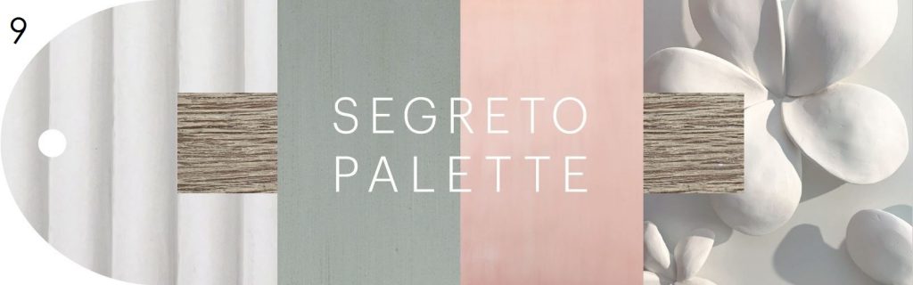
Posted at 05:53h, 05 OctoberI like #2 because the faux marble is timeless and the thin sample stripes embodie all that Segreto does.
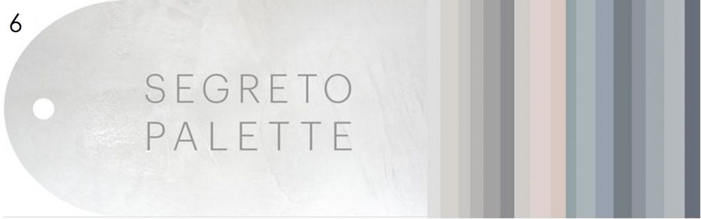
# 6 is also in the running, because it tells me about the range of colors in your pallet deck. I probably already know about the many finishes that are available if I am buying yor paints.
#10 because it is simple, to the point and will never go out of style. I’m not sure if this cover tells the Segreto story…. but most likely the paint buyer will know your story!
God bless and best wishes as you move forward with your new paint line.
Leslie Sinclair
Posted at 06:23h, 05 OctoberHI Patricia! Thank you do much for taking time to share your input! Valuable! My internet friends and the best!! xo Leslie
Carolyn R Hebert
Posted at 06:29h, 05 October9
1
5
MaryBeth
Posted at 06:39h, 05 OctoberLeslie, #2 would catch my attention but anything with Segreto Stone would catch my eye first! Best wishes!
Leslie Sinclair
Posted at 13:45h, 07 OctoberHi MaryBeth! Our SegretoStone colors are included in the back of the palette. Can’t wait for you to see! xo
Patti E
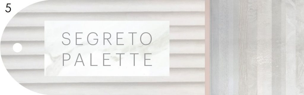
Posted at 06:52h, 05 OctoberI like number 5—it is soothing yet eye catching just like your paint colors!
Marta Henderson
Posted at 06:56h, 05 OctoberI like #6. This cover represents a large spectrum of your colors and keeps it simple with color tones only. However, all choices are beautiful.
Christine Hilton
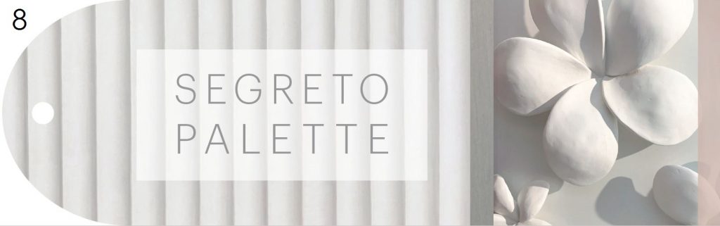
Posted at 06:58h, 05 OctoberI am a retired designer,but let’s face it we never retire.There is always a friend or old client that needs help.l have always found the absence of colour an easier place to start so #7 is my pick.Please put me on the wait list for a deck.l too have been making my own colours and l think you have nailed it!
Thank you for a great start to my week again!
Leslie Sinclair
Posted at 14:01h, 07 OctoberHi Christine! Once a designer, always a designer! I so appreciate you sharing your thoughts. So valuable! xo
Lynn Ellen Gordon
Posted at 07:19h, 05 OctoberI like 7 from this selection – neutral, timeless, and elegant. I wish you would have added the flower to 10 – it would show color and texture. Your colors are soft and relaxing and do not demand constant change every five years with the change in decorating fads. I have enjoyed watching your business grow, and love it when I see articles in magazines mentioning you name, products, and photos of your work! You must be so proud of your accomplishments! Have a blessed day🥰
Susan Hunter
Posted at 07:20h, 05 OctoberI’m leaning towards number 3 as it seems to be in the middle of all that you do. Covers just about all your concepts.
Leslie Sinclair
Posted at 14:04h, 07 OctoberHi Susan! Your input is so valued and appreciated! Thank you! xo
Amy Cunningham
Posted at 07:25h, 05 OctoberMy three favorites are 6, 4 and 5! All beautiful though! Can’t wait to see what you choose!
Leslie Sinclair
Posted at 14:12h, 07 OctoberHi Amy! Can’t wait for you to see our finished palette deck. We had so much fun picking Segreto Paint colors with you and Rachel! xo
Jen Borba
Posted at 07:27h, 05 October1st #1 It showcases what Segreto finishes are available and how wide your selections are.
#6 simple but covers a large spectrum of colors choices.
Jennie Murphy
Posted at 07:33h, 05 OctoberMy picks are #1,2 and 4. I love your colors. They give you a very comforting, homey, calm feeling. I always look forward to your post to see what you have been creating.
Leslie Sinclair
Posted at 13:42h, 07 OctoberHi Jennie! Thank you so much for sharing your picks and sweet words! xo
Denise M. Traylor
Posted at 07:34h, 05 October2,5,9! Love them all. You may not remember but choosing paint colors was what originally brought me to you! Hope you are all well!
Bryn Larsen
Posted at 07:36h, 05 OctoberI like no. 2 the most and would thereafter select 3 or 4, but they are all gorgeous choices! Can’t wait to see how this turns out!
Becky Stephens
Posted at 07:40h, 05 OctoberAll fabulous! But if I had to pick 3….then I would chose 2-6 or 7!
Leslie Sinclair
Posted at 14:15h, 07 OctoberHi Becky! I’m so thankful to have my blog readers help me make this decision. Thanks for sharing your picks! xo
Elizabeth Larabee
Posted at 07:45h, 05 October7 would be my first choice . It is clean and simple. When I look at the board where you have samples displayed, I see the gold trim and wish you added a little gold to the the deck covers. I know foil application is more $ though. 6 would be my second choice. It is showing you exactly what to expect.
Leslie Sinclair
Posted at 14:25h, 07 OctoberHi Elizabeth! Thank you so much for sharing your thoughts and ideas! I can always count on my internet friends! xo
debbie brassfield
Posted at 07:46h, 05 OctoberHow fun and exciting for you to birth these decks, Leslie!
The smooth, soothing simplicity of #6 makes me want one of each of these gorgeous colors in my home – and is my first choice!
With #2 being a close second choice, suggesting all of the textures you often colorize or enhance.
Fun for us fans to be included in the decision making! XO
Julie Mitchell
Posted at 07:52h, 05 OctoberLeslie, I’m loving number 6 because it’s timeless with clean lines and it tells us your color story. Bless you, my friend! XO
Kristen Johnston Interiors LLC
Posted at 07:59h, 05 OctoberCan’t wait to see them in person! I like the distinct sophisticated look of 7 and 8 and feel that their quiet simplicity calls to me.
Tongula Steddum
Posted at 08:19h, 05 October2, 6, 10
Brenda Brunette
Posted at 08:31h, 05 OctoberI love the simplicity of #7 and was immediately drawn to it. There is something about the dimensionality of it that I love.
Lynne Marie
Posted at 08:46h, 05 OctoberHow exciting! Top three choices would be #7, #10, and #6. But #7 is my favorite – clean and creative, but also timeless!
Lara Kenney
Posted at 09:04h, 05 OctoberHow exciting! 7, 5 & 6 are my picks. 7 is by far my fav, because it catches my attention while invoking a feeling of calm.
I don’t believe 1-3 & 9 will stand the test of time, because of the stained wood. 10 also could seem dated years to come when color palette trends shift. However, they all are beautiful today!
TJF Design
Posted at 09:19h, 05 OctoberLeslie ~ it’s SO HARD. they’re all beautiful (and timeless, I think) and they all speak Segreto. Forced to choose, 7 is the most unique, which Swgreto definitely is. 6 and 4 are also very on brand and soothing and timeless just like your paint, plaster and product finishes. I love them all so I’m glad the task is all yours. The team did a beautiful job putting it all together and I can’t wait to have my own copy. We can’t have you and your amazing artisans right here in Florida but this will be such a treat to specify in client projects ~ just can’t get enough of all the beauty you spread. Super excited about the lime wash too ~ y’all stay safe and keep on making life lovely ~ TJF
allyson zoellner
Posted at 09:20h, 05 October6, 3, then 2. The reason for number 6 is that it represents a full range of colors rather than just lights/pastels. The others also represent a full range of colors but pull in the other finishes that Segreto specializes in and for which the new paints become complementary.
Maree Sperle
Posted at 09:29h, 05 OctoberReally liking #4. Lovely colors that would be elegant and serene in a home.
Diana Humphrey
Posted at 09:36h, 05 OctoberLeslie, I like Segreto Palette numbers 3, 6 & 7, but of the three, I prefer #6 because the colors are soft but intense enough to catch your eye.
Leslie Sinclair
Posted at 14:32h, 07 OctoberHi Diana! Thank you for sharing your selections! I so appreciate your input!! xo
Joan Rosen
Posted at 10:20h, 05 OctoberMy favorite is 8 because it is beautiful and inviting, tempting me to open the deck. Next is 6 because the color palette is soft and harmonious. Then number 1 because I can see what all of these beautiful colors can make! Truthfully, there are no bad choices.
Diane Simmons
Posted at 10:25h, 05 October#7 is my fav~
Mary Anne Doms
Posted at 10:38h, 05 October6, 3 and 2. I need color to stand out on my desk covered with plans, sketches and inspiration.
Leslie Sinclair
Posted at 15:15h, 07 OctoberHi Marry Anne! Thank you for taking the time to share your selections with me! I sure do value and appreciate your input! xo
Carol Landers
Posted at 11:02h, 05 October#6 is a clear favorite for me because it shows your range—which is lovely!
You’re an amazing artist & businesswoman, Leslie!
Teri C
Posted at 11:03h, 05 OctoberI would pick 6 as #1 as it shows the breath of the trend right palette right off the bat.
I would next pick #3 as it exhibits is a beautiful collective way the large breath of Segreto finishes, albeit not all inclusive.
Finally, I would pick #3 for the same reason as #2, although I feel #3 lays out the colors and technique in a more aesthetically appealing way.
Lisa Dremann
Posted at 11:42h, 05 OctoberI would say #2, #6 and #7! I think #7 is so unique and would stand out to me. #6 is great in that it shows the range of beautiful colors available. #2 is very classic and elegant as well. Hard choice!
Leslie Sinclair
Posted at 15:17h, 07 OctoberHi Lisa! It is a hard choice! We have narrowed it down to these ten options and I appreciate your input to help us pick the final cover!! Thank you! xo
Lynda Stansberry
Posted at 12:21h, 05 OctoberI like # 2. Timeless; traditional
Patricia Miller
Posted at 12:44h, 05 October4-5
Leslie Sinclair
Posted at 15:19h, 07 OctoberHi Patricia! We’ve got your selections counted! Thank you! xo
Anne Toone
Posted at 12:48h, 05 OctoberWhat a difficult decision, but No. 7 is my favorite.
I have been waiting for these and hope to be able to order a deck when available. Your creativity is amazing…hope you all are well!
Leslie Sinclair
Posted at 15:22h, 07 OctoberHi Anne! It is a difficult decision and that is why I am looking to all my creative and talented friends to help me decide! The palette decks will be ready very soon! I hope all is well with you and your loved ones too! xo
Patricia Miller
Posted at 12:51h, 05 OctoberHello Leslie,
I have slight orange peel texture on my walls would love to do plaster is this something my painter could do? If not what would you suggest? Would you washable Matt work,
Many thanks
Patricia
Kathrine
Posted at 12:52h, 05 October2, 5, & 7 with No 7 being my favorite.
Elaine
Posted at 14:11h, 05 OctoberI love them all but since you asked for three – –
#2, #3, #6 in that order.
Good luck to you!
Leslie Sinclair
Posted at 15:23h, 07 OctoberHi Elaine! I love them all too! Such a difficult decision. Thanks for sharing your selection!! xo
Connie
Posted at 15:02h, 05 October4,6,7
Couldn’t lose with any of them however.
Julie Young
Posted at 15:42h, 05 OctoberI love #2 because of the gorgeous colors as I do not think that the flower has anything to do with paints.
Leslie Sinclair
Posted at 15:25h, 07 OctoberHi Julie! I value and appreciate your input! Stay tuned to see which cover is selected! xo
Stephanie Sutton
Posted at 16:57h, 05 October1, 2,8
#1 Just calls out Segreto Finishes to me. Beautiful, timeless and inspiring.
#2 showcases the gorgeous palate of colors your about to view. Would compliment any design style for years to come.
#8 classy and simple
Laurie Young
Posted at 17:09h, 05 OctoberI think #1, #3 & #4 best represent your brand:) Best of luck in making your decision.
Susan Whinnery
Posted at 17:39h, 05 OctoberI think # 2 HITS ALL THE BUTTONS .
2ND BEST IS # 7 even though I like it the best it isn’t as universal and it may feel dated after time.
Becky Franklin
Posted at 18:36h, 05 OctoberThis is not easy. Thinking of now, future and all inclusive eye sets… #2, 3 and 5
alm
Posted at 18:53h, 05 OctoberFavorites are 3,4, and 6. I think #6 is best because this cover shows the color range offered in your paint line, inspiring customers to look through the paint deck and discover the perfect Segreto white, beige, gray, pink, or blue shade for their own home.
Victoria Myers
Posted at 19:11h, 05 OctoberI think many will be inspired to purchase your paints because of your gorgeous finishes. It’s part of your name and what your company is known for;) Capitalize on that strength. Therefore, I personally like #1, 2 and 3. They represent your range of finishes the best. My favorite is #3 but I would make two changes. Use the marble finish on the left side (as used in #1 and #2) and include the small ivory and gold leaf stripe in #1. This would be a beautiful representation of your work. I wish you all the best in expanding your line!
Nancy
Posted at 19:39h, 05 OctoberMy favorites are 2, 6 and 7. So difficult to showcase all of your work on one small cover. Really looking forward to seeing the final choice.
Love your amazing work.
Beth Brace
Posted at 19:52h, 05 OctoberNumber. 3
KATHY BOYD
Posted at 20:57h, 05 October#1
Natalie Carlson
Posted at 21:06h, 05 October6 all the way!!!! Love your new paints!!
Sissy
Posted at 22:01h, 05 October#6 timeless and #9 artistic beauty…..Both say Segreto to me!
TRUDI E ROWE
Posted at 23:04h, 05 OctoberMy favorites are #2, #3 and #6. They are all beautiful. So happy for you, your business is really expanding.
Jill Oliver
Posted at 07:44h, 06 OctoberSIX!!! Congrats on your paint line.
Leslie Sinclair
Posted at 15:25h, 07 OctoberHi Jill! Thank you so much! I appreciate you taking the time to share your favorite cover! xo
Merideth Melville
Posted at 08:54h, 06 OctoberAll beautiful. I’m drawn to: Calm #5, Color #6, Catchy #9. Building my home now.
Robin Clayton
Posted at 10:28h, 06 OctoberMy favorite is number 6. I found it clear and non confusing. When I’m choosing color I like as little design interference as possible. The rest of the covers were lovely just not as helpful for the way I process information.
Suzanne D. Grable
Posted at 12:01h, 06 OctoberI choose number 2, 1 & 3. No. 2 looks richer but number 1 has a sample of the work on the left side which I guess to be the top of the cover and is more prominent. 2 & 3 both show a wide variety of color and the richness of the color shows. No. 1 shows samples of your designs all the way through.
Mary Noland
Posted at 12:20h, 06 October5 because the textures are gorgeous and the horizontal stripping will appeal to all decorators and home owners looking for a modern farmhouse, simply modern, or traditionalist drawn to soft colors
7 because it reflects the neutral, Old World textures that are my favorite
9 because it reveals better range of options to mix mediums and textures
Pamela Shipp
Posted at 15:30h, 06 OctoberNumber 7. It is soft, elegant and sophisticated. Seems that represents your brand well.
How do we buy a fan deck??????
Colleen Martin
Posted at 18:10h, 06 OctoberMy three are 5, 6 and 7 I think 7 is classically beautiful neutral that would lead you to want to open the palette to see what all the colors are without prejudgment of various colors on the cover. If I had to choose one only it would be 7.
Excited to use your paint on my next new home.
Joan Thornock
Posted at 20:06h, 06 OctoberI like #2, and #6! Very cool designs!
Janie Dickerson
Posted at 20:19h, 06 October2, 6 and 7 are my three picks. All beautiful! Each of these three make me want to see more.
ARLY DIETRICH
Posted at 21:04h, 06 OctoberI love the simplicity of 7,8 and 9. However, my favourite is 9 because it not only has the simplicity which I feel is important in any marketing concept. the golden rule “KISS” Keep It Simple Stupid! But it also has the colour of pink which is always a fashion forward colour mixed with the opposite grey/green/blue. Has the key neutral of white in the background, which is essential backdrop for colour. then you have captured the dimension in the flower and the texture in the wood piece! I think it is timeless and perfect! Well done!
Lydia
Posted at 04:57h, 07 October2 is my favorite. It made me want to explore all of your colors.
Nettie
Posted at 07:47h, 07 OctoberNumber 7
Simple
Elegant
Timeless
Susan
Posted at 12:07h, 08 OctoberGreat options! Six and 10 are the most interesting for me. Timelessly beautiful and on brand while conveying quality. Can’t wait to see the finished product!
Leslie Sinclair
Posted at 09:16h, 19 OctoberHi Susan! Thank you so much for your input! I so appreciate it! xo
Shelly Hubel
Posted at 12:40h, 11 OctoberI ABSOLUTELY LOVE them all, but based on what you described as your goals and needs, my favorites are: 6, 3, 2 in that order .
My favorite, #6 shows the broad range of color values in finishes you offer as well as the nuanced tones Segreto is known for. It is timeless and classic! The background behind the “Segreto Palette” nicely shows one of your wall finishes. (Wouldn’t mind also seeing the lighter rectangular box superimposed with the Segreto Palette words).
My next favorite is #3. I love seeing the broader range of applications Segreto does….especially the gray/silver stencil snippet. However, with the “teaser” images of what looks like wallpaper, wood texture and 3-d flowers,….I feel if those images are on the front, it would make sense to have corresponding “pages” with full photos in the palette describing more of why those images are on a paint deck cover.
My 3d favorite is #2. Very Very similar to #3, but lighter colored. I preferred 3 over 2 because the palette range takes up more of the paint deck cover on #3 over #2. I feel #2 needed more presence of actual paint colors.
Leslie Sinclair
Posted at 09:19h, 19 OctoberHi Shelly! We’ve got your selections counted! Thank you so much for taking the time to share your thoughts and reasons behind your favorites. It is so appreciated! xo
Tammy McKenny
Posted at 06:56h, 12 OctoberI think #’s 3, 4 and 6 would entice me to see more of what’s inside. I love following you to see the beautiful things you and your team transform/create each week.
Leslie Sinclair
Posted at 09:20h, 19 OctoberHi Tammy! Thank you for your sweet words! I appreciate you letting me know your favorites. xo
Debbie Shepler
Posted at 12:36h, 12 OctoberMy favorites are 2, 3 and 6
Leslie Sinclair
Posted at 09:21h, 19 OctoberHi Debbie! Your input is so appreciated! We’ve got your favorites counted! xo
Gina Diamond
Posted at 19:57h, 17 OctoberI love number 7 so much. I feel it will stand the test of time.
Leslie Sinclair
Posted at 09:26h, 19 OctoberHi Gina! I’m so thankful for my readers! I couldn’t do this without you! xo
Julie Porter
Posted at 12:12h, 26 October2, 1, 6 in that order! : )
Carole Pena
Posted at 14:10h, 05 NovemberI would use #3. It shows a variation of both colors and textures—the Segreto singnature!! They all are beautiful, though Leslie!!
Whitney Anderson
Posted at 14:50h, 05 NovemberCongrats! My two favorites are #2 and #7. Number two shows more of the breadth of Segreto’s work and the marble look is timeless. A close second is number seven as it’s beautiful, timeless, and classic. Good luck!
Brittany Bures
Posted at 18:04h, 19 NovemberBeautiful colors as always!
My pick is #1 #3 #9