Downsizing-A Warm, Comfortable and Functional Space!
Hi Friends! I hope you have grabbed your cup of coffee or a glass of wine depending on what time of day it is. With school starting, life is about to get busier so be sure to take a breath and a little time for yourselves. This week I am traveling to up state New York with most of my staff for a job we are completing there!! I loved Skaneateles when I went before for the design meetings!!
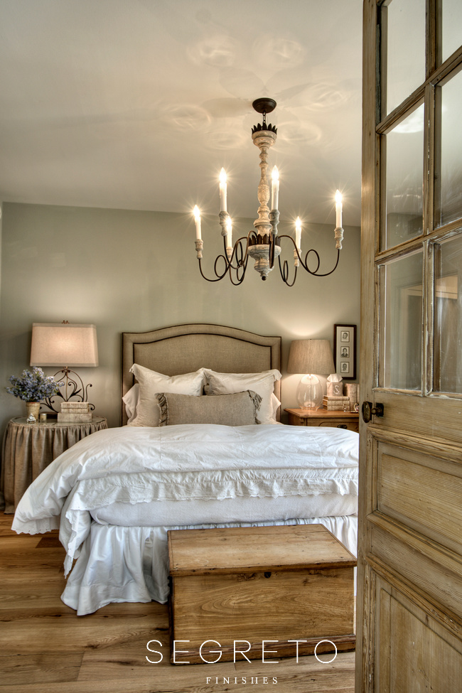
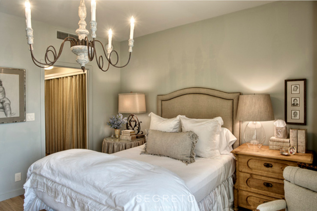
Then, it was a winter wonderland and I felt I was entering a Christmas town from a Hallmark movie. I can’t wait to share with you what it looks like in the “high season” of summer! This week, I am reposting a very popular article which could not be viewed on my new site for some reason. The bedroom shot has been one of Pinterest’s most viewed images. It’s a charming renovation and a wonderful example of how you can take a small white box and transform it into a warm, inviting and comfortable space.
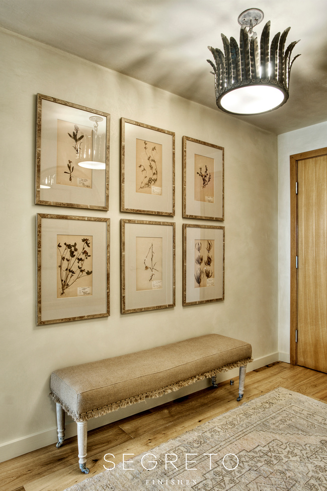
After living in the same house for over 40 years, these homeowners were ready for a lifestyle change. Wanting a handicap accessible place with security, no maintenance and the comfort of a concierge staff, they moved from their 5,000 square foot Dallas home to this 1,100 square foot high-rise – now that’s what I call downsizing! Enlisting the help of their daughter, renowned interior designer Kara Childress, they edited their existing furnishings and accessories to create an easy, fresh look that incorporated some of their favorite traditional pieces. I love how this light fixture from BROWN, the series of old herbieries in the entry and the wonderful bench with the trim detail create a warm inviting feel as you enter the space which continues throughout.
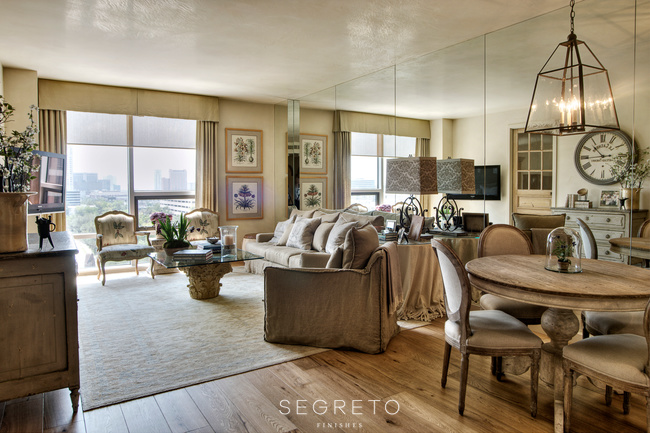
The mirrors seemed a bit dated when they first viewed the new unit, but by cleaning up the trim and plastering floor and ceiling, the reflection makes the space seem twice as big. The inspiration for the design came from their existing pair of hand-colored botanical engravings and two French chairs with a soft floral fabric. Preferring the morning sun, they got this spectacular view overlooking the city that Kara framed with silk draperies in the same tones as the other upholstery. “We instantly added character to the simplistic architecture, embellishing those bones with such uncomplicated objects as family photos and handsome lamps and fixtures, the space feels collected and personal.” Kara tried to adhere as closely as possible to the “less is more” philosophy and get rid of the “dust catchers” her parents had accumulated over the years with four kids and thirteen grandkids. With comfy slip-covered pieces which blended with traditional elements like the 18th century commode and glass-topped Corinthian coffee table. this multiuse space really feels like home!!
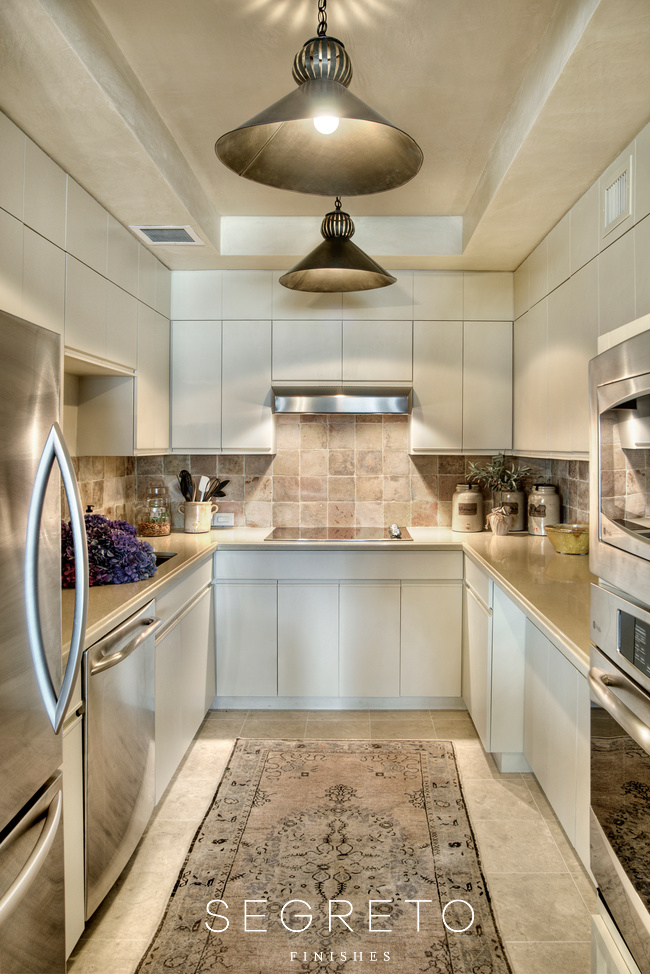
The kitchen was a key place to bring in that homey feel. Painting the existing previously stained cabinets, adding a backsplash of antique tiles from Chateau Domingue and removing sliding doors that closed off the space gave the small space a whole new dimension. With elegant crema marfil honed marble floors and practical Silestone countertops BROWN provided the finishing touch with these unique kitchen pendants – check out the great reflection they cast on the plastered ceiling!
This beautiful antique door from Chateau Domingue greets you as you enter the master bedroom retreat creating a special place. Kara mixed soft textures with warm wood pieces that create interest. To customize the original construction, all of the floors were replaced with these wide wood planks and all the door openings were enlarged or made into casements. I think having the different bedside tables and lamps is a great way to add “his” and “her” personality to a bedroom.
According to Kara, “the closet was originally a big wall of heavy sliding doors that were coming off the track.” I love the solution she came up with – replacing the doors with a fabulous linen drape on a track installation so that the drapes literally disappear into the walls but create interest to an otherwise utilitarian type hallway.
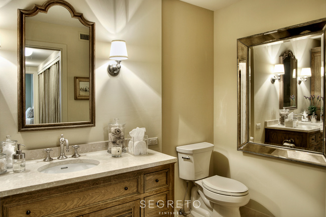
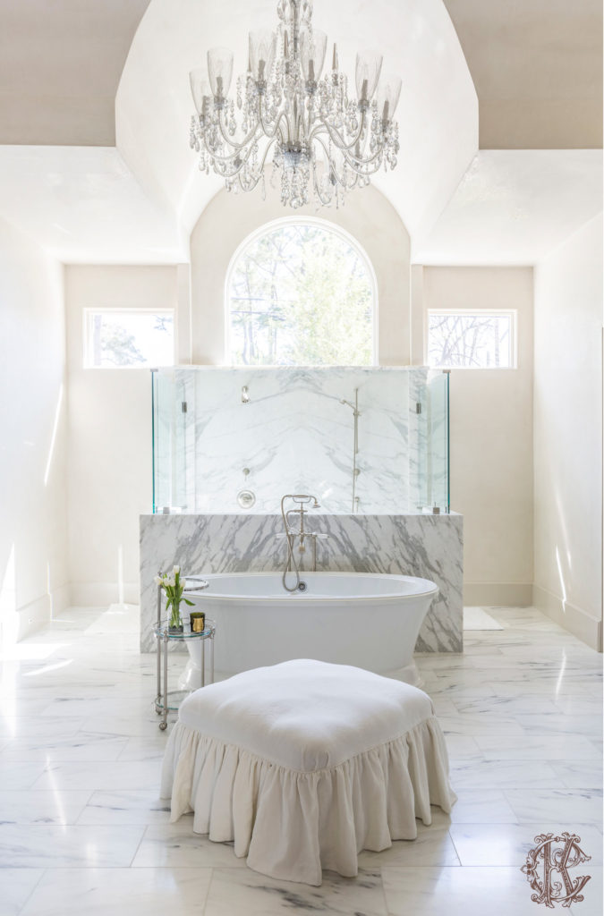
Kara opened up the master bath by knocking out walls and making it one big space. They built a free-standing shower and added a Restoration Hardware console as well as a mirror to conceal the medicine cabinet. This turned out to be a functional, beautiful, warm home full of character, personality and intimacy. I truly loved working on this project with Kara and her parents. It was so interesting to see how she made this space, so warm and comfortable, just what her parents wanted!! Just FYI-in my opinion, Kara does it all well, from small ……
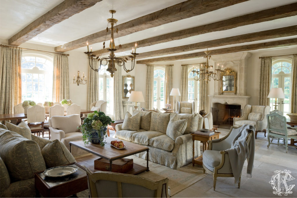
to spacious and inviting……………
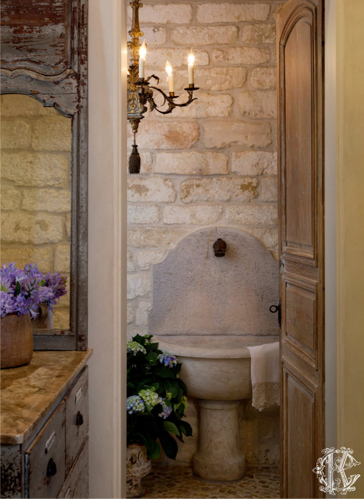
to rustic and romantic ……………………………
Thanks Kara and team, for always letting us install the finishes as a back drop for your beautiful design!!
A big THANK YOU to all this week. Segreto Secrets was nominated for many categories for the International Amara Design Blog Awards!!!! The category in which we obtained most nominations for was “Best Company Blog” and we are up against some amazing talent. If you could take a minute to vote I would be so appreciative. Our goal is to obtain enough votes to secure the top 5 blogs out of a 100 and make the shortlist. At that point the blogs will be evaluated by a curated panel. Go here to vote! From New York, I am wishing you all a wonderful week! Till next time! xo Leslie


Delores
Posted at 13:31h, 27 SeptemberHi Leslie,
I got some great ideas from this post! First of all, I love what this couple did–downsize! Their new condo looks absolutely gorgeous! Love how Kara put the linen drapes
in place of closet doors. And all the light fixtures are fabulous.
I heard Heather is coming to Houston to help with the book signing! Oh, you two are gonna have so much fun. Wish I could sneak into Heather's suitcase!
So proud of you Leslie! Your book is so wonderful–I just looked at it again last night. So much inspiration!
xo Delores
Kendra
Posted at 00:23h, 05 OctoberI love this decor. The great vintage floral prints, the linen headboard and lampshade, and the great rugs. Nice work!
Marble Floor Polishing
Posted at 10:58h, 28 DecemberVery nice blog. Thank you very much for sharing.
Marble Floor Polishing
Granite Polishing
Posted at 09:19h, 05 JanuaryNice post and nice information too. I read your post. It's really nice and I like your post. It’s very simple to understand……..Thank you for sharing………..
Granite Polishing
Kae
Posted at 04:39h, 28 JanuaryWhere is the headboard from?!?
Katarina - Sukhirugs.com
Posted at 07:49h, 21 AugustOh my God, I’m head over heels for this space! It looks so dreamy, luxurious and breathtaking. Seems like it popped out from the coziest and the most glamorous fairytale with all these antique details, pieces of art, pastel and radiant colors and delightful rugs. Rustic, romantic, vintage, elegant, they all mix perfectly in this home. Wouldn’t change a single thing here. Adorable! 🙂
Leslie Sinclair
Posted at 04:43h, 23 AugustHi Katarina!! It is so pretty! I loved working on it!! Thank you so much for your comments!! I hope you have a wonderful day!!!
bayboxwood
Posted at 21:03h, 21 AugustSuch a beautiful apartment, Kara has provided inspiration for my own decorating for 20+years. Thanks for sharing.
Leslie Sinclair
Posted at 04:42h, 23 AugustHi Rachael!! I forwarded the sweet comment to Kara! She was so appreciative!! She is a true gem! Have a great week!
Denise Moseley
Posted at 12:08h, 14 SeptemberKara and her team are absolutely amazing. She has helped us create a beautiful home and we are eternally grateful for her talent, Kara is as lovely as the interiors she creates.