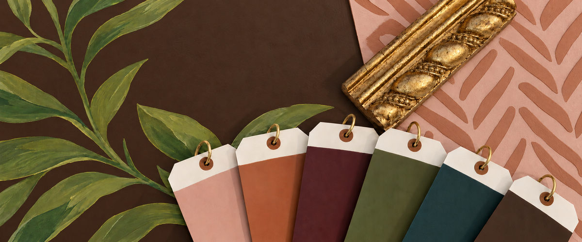
Every fall, I find myself drawn to colors with a little more depth—warm terracottas, rich greens, mineral blues, softened blushes, and deep, earthy neutrals.
Some are familiar autumn shades; others are less expected. A dusty rose recalls the last blooms of a garden, while a blue that leans toward teal offers a cooler note among the earthy tones.
For me, fall color is as much about the feeling it creates as the shade itself. These are colors that invite us to settle in, and they become especially beautiful through the softness and movement of a hand-applied finish.
Blush may not be the first color that comes to mind when we think of autumn, but the right blush can be surprisingly grounded.
Perfect Rose is not a sweet or overly feminine pink. Its earthy undertones allow it to feel almost neutral in the right setting. Natural light brings out its softer rose tones, while warm evening light makes it deeper and more atmospheric.
It reminds me of a faded flower, an antique textile, or the last touch of color remaining in a fall garden.
Terracotta: Color Rooted in the Earth
Tadelakt Plaster | Ashton Taylor Interiors | David James Custom Builders | Gordon Partners Design | Lisa Petrole Photography
Terracotta, ochre, and clay are natural choices for fall, but their appeal extends far beyond the season. These colors come from materials we have used in our homes for centuries: clay vessels, brick, tile, leather, and plaster.
Colors such as Santa Fe and Georgia Clay from our Segreto line bring immediate warmth to a room. They pair beautifully with wood, stone, linen, and aged metals, making those surrounding materials feel even richer.
They are especially beautiful in a hand-applied finish. The movement of plaster creates natural variations of light and dark, keeping an earthy color from feeling flat or heavy.
Santa Fe, Segreto Paint | Elizabeth Garrett Interiors | Goodchild Custom Homes | Kerry Kirk Photography.jpg
Every warm palette benefits from a cooler note, and a teal-leaning blue can provide a beautiful counterpoint to the colors of fall.
Because teal contains both blue and green, it can shift throughout the day. The blue may be more noticeable in the morning, while warmer afternoon light brings forward its green and mineral undertones.
Against walnut, oak, brass, terracotta, or warm limestone, teal feels rich and collected rather than bright or coastal. It gives the palette depth and a slightly unexpected point of view.
Deep green recalls shaded gardens, mature hedges, moss, and rooms that have developed character over time.
People often worry that a dark color will make a small room feel smaller, but it can actually soften the room’s boundaries. The corners become less defined, the shadows blend into the finish, and the space begins to feel more enveloping.
This can be especially beautiful in a study, library, powder room, or home office—spaces where we want the atmosphere to feel intimate and intentional.
Segreto Paint in Otter and a SegretoStone Coffee Table
Design & Photography, Studio McGee | Erin Stetzer Homes | Regan & André Architecture.jpg
Some of the most versatile neutrals have real depth: taupe, umber, charcoal, mushroom, and chocolate brown. They can give pattern, artwork, and upholstery a beautiful foundation while still having a presence of their own.
Nicole Zarr’s Kips Bay room is a wonderful example. A chocolate brown background brings her signature yellow and the other colors in the room to life.
Nicole Zarr and Associates | Jeff Jones Photography
“Yellow has always been my signature color and I think it looks so good with chocolate brown, plumbs, rich greens. I fell in love with this de Gournay paper in the black color way a year before I was asked to design a room at Kips Bay. When they agreed to let me custom color, chocolate brown background was a no brainer.”
— Nicole Zarr, Nicole Zarr and Associates
A Fall Palette Out on the Town
These rich colors are just as inviting in spaces where we gather. At Relish, Meg Lonergan combined burgundy, navy, plum, and gold to give a new restaurant the comfortable familiarity of a longtime favorite.
Meg Lonergan Interiors | Julie Soefer Photography
“We love the way this burgundy, navy, plum and gold all work together at Relish — a classic American family restaurant with a bistro ambiance. We stained the oak in the bar a deep maroon to coordinate with the barstool upholstery. The balance of gold and navy is classic and traditional; mixing it with plum and burgundy adds a twist. These deep saturated colors are our favorites — they feel familiar and sophisticated, making the restaurant feel as if it has been here for years despite being very new. These materials patina over time feeling inviting and comfortable — all are welcome always!”
When we select a color, we consider everything around it—the natural light, flooring, stone, woodwork, upholstery, and even the landscape outside.
The finish matters too. A matte surface creates a softer effect, while a subtle sheen catches the light and highlights the movement of the application.
This is why I always recommend viewing a generous sample in the room. Move it from wall to wall and look at it in the morning, afternoon, and evening. A small paint chip simply cannot show you how a color will live in a space.
A Feeling That Lasts Beyond the Season
Kara Childress Interior Atelier | Julie Soefer Photography
Fall is a wonderful invitation to explore a richer palette, but the colors we choose can feel at home all year. Whether you are drawn to an earthy rose, a deep teal, or chocolate brown, I hope you find a shade that makes your home feel a little more personal—and a little more inviting.